Table of Contents >> Show >> Hide
- What Exactly Is a Botanical Blueprint?
- Why Botanical Subjects Look So Good in Blueprint Blue
- From Specimen Study to Stylish Wall Art
- How Designers Use the Look in Modern Rooms
- Design Clues: What Makes the Best Botanical Blueprint Art Work
- How to Style Botanical Blueprints Without Making the Room Feel Theme-y
- Why This Look Works So Well Online and in Real Homes
- Experience: Living With a Botanical Blueprint
- Conclusion
Some wall art hangs politely in the background. Botanical blueprints do not. They enter a room like they know exactly where the good light is, then proceed to make every other decorative object work a little harder. Part science, part poetry, part “I definitely have my life together” energy, this style turns leaves, fronds, stems, and blossoms into crisp blue silhouettes that feel both historic and surprisingly modern.
That is the real charm of the look. A botanical blueprint carries the precision of a specimen sheet, the mood of a moody indigo painting, and the cool confidence of architectural drafting. It feels natural without being rustic, classic without being dusty, and dramatic without needing a chandelier the size of a compact car. In other words, it is exactly the kind of visual contradiction good design loves.
So let’s put on the design detective hat and investigate why these botanical moments feel so unforgettable when captured in blueprint blue. From the origins of cyanotype to the way designers use botanical prints in modern interiors, this is the case file on one of the smartest, prettiest, and most quietly clever looks you can hang on a wall.
What Exactly Is a Botanical Blueprint?
A botanical blueprint is usually a plant image rendered in the visual language of cyanotype: a rich blue ground, pale silhouettes, and sharp detail that makes each leaf vein look like it sat for a formal portrait. The result resembles an architectural blueprint, which is not an accident. The cyanotype process eventually became closely associated with blueprint reproduction, so the look naturally carries an air of planning, structure, and technical beauty.
Long before it became a decor favorite, cyanotype was part scientific tool and part photographic breakthrough. In the mid-19th century, the process made it possible to record plant forms directly, with remarkable clarity. That mattered because botanical imagery was never just about prettiness. It helped identify species, preserve visual evidence, and communicate plant structure in a way words alone could not. Suddenly, nature was not merely being painted; it was being impressed into light.
That is why the style still feels so compelling today. A botanical blueprint is not just floral decor dressed up in blue. It carries the logic of observation. It suggests collecting, cataloging, noticing, and preserving. Even when used purely as wall art, it still whispers, “I appreciate beauty, but I also appreciate the thrill of a labeled specimen.”
The Cyanotype Backstory That Gives the Style Its Soul
The visual identity behind this look comes from cyanotype, the photographic process introduced in the 1840s and later used for reproduction work that gave us the everyday idea of a blueprint. Anna Atkins, now widely celebrated in the history of photography and botanical image-making, used cyanotypes to produce stunning studies of algae and plants. Her work helped prove that botanical subjects could be documented with both scientific value and breathtaking elegance.
That fusion matters for design. Good interiors often balance emotion and order. Cyanotype does exactly that. It is lyrical because it captures fragile natural forms, but it is disciplined because the process strips the subject down to structure, edge, and contrast. A fern becomes almost architectural. A flower becomes a diagram with feelings. A piece of seaweed somehow looks like lace and lab work at the same time. Frankly, it is showing off, and deservedly so.
Why Botanical Subjects Look So Good in Blueprint Blue
Plants already have excellent design instincts. They come with repetition, asymmetry, rhythm, negative space, and elegant line work built right in. Cyanotype simply reveals those strengths with almost suspicious efficiency. Where a colorful floral painting might ask you to admire petals and shading, a botanical blueprint asks you to notice structure. You see the skeleton of the beauty. And somehow that makes it even more beautiful.
The blue itself does a lot of heavy lifting. Blue feels calm, timeless, and versatile, but it also carries associations with sky, water, technical drawing, and old photographic processes. It can behave like a statement color or a near-neutral, depending on what surrounds it. Pair it with white and the image feels crisp and coastal. Pair it with brass and walnut and it feels scholarly. Pair it with black accents and the mood sharpens immediately. Blue is the rare overachiever that can be serene and dramatic in the same breath.
Then there is the silhouette effect. A leaf pressed against light becomes a bold graphic form. Fine stems create linear movement. Dense blooms turn into cloudlike masses. The eye reads all of this instantly, which makes botanical blueprints especially strong from across a room. They do not need neon color or oversized scale to make an impact. One well-framed frond can hold a wall with the confidence of a much louder piece.
From Specimen Study to Stylish Wall Art
One reason this look has lasted is that it moves gracefully between worlds. It belongs to science, art, craft, and decor all at once. That gives it unusual flexibility in the home. It can feel academic in a library, airy in a bedroom, fresh in a hallway, and surprisingly sophisticated in a bathroom. Very few decorating styles can say that without sounding smug.
Designers continue to return to nature-inspired motifs because people crave rooms that feel grounded, layered, and emotionally generous. Botanical imagery delivers that connection to the natural world without demanding constant watering or the negotiation skills required to keep a fiddle-leaf fig alive. A botanical blueprint offers biophilic energy in a quieter form: not a jungle takeover, but a thoughtful nod to plant life through pattern, form, and visual memory.
There is also a collecting instinct at play. A single botanical print is lovely. A series becomes a story. Once you place one cyanotype-inspired piece on the wall, the temptation to add a fern, a ginkgo, a hydrangea, and something delightfully obscure from the marshlands becomes very real. Suddenly you are not decorating. You are curating. Congratulations on your transformation into a tasteful indoor naturalist.
How Designers Use the Look in Modern Rooms
Entryways and Stairwells
Botanical blueprints are excellent in transitional spaces because they create interest without visual chaos. In an entryway, a blue botanical moment feels welcoming but not sugary. In a stairwell, it adds movement and vertical pull. This is especially effective when the surrounding architecture is clean and light, letting the blue read almost like a pulse running through the house.
Living Rooms and Formal Gallery Walls
In living spaces, the style shines when arranged in disciplined groupings. Tidy rows of botanical prints can balance a fireplace wall, while a grid of antique-style nature illustrations feels formal yet inviting. This is where the blueprint connection becomes especially useful. Because the imagery already suggests order and classification, it looks fantastic in repeated layouts. Matching frames, consistent spacing, and a shared palette turn a cluster of plant studies into something that feels deliberate rather than fussy.
Bedrooms, Bathrooms, and Quiet Corners
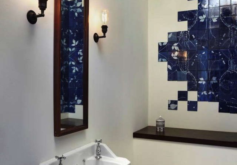
Bedrooms benefit from the calming nature of blue, especially when the art leans airy rather than dense. A pair of simple botanical blueprints above the bed can feel cleaner and more restful than louder abstract art. In bathrooms, the style works best in well-ventilated spaces with inexpensive or well-protected prints. The look is fresh, spa-adjacent, and elegant without sliding into seashell clichés. Nature and blue are already doing enough; no one needs a basket of decorative starfish.
Design Clues: What Makes the Best Botanical Blueprint Art Work
Strong Silhouette
The best pieces have a subject with a memorable outline. Ferns, grasses, wildflowers, seed heads, and branching stems all perform beautifully because they create readable shapes from a distance and rewarding detail up close.
Negative Space
Do not underestimate empty space. A botanical blueprint needs room around the plant form so the image can breathe. Crowding the subject weakens the specimen-like elegance that makes this style special.
Sharp Contrast
The magic is in the crisp relationship between blue and pale form. Whether the print feels vintage or contemporary, strong contrast is what gives the image its quiet authority.
Thoughtful Framing
A thin black frame sharpens the graphic edge. Natural wood warms the image and makes it feel more organic. Brass or gold adds a little museum confidence. White mats amplify the airy, archival quality. The frame should support the illusion that this object deserves closer inspection, because it does.
How to Style Botanical Blueprints Without Making the Room Feel Theme-y
The easiest mistake with botanical decor is overcommitting until the room starts to look like a greenhouse gift shop with excellent lighting. The cure is contrast. Pair botanical blueprints with solid textiles, simple ceramics, textured linen, warm wood, or sculptural lighting. Let the plant imagery be the poetry, not the entire cast list.
Keep the color story disciplined. Because blue is flexible, it works beautifully with white, cream, tan, rust, brass, forest green, soft pink, or charcoal. Choose two or three supporting tones and repeat them subtly through pillows, rugs, trim, or accessories. This creates cohesion without turning the room into a color chart.
Scale matters too. One oversized botanical blueprint can feel modern and bold. A set of smaller pieces can feel archival and collected. A symmetrical pair works for more traditional rooms, while an off-center grouping feels relaxed and current. There are no rigid rules here, but there is one useful test: if the arrangement looks like a scientist and a stylist collaborated without arguing, you are probably on the right track.
Why This Look Works So Well Online and in Real Homes
From an SEO and shopper-intent perspective, botanical blueprint art has an unusual advantage: it satisfies multiple search desires at once. People looking for botanical wall art, blue wall decor, cyanotype prints, vintage nature illustrations, gallery wall ideas, biophilic decor, or even calming bedroom artwork can all land in the same visual territory. That is not accidental. The style lives at the intersection of trend and timelessness.
It also photographs beautifully, which matters on the web. The high contrast reads clearly in thumbnails. The blue pops in social feeds without screaming. The subject matter feels refined and giftable. And because the look is rooted in real visual history rather than short-lived novelty, it gives buyers confidence. It feels like a smart purchase instead of an impulse fling with a trend that will embarrass everyone by next spring.
In actual homes, the style earns its keep because it is adaptable. It can lean coastal, traditional, cottage, academic, minimalist, or eclectic depending on how it is framed and paired. That range makes it easier to publish, sell, and decorate with. A botanical blueprint does not insist on one identity. It simply improves the room, which is a very elegant form of confidence.
Experience: Living With a Botanical Blueprint
There is a particular experience that comes with living near botanical blueprint art, and it is more intimate than people expect. At first, you notice the color. It settles into the room like cool air. Even on a hectic day, that blue has a calming effect. It does not demand attention in the loud way some art does. Instead, it waits. Then, usually while carrying laundry, holding coffee, or pretending to tidy up while actually procrastinating, you look again and begin noticing the details.
A stem that forks unexpectedly. The tiny ribs inside a leaf. The ragged perfection of a petal edge. The way one specimen looks almost mathematical while another feels completely unruly. That is when the art starts acting less like decoration and more like a companion to observation. It changes how you look at the plants outside your home too. You start seeing the structure of ordinary things. Suddenly, the weed near the sidewalk has choreography. The herb in a kitchen glass has architecture. The tree branch against the sky becomes a sketch waiting to happen.
In a workspace, a botanical blueprint can have an especially interesting effect. It feels orderly, but not sterile. It suggests study, but not stress. There is something encouraging about sitting near an image that reminds you that nature is full of systems, patterns, and graceful solutions. It can make a desk feel less like a place of digital chaos and more like a thoughtful station for making things. Even when your browser has forty tabs open and your notes look like a conspiracy board, the fern on the wall remains composed. An icon of stability.
In a bedroom, the experience shifts again. At night, the blue deepens and softens. In morning light, the pale silhouette returns with clarity. The art changes with the day, which gives it a quiet sense of life. Unlike trendier decor that can feel overfamiliar after a month, botanical blueprint imagery rewards repeat viewing. It is simple enough to stay restful, detailed enough to stay interesting, and classic enough to avoid visual fatigue.
Perhaps the most satisfying part is the emotional contradiction it holds. It feels both collected and spontaneous. Historical and fresh. Scholarly and deeply human. It is the visual version of pressing a flower into a book, except more dramatic and much easier to admire from across the room. It reminds us that beauty does not always need excess. Sometimes it just needs sunlight, a plant, a rich field of blue, and the good sense to leave the rest alone.
Conclusion
Design Sleuth has solved the case: botanical moments captured in a blueprint endure because they do several beautiful jobs at once. They celebrate the natural world, borrow authority from scientific observation, and bring the calm, versatile power of blue into the home. They can read vintage or modern, decorative or intellectual, minimal or layered. Most importantly, they make people pause and look closer, which is one of the highest compliments any piece of design can earn.
If you want wall art that feels thoughtful rather than trendy, elegant rather than overworked, and memorable without being noisy, botanical blueprint imagery is a remarkably smart choice. It gives nature a graphic edge and gives rooms a sense of story. Not bad for a leaf on a blue background. Some artworks have a lot to learn from that kind of efficiency.