Table of Contents >> Show >> Hide
Three pictures may not sound like a dramatic design move, but do not let the number fool you. A trio can do a lot of heavy lifting. It can anchor a sofa, wake up a hallway, rescue a boring staircase wall, and make your home look like you know exactly what you are doing, even if you just spent 20 minutes debating whether a hammer counts as cardio.
The good news is that arranging three pictures on a wall is easier than building a giant gallery wall. The even better news is that it still gives you tons of style options. With the right spacing, scale, and layout, three frames can look polished, personal, and intentionally designed instead of “I had these three things and a dream.”
In this guide, you will learn how to arrange three pictures on a wall using nine creative ideas that work in living rooms, bedrooms, entryways, dining rooms, staircases, and home offices. You will also get practical tips on spacing, height, proportion, and frame selection so your wall art looks balanced from the start.
Before You Hang Anything: 5 Smart Rules That Make Every Layout Look Better
1. Treat the three pictures as one visual unit
One of the biggest mistakes people make is hanging each piece separately without considering the group. When you arrange three pictures on a wall, the trio should feel like a single composition. Step back and ask yourself whether the group reads as one shape. If the answer is yes, you are on the right track.
2. Keep the center at eye level
A reliable decorating rule is to place the center of the arrangement around eye level. In most homes, that means the center of the grouped artwork should land roughly 57 to 60 inches from the floor. This keeps the display comfortable to view and stops it from floating awkwardly near the ceiling like it is avoiding commitment.
3. Use consistent spacing
Spacing matters more than people think. If the gap between one frame and the next is too wide, the pictures stop feeling connected. If the gap is too tight, the wall can feel cramped. For most three-picture arrangements, a spacing range of about 2 to 6 inches works well, depending on frame size and wall space. The key is consistency. Uneven gaps are the design equivalent of crooked bangs.
4. Match the layout to the furniture below
If the pictures are going above a sofa, bed, console, or desk, the arrangement should feel proportional to that piece of furniture. A good rule of thumb is for the full grouping to span about one-half to two-thirds of the furniture width. You want the art to relate to the furniture, not look like it accidentally wandered into the wrong room.
5. Plan on the floor first
Before making holes in the wall, lay the frames on the floor and test a few options. You can also use painter’s tape or paper templates to preview the arrangement. This simple step saves time, prevents unnecessary patching, and reduces the chance of standing in the middle of your room whispering, “Why does this look weird?”
How to Arrange Three Pictures on a Wall: 9 Creative Ideas
1. The Classic Horizontal Row
If you want a layout that looks clean, timeless, and hard to mess up, start with a horizontal row. Place the three pictures side by side in a straight line. This is one of the best arrangements for hanging art over a sofa, buffet, bed, or long entry console.
This layout works especially well when the frames are the same size and style. Matching frames create symmetry and make the arrangement feel organized. If you want a calm, modern look, keep the artwork related in color palette, subject, or theme. Black-and-white photography, botanical prints, travel photos, or abstract line art all work beautifully here.
For best results, keep the spacing equal between the frames and make sure the whole trio is centered over the furniture below. This arrangement is ideal if you prefer neat, balanced decor and want your wall to look polished without trying too hard.
2. The Vertical Stack
When you have a narrow wall, a vertical stack is your best friend. Hang one picture above the next, creating a top-to-bottom arrangement that adds height and draws the eye upward. This layout is perfect for small entry walls, corners, narrow hallways, and the awkward slice of wall that seems too skinny for everything except regret.
A vertical trio works well when all three frames are identical, but it can also look great with varying sizes if the pieces share a common visual element. Keep the center line straight so the arrangement feels intentional. If you are styling a staircase wall, this format can be adjusted to follow the incline, which creates movement while still feeling cohesive.
This is also a great choice for people who want a minimalist picture wall idea. It uses limited wall space efficiently while still making an impact.
3. The Center-Large, Sides-Small Layout
Want the arrangement to feel more dynamic? Use one larger picture in the middle and flank it with two smaller pieces. This composition creates a natural focal point and works especially well above furniture. The large center frame grounds the arrangement, while the smaller side pieces add balance.
This layout is useful when you have one statement piece and two supporting prints or photographs. The center image could be a family portrait, a bold abstract print, or a scenic photograph, while the side pieces echo the color palette or subject matter.
To keep the arrangement balanced, align the vertical centers of the three frames or align their bottom edges, depending on the look you want. Center alignment feels more traditional, while bottom alignment can look a bit more modern.
4. The Asymmetrical Cluster
If symmetry feels a little too formal for your taste, go with an asymmetrical cluster. This arrangement still uses three pictures, but instead of lining them up perfectly, you create a loose grouping with varied heights or sizes. The goal is balance, not strict uniformity.
This is one of the best three-picture wall ideas for eclectic, collected, or lived-in spaces. Use different frame sizes or mix vertical and horizontal orientations. For example, you might place one larger portrait-oriented piece slightly off-center, then tuck two smaller pieces around it. The arrangement should still feel compact enough to read as one group.
Asymmetrical does not mean random. Keep the spacing visually consistent, and make sure the overall outer shape feels balanced. Think curated gallery wall, not “the wall won.”
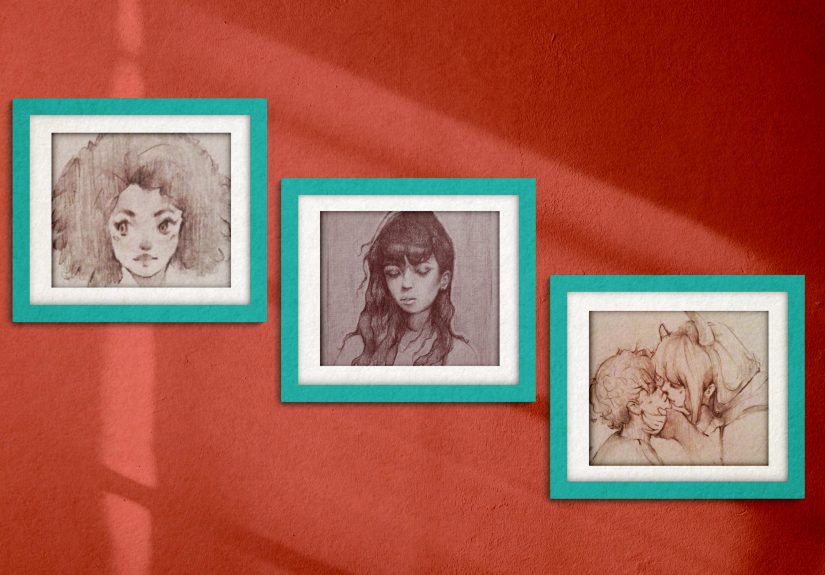
5. The Triptych Look
A triptych is a set of three artworks designed to work together as one image or theme. This layout is perfect if you want a sleek, designer-approved look with built-in cohesion. Three panels of the same landscape, abstract design, or photographic scene can create a strong focal point without feeling busy.
This arrangement works best when the frames are identical and the spacing is tight and even. Hang the panels in a straight row or slight vertical series, depending on the wall shape. A triptych is excellent over beds, dining room buffets, or living room sofas because it looks substantial without needing a dozen pieces.
If you love clean lines and coordinated decor, this may be your winner. It gives maximum visual impact with minimum layout drama.
6. The Staggered Step Layout
The staggered step layout places the three pictures in a gently rising or descending formation. Imagine a staircase pattern with the frames offset diagonally. This idea is perfect for stairwells, hallway walls, and spaces where you want movement rather than strict formality.
You can use matching frames for a crisp look or similar-but-not-identical frames for something more relaxed. To make it work, keep the distance between the pictures consistent and ensure the diagonal line feels intentional. If the wall sits beside an actual staircase, following the angle of the stairs creates harmony and makes the area feel thoughtfully designed.
This arrangement is especially effective with family photos or travel prints because it adds energy and helps the eye move through the space naturally.
7. The Shelf-and-Ledge Style
Technically, the pictures are still on the wall, but instead of hanging each one directly, you can place all three on a picture ledge or narrow wall shelf. This is a fantastic solution if you like flexibility, rent your home, or change your mind more often than your streaming password.
Set the three framed pictures on the ledge with slight overlap or evenly spaced placement. You can keep them uniform for a modern look or mix sizes for a relaxed layered effect. This approach works beautifully in bedrooms, home offices, and casual living spaces.
The major advantage here is freedom. You can swap art, rotate seasonal prints, or adjust the order without putting extra holes in the wall. It is also a smart choice for anyone nervous about precise measuring.
8. The Mixed Orientation Trio
Who says all three pictures need to face the same way? Mixing one horizontal piece with two vertical pieces can create a sophisticated arrangement that feels more custom. For instance, hang a horizontal print in the center with two smaller vertical frames on either side, or place two horizontal frames over one vertical piece below.
This layout works best when the artwork shares a visual connection, such as a common color palette, matching mats, or related subject matter. Mixed orientation arrangements tend to feel more editorial and less cookie-cutter, which is perfect if you want your wall decor to look a little more designer and a little less catalog page 42.
Just remember that variety still needs structure. The arrangement should have a strong visual center and a balanced outer silhouette.
9. The Rule-of-Three Styling Statement
Sometimes the magic is not in the shape of the layout but in the styling story. The rule of three is popular in interior design because odd-numbered groupings often feel more natural and visually interesting. So instead of thinking only about where to place the frames, think about how the trio works together as a set.
You could use three black-and-white city photographs, three vintage-inspired botanical prints, or three abstract pieces in the same color family. You could even tell a story through the sequence, such as sunrise, midday, and sunset landscapes. The arrangement can be horizontal, vertical, or asymmetrical, but the theme ties everything together.
This is one of the easiest ways to make a simple three-picture wall arrangement feel intentional and elevated. The viewer may not consciously notice the theme, but they will feel the harmony.
Best Rooms for a Three-Picture Wall Arrangement
Living room
Go with a horizontal row, a triptych, or a center-large layout above a sofa. These formats feel stable and proportional in larger spaces.
Bedroom
Use a row above the bed, a ledge display, or a soft asymmetrical cluster for a more relaxed look. Calmer color palettes work especially well here.
Entryway
Try a vertical stack or narrow asymmetrical arrangement. Entry walls benefit from art that feels welcoming without overwhelming the space.
Hallway or staircase
Choose a staggered step layout or vertical line to emphasize movement and fit the shape of the wall.
Home office
Picture ledges, mixed orientations, or themed trios work well in offices because they add personality while still looking tidy on camera during video calls.
Common Mistakes to Avoid
Even great art can look off when the layout misses a few basics. Here are the most common mistakes to avoid when arranging three pictures on a wall:
- Hanging the group too high above furniture
- Using wildly inconsistent spacing
- Choosing frames that clash with the room and with each other
- Making the grouping too small for the wall
- Ignoring the relationship between art size and furniture width
- Skipping the floor mockup and guessing on the wall
The easiest fix for nearly all of these issues is to step back often. What looks centered from six inches away can look wildly off from across the room. Your wall deserves the full inspection, not just a close-up panic check.
Extra Experience and Practical Tips From Real-Life Decorating Moments
One of the most useful things people learn after hanging art a few times is that the wall always behaves differently than expected. A layout that looks perfect on the floor can suddenly feel too tight once it is above a sofa. A trio of matching frames may seem polished in the store, then read a little stiff in a cozy family room. That is why experience matters so much when arranging three pictures on a wall. The rules help, but the room always gets a vote.
For example, many people discover that lighting changes everything. Three black frames with white mats may look crisp during the day but feel too stark at night under warm lamps. On the other hand, natural wood frames often soften a wall and make family photos feel more personal. If the room has lots of clean lines and modern furniture, matching frames can look elegant. If the space already has texture and character, slightly varied frames can make the display feel more collected and relaxed.
Another common experience is learning that wall size is only half the story. The surrounding objects matter just as much. A three-picture arrangement above a narrow console table may need tighter spacing to feel connected. Above a wide sectional, the exact same trio might need larger mats, bigger frames, or more breathing room around the edges. People often think the wall is the problem when really the issue is scale in relation to the furniture.
There is also the emotional side of the project, which is more important than design blogs sometimes admit. Hanging three pictures can be surprisingly personal. Maybe the trio includes wedding photos, travel snapshots, or artwork from your children. In that case, the goal is not only to create a balanced arrangement but also to make the display feel meaningful. Some of the best three-picture walls are not perfect in a technical sense. They work because they tell a story. A beach photo, a favorite quote print, and a candid family portrait can feel more powerful together than a perfectly matched set bought all at once.
People also learn through experience that patience pays off. The first arrangement is not always the best arrangement. A lot of homeowners end up rehanging at least one frame after living with the display for a few days. That is normal. Sometimes your eye needs time to adjust before you can tell whether the center frame should be half an inch lower or the spacing should be a little wider. Decorating is part skill and part editing.
And finally, one of the most practical lessons is this: use the right tools. A level, painter’s tape, measuring tape, and paper templates can save you from unnecessary wall repairs and unnecessary mood swings. The polished homes you admire are not magically precise. Someone measured. Probably twice. Possibly while muttering under their breath.
So if you are arranging three pictures on a wall and it does not look perfect on the first try, welcome to the club. The best results usually come from testing, adjusting, stepping back, and trusting both the guidelines and your own eye. The goal is not a museum wall. The goal is a home that feels thoughtful, stylish, and unmistakably yours.
Conclusion
If you want a decorating idea that is simple, versatile, and surprisingly impactful, a three-picture wall arrangement is hard to beat. Whether you choose a classic horizontal row, a narrow vertical stack, a bold asymmetrical cluster, or a polished triptych, the right trio can transform a blank wall into a focal point. Focus on proportion, keep spacing consistent, and let the three pictures work as one composition. Do that, and your wall will look less like an afterthought and more like a design decision worth bragging about.