Table of Contents >> Show >> Hide
- What “Vector” Actually Means (And Why Illustrator Loves It)
- Before You Start: Pick Your Vector “Recipe”
- 12 Steps to Create Vectors in Adobe Illustrator
- Step 1: Define the final use (logo, icon, print, web) before you draw
- Step 2: Create a new document with the right color mode and size
- Step 3: Turn on smart guides and set up an efficient workspace
- Step 4: Bring in a reference image (optional) and lock it
- Step 5: Choose your starting method: shapes first or Pen Tool first
- Step 6: Build clean base forms with shape tools
- Step 7: Draw precise paths using the Pen Tool (the “anchor point economy” rule)
- Step 8: Refine curves and corners with Direct Selection and anchor controls
- Step 9: Clean up paths with Simplify and smoothing techniques
- Step 10: Combine and carve shapes with Pathfinder and Shape Builder
- Step 11: Vectorize a raster image using Image Trace (when it makes sense)
- Step 12: Organize, finalize, and export your vector the right way
- Common Vector Mistakes (And How to Fix Them)
- Mini Case Study: Turning a Hand-Drawn Icon Into a Clean Vector
- Real-World Experiences and Tips From Vector Work (500+ Words)
- Wrap-Up
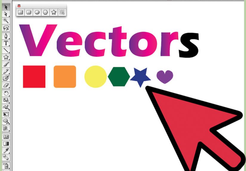
Vectors are the superheroes of the design world: they can stretch, shrink, and show up on everything from a tiny app icon to a billboard without turning into a crunchy pixel casserole.
If you’ve ever zoomed in on a logo and watched it stay crisp instead of dissolving into square confettiyep, that’s vector magic.
In this guide, you’ll learn how to create vectors in Adobe Illustrator using a practical, modern workflow (with just enough humor to keep the Pen Tool from bullying you).
What “Vector” Actually Means (And Why Illustrator Loves It)
A vector graphic is built from pathsmathematical lines and curves controlled by anchor points and handles. Unlike raster images (JPEGs, PNGs) that store pixels, vectors store instructions.
That’s why vector artwork scales cleanly, edits beautifully, and exports into formats like SVG and PDF without losing sharpness.
Illustrator is built specifically for this: drawing, editing, combining, and exporting paths is basically its entire personality.
Before You Start: Pick Your Vector “Recipe”
There are three common ways to create vector art in Illustrator:
(1) draw with the Pen/Curvature tools (best for precision),
(2) build with shapes + Pathfinder/Shape Builder (best for icons and geometric work),
and (3) convert a raster image using Image Trace (best for turning sketches/logos into editable pathswhen used carefully).
Most real projects use a mix of all three.
12 Steps to Create Vectors in Adobe Illustrator
-
Step 1: Define the final use (logo, icon, print, web) before you draw
This step saves you from “surprise rework” later. A logo needs clean shapes and minimal points. A t-shirt graphic may need thicker strokes and simplified details.
An SVG icon should stay readable at 24–48px. Decide where the vector will live, then design accordingly. -
Step 2: Create a new document with the right color mode and size
Start with File → New. If your vector is for screens, use RGB. If it’s primarily for print, consider CMYK.
Choose artboard size based on your target output (for example: 1000×1000 px for an icon set master, or a standard print size for posters).
Don’t obsess over perfection herevectors scalebut do set a sensible workspace. -
Step 3: Turn on smart guides and set up an efficient workspace
Go to View → Smart Guides so Illustrator helps you snap, align, and avoid tiny gaps that will haunt you later.
Open panels you’ll use a lot: Layers, Pathfinder, Align, and (if tracing) Image Trace.
Think of this like setting up your kitchen before cookingyou can technically chop onions in the dark, but it’s not ideal. -
Step 4: Bring in a reference image (optional) and lock it
If you’re vectorizing a sketch or photo reference, place it via File → Place. Then reduce opacity (around 20–50%) and lock that layer.
Name the layer something obvious like “REFERENCEDO NOT TOUCH” so Future You doesn’t accidentally drag it across the artboard and blame Illustrator. -
Step 5: Choose your starting method: shapes first or Pen Tool first
If your design is geometric (icons, badges, UI elements), start with shape tools (Rectangle, Ellipse, Polygon) and build up.
If your design is organic (illustrations, lettering, custom silhouettes), start with the Pen Tool (P) or Curvature Tool.
The trick is not “one tool to rule them all,” but “the right tool so you don’t suffer unnecessarily.” -
Step 6: Build clean base forms with shape tools
Use simple shapes as building blocks. Hold Shift to constrain circles/squares.
Duplicate shapes with Alt/Option + drag. Use the Align panel to line things up cleanly.
This approach is fast, editable, and perfect for creating consistent icon families (same corner radius, same stroke weight, same alignment logic).Example: For a “location pin” icon, start with a circle + a rounded triangle-like shape, align them, then merge into one clean silhouette.
-
Step 7: Draw precise paths using the Pen Tool (the “anchor point economy” rule)
With the Pen Tool, click to create corner points and click-drag to create smooth curves with direction handles.
The #1 rule for beautiful vectors: use fewer anchor points. More points usually means wobblier curves and harder edits.
Place points at curve “extremes” (top/bottom/left/right of a curve) and let handles do the work.If you feel like you’re placing an anchor point every two pixels, pause. You’re not drawing; you’re making a tiny path-point centipede.
-
Step 8: Refine curves and corners with Direct Selection and anchor controls
Use Direct Selection (A) to select and move anchor points, adjust handles, and fix lumps.
Convert points between corner and smooth when needed (corner points for sharp turns, smooth points for flowing curves).
Zoom in to edit, then zoom out to judge the overall shapebecause a curve can look perfect at 6400% and still feel weird at normal size. -
Step 9: Clean up paths with Simplify and smoothing techniques
If your path has too many points (often happens after tracing or freehand drawing), use Object → Path → Simplify.
This can reduce anchor points while preserving the overall shape. Be gentle: the goal is clean curves, not accidental modern art.
For small wobbles, smoothing tools and careful handle adjustment can help make your vector look intentional rather than “drawn on a bumpy bus.” -
Step 10: Combine and carve shapes with Pathfinder and Shape Builder
This is where vectors become fun LEGO projects. Use Pathfinder operations like Unite, Minus Front, Intersect, and Exclude to build complex shapes from simple ones.
Or use the Shape Builder Tool (Shift+M) to merge and subtract by dragging across selected shapes (hold Alt/Option to subtract).Example: To create a “camera” icon, combine a rounded rectangle body + a lens circle, then subtract a smaller circle to create the lens hole.
One minute you have boring shapes; the next minute you have a functional icon. It’s oddly satisfying. -
Step 11: Vectorize a raster image using Image Trace (when it makes sense)
Image Trace is powerful, but it’s not a “one-click perfection” buttonmore like a “one-click starting point” button.
Select a placed image, open Window → Image Trace, choose a preset (like Black and White Logo or High Fidelity Photo), then tweak settings.
After you like the preview, use Expand to turn the trace into editable paths.Pro tip: if you’re tracing a logo or line art, simplify afterward and delete unnecessary shapes. If you’re tracing a photo, be prepared for lots of points and consider manual redraw for a cleaner final.
-
Step 12: Organize, finalize, and export your vector the right way
Group related objects, name layers, and consider using global swatches for easy color changes.
Then export based on your destination:
SVG for web and UI,
PDF for print and sharing,
and AI to preserve your fully editable master.
For multiple artboards or assets, Export for Screens can batch output formats like SVG and PDF efficiently.
Common Vector Mistakes (And How to Fix Them)
Too many anchor points
Symptom: curves look bumpy, editing takes forever, and selecting anything feels like trying to pet a porcupine.
Fix: simplify paths, redraw with fewer points, and place anchors at curve extremes. Clean vectors are usually simpler than they look.
Unexpanded traces that won’t edit properly
Symptom: you adjust Image Trace settings, but can’t edit individual shapes.
Fix: once you’re satisfied with the trace, use Expand to convert the result into editable paths, then ungroup and refine.
Strokes that don’t behave in exports
Symptom: a stroke looks fine in Illustrator but changes when exported or scaled.
Fix: decide whether the stroke should remain a stroke (more editable) or become a shape (more predictable).
When needed, convert strokes to outlines before final exportespecially for print workflows or certain SVG use cases.
Mini Case Study: Turning a Hand-Drawn Icon Into a Clean Vector
Let’s say you sketched a simple “coffee cup” icon on paper. A fast, clean workflow looks like this:
place the photo of your sketch, lock it, trace the main silhouette with a few deliberate Pen Tool points, build consistent curves with handles,
then use Shape Builder to cut out the cup opening. Finally, simplify tiny wobbles, align the handle shape, and apply a consistent stroke or fill.
The result looks professional because it’s controllednot because it was complicated.
Real-World Experiences and Tips From Vector Work (500+ Words)
Here’s the part nobody tells you when you first learn how to create vectors in Adobe Illustrator: the tools are easy, but your taste develops slower.
The Pen Tool doesn’t become “easy” because you memorized shortcuts. It becomes easier because you start seeing shapes differentlylike a designer, not a tracer.
In practice, many beginners try to draw a curve the way they would with a pencil: lots of tiny corrections, tons of anchor points, and frequent zooming to 10,000%.
The funny thing is that professional-looking vector curves usually come from doing the opposite: fewer points, longer handles, and calmer decisions.
One common real-world moment: you trace something and it technically matches the reference, but it still looks… off.
That’s usually because vectors aren’t judged by “accuracy” alonethey’re judged by rhythm and geometry.
For example, a circular logo that’s perfectly traced from a low-resolution image can still look lumpy because the source image was lumpy.
In those cases, the best “experience-based” move is to stop tracing and start rebuilding:
replace “almost-circles” with real circles, replace wobbly symmetry with aligned shapes, and redraw curves using anchor points at extremes.
It can feel like cheating, but it’s actually the point of vector design: you’re creating a clean, scalable interpretation, not a photocopy.
Another experience you’ll probably have: Image Trace gives you something usable in 30 seconds… and then you spend 30 minutes cleaning it.
That’s normal. Image Trace is best treated like a rough assistant who works fast but leaves crumbs everywhere.
The smartest approach is to trace with the simplest settings that still capture your intent (especially for logos and line art),
then immediately clean the result: expand, ungroup, delete tiny artifacts, simplify paths, and rebuild key shapes manually.
If you’re making an icon set or brand mark, it’s often faster (and cleaner) to use Image Trace only as a guide and redraw with the Pen Tool.
If you’re converting a detailed illustration, Image Trace might be worth itbut you still want to reduce points and unify shapes so editing stays manageable.
A very practical tip that comes from doing vector work repeatedly: build from big to small.
Start with the largest forms first (silhouette, major shapes), then add secondary details (cut-ins, interior shapes), then refine micro details (small corners, tiny highlights).
This prevents you from polishing a detail that later gets deleted because the overall proportions changed.
It also helps you keep style consistentespecially when you’re creating multiple assets like social icons, badge variations, or a family of product pictograms.
Finally, exporting is its own mini skill. In the real world, vectors aren’t finished when they “look good” in Illustratorthey’re finished when they behave correctly wherever they go.
SVGs should scale and render cleanly in browsers. Print PDFs should preserve vector shapes and color intent.
If you’re collaborating with other designers, keeping an organized AI master file (clean layers, named groups, consistent swatches) is a gift to everyoneincluding Future You.
The best vector artists aren’t just good at drawing paths; they’re good at creating files that survive deadlines, handoffs, edits, and “Can we make the logo 12% friendlier?” requests.
(No, you can’t measure friendliness in percentages, but you can absolutely pretend you can.)
Wrap-Up
Creating vectors in Adobe Illustrator is a blend of technique and judgment: set up your file, choose the right tools, draw with fewer points, refine curves,
combine shapes cleanly, and export with purpose. Once you practice the workflow a few times, you’ll start building vector artwork fasterand with far less “why is this curve doing that” energy.