Table of Contents >> Show >> Hide
- Why the Images Hit So Hard
- What the Satellites Actually Revealed
- How Big Was the Disaster, Really?
- Why Black Summer Became So Severe
- Why Satellite Photos Were So Important
- The Smoke Was Not Just a Side Effect
- Wildlife and Forests Paid a Terrible Price
- The Human Experience Behind the Pixels
- Final Takeaway
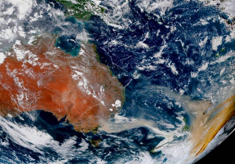
Satellite images have a rude habit of ending arguments. They do not care about spin, optimism, or that one guy online insisting everything is “totally normal.” When the Australian bushfires of 2019–2020 exploded across the landscape, the pictures from space did more than look dramatic. They exposed the scale of the disaster in a way ground-level photos never could. From orbit, the fires were no longer isolated emergencies. They were a continent-sized crisis, complete with glowing fire fronts, enormous smoke plumes, blackened forest scars, and atmospheric effects that stretched far beyond Australia.
That fire season, often called Black Summer, became one of the most devastating in Australia’s history. Satellite photos helped the world understand just how far the blazes spread, how quickly conditions worsened, and why the environmental damage could not be shrugged off as “just another fire season.” NASA imagery showed smoke streaming off southeastern Australia like a giant smear across the ocean. USGS Landsat images highlighted how fires near New South Wales ballooned from smaller burn zones into sprawling scars. Later analyses from NASA, NOAA, and other research groups revealed that the smoke did not simply drift away. It rose into the stratosphere, circled the globe, and lingered long enough to affect climate, air quality, and even ozone chemistry.
In other words, the satellite photos were not shocking because they were pretty. They were shocking because they were accurate.
Why the Images Hit So Hard
There is something uniquely unsettling about seeing disaster from space. A house fire is tragic. A neighborhood fire is catastrophic. But a satellite image showing smoke stretching over oceans and burn scars eating through forest after forest lands differently. It tells your brain, in one brutal glance, that this is no local story.
During the worst weeks of the crisis, satellite views captured thick tan and gray smoke over southeastern Australia, with bright white pyrocumulonimbus clouds bubbling above some fire zones. That sounds technical, but the visual message was plain enough: the fires were so intense they were making their own weather. If your wildfire has graduated from “bad” to “meteorologically ambitious,” things are not going well.
These images also solved a visibility problem. On the ground, smoke can hide what is happening. Roads close. Power fails. Communities evacuate. But satellites keep watching. They can detect heat signatures, trace smoke transport, compare before-and-after burn scars, and show how fires merge into larger monsters. In a crisis packed with emotion, satellite photos added hard evidence. They turned scattered reports into one undeniable picture.
What the Satellites Actually Revealed
1. The fires were widespread, not isolated
One of the most important revelations from satellite coverage was that the bushfires were not a handful of separate blazes making headlines for a few dramatic days. They formed a broad and persistent emergency across large parts of southeastern Australia. Heat-detection systems used by NASA picked up more than 1 million fire detections across the country between September 1, 2019, and January 8, 2020. That figure does not mean 1 million separate infernos, but it does show extraordinary fire activity on a staggering scale.
Meanwhile, Landsat imagery highlighted how fires near Sydney and across New South Wales spread rapidly over large areas. False-color images made the growth easier to track by showing burn zones and active fire edges more clearly than natural-color photography could. In plain English: the satellites were showing that the fire map was getting uglier fast.
2. The smoke plume became a global story
Some of the most haunting images from the crisis did not show flames at all. They showed smoke. NASA’s Earth Observatory captured major plumes blowing off Australia’s southeastern coast, while later NASA summaries explained that smoke from the fires circled the globe before returning to Australian skies. The visual was surreal: a regional wildfire event acting like a planetary atmospheric experiment nobody asked for.
Reports from U.S. news outlets described smoke drifting over New Zealand, where skies turned eerie shades of orange and even snowfields were stained brown. From a search-engine thumbnail, that may sound almost cinematic. In real life, it was a grim reminder that wildfire smoke does not respect coastlines, passports, or anyone’s vacation plans.
3. The fires reached extraordinary intensity
Satellite and atmospheric observations later showed that smoke from the fires rose to remarkable heights. NASA described smoke plumes reaching about 18 miles, or 30 kilometers, into the atmosphere, while other NASA and Scientific American reporting on the event described fire-driven storms punching smoke into the stratosphere. NOAA researchers later estimated that approximately 0.9 teragrams of smoke were injected there, the largest amount observed in the satellite era.
This matters because smoke in the stratosphere behaves differently from smoke lower in the atmosphere. It can persist longer, travel farther, and alter atmospheric chemistry. Once a wildfire starts behaving a little like a volcanic eruption, scientists stop using words like “routine.”
How Big Was the Disaster, Really?
Big numbers can blur together, so here is the plainspoken version: the damage was enormous, and then somehow it got bigger.
Early in January 2020, major U.S. coverage was already describing around 14.5 million acres burned. Later summaries put the broader season’s total near 17 million hectares, or roughly 42 million acres. At least 33 people died over the course of the disaster, thousands of homes were destroyed, and wildlife losses reached horrifying levels. NASA later cited an estimate that 3 billion animals were killed or displaced. That number is not a dramatic flourish. It is the kind of figure that makes you stop reading for a second and stare at the wall.
And the fire behavior was not limited to landscapes that normally burn. AP reporting highlighted the alarming fact that even rainforests and peat swamps caught fire in some areas, raising fears of long-term ecological change. That detail matters because it suggests the disaster was not just larger than usual. In some ecosystems, it was outside the script entirely.
Why Black Summer Became So Severe
Disasters this large rarely have one cause. The Australian bushfires were driven by an ugly combination of prolonged drought, extreme heat, dry vegetation, wind, and lightning. Satellite images did not create that story, but they helped verify it. They showed where the fires were spreading, how intensely they were burning, and how conditions on the ground translated into continental-scale consequences.
Scientific American summarized research suggesting climate change made this sort of extreme fire season at least 30 percent more likely in southeastern Australia. NASA later reported that the fires burned more than 20 percent of the Australian temperate forest biome. National Geographic also pointed to increasingly dangerous wildfire conditions in a warming world and explained how firestorms, including pyrocumulonimbus events, can create a nasty feedback loop by generating extreme local weather that helps fires intensify.
So yes, drought mattered. Heat mattered. Winds mattered. But the larger climate backdrop matters too. When the landscape is hotter and drier for longer, a spark does not need much encouragement. It gets a standing ovation from the environment.
Why Satellite Photos Were So Important
It is easy to think of satellite imagery as dramatic wallpaper for news stories, but it did real work during the bushfire crisis.
Emergency awareness
Satellites helped officials and scientists track active fire zones, identify hotspot clusters, and monitor the spread of smoke. That is especially useful in rugged or remote terrain where ground observations are limited.
Before-and-after comparisons
USGS imagery helped reveal just how quickly the fires expanded and how much land they consumed. Comparing scenes across days or weeks turned abstraction into evidence. A green landscape becomes a dark scar, and suddenly no one needs a long speech about the scale of damage.
Atmospheric tracking
NASA, NOAA, and related research teams used satellite observations to examine how high the smoke rose, where it traveled, and how long it persisted. This became crucial for understanding health effects, climate impacts, and the unusual chemistry that followed in the upper atmosphere.
Ecological assessment
Remote sensing also helped researchers estimate broader environmental damage, from forest loss to marine impacts. NASA later reported that iron-rich aerosols from the fires helped trigger huge phytoplankton blooms in parts of the South Pacific and Southern Ocean. That does not make the story less tragic; it just shows how far the consequences traveled.
The Smoke Was Not Just a Side Effect
In many wildfire stories, smoke is treated like the annoying cousin of the fire itself. During Black Summer, smoke was a second disaster. It choked cities, disrupted travel and outdoor events, reduced visibility, and created serious health risks. Scientific American reported that smoke from the bushfires killed hundreds of people and sent thousands to hospitals and emergency rooms. CBS coverage during the season noted dangerous PM2.5 pollution levels and widespread air-quality problems.
Then the smoke climbed. NOAA later found that the fires injected roughly 1 million tons of smoke into the stratosphere. NASA and Smithsonian reporting described how those towering smoke plumes set records or approached the upper extreme of what scientists had observed from fires. Later research summarized in Smithsonian Magazine found that smoke from the Australian bushfires even contributed to measurable ozone depletion over parts of the Southern Hemisphere.
That is a stunning sentence to write about a wildfire: it was bad enough to leave fingerprints on the atmosphere.
Wildlife and Forests Paid a Terrible Price
The emotional center of the bushfire story was often wildlife, and for good reason. Koalas, kangaroos, wallabies, birds, reptiles, and countless less famous species were caught in fires that moved fast and burned hot across huge areas. Scientific American reported early estimates of more than 800 million animals affected in New South Wales alone. Later summaries placed the nationwide toll far higher, with about 3 billion animals killed or displaced.
That number is not only about death in the flames. It also reflects habitat loss, injury, starvation, and the long aftermath that follows when food sources vanish and ecosystems fragment. AP reporting warned that some forests may take decades or even centuries to recover, while some experts doubted whether intervention could fully restore landscapes that were never expected to burn this way in the first place.
Satellite photos helped tell this part of the story too. Burn scars are not just dark shapes on a map. They are lost habitat. They are interrupted migration routes. They are nesting grounds, food webs, and shelter reduced to ash. From orbit, the images looked silent. On the ground, that silence meant something had disappeared.
The Human Experience Behind the Pixels
Satellite photos can make disasters look distant, but Black Summer was painfully personal for the people inside those images. One reason the Australian bushfires hit so hard around the world is that viewers were constantly switching between two scales of reality. On one screen, there was a continent draped in smoke. On the next, there were families huddled on beaches, firefighters working under orange skies, and communities staring at roads that had become walls of flame. The satellite view gave the crisis size. Human stories gave it a pulse.
Take the now-famous scenes from Mallacoota, where thousands of people sought refuge near the water as fire closed in. From the ground, the experience sounded apocalyptic: darkness in daylight, ash falling through the air, the roar of wind and flame, and the awful uncertainty of waiting to see whether the fire would move past or swallow everything. From space, the same event looked like vast smoke plumes pouring over the coast. Put those perspectives together and the scale becomes emotionally legible. This was not just a “weather event.” It was people standing at the edge of the ocean because there was nowhere else left to go.
Then there was the strange, unsettling experience of distance. People in New Zealand looked up and saw orange skies caused by smoke that had crossed the Tasman Sea. Snowfields turned brown. Sunlight looked wrong. The atmosphere itself seemed off-kilter, like someone had quietly adjusted reality while nobody was looking. That experience matters because it showed how wildfire can spread fear without flames. You do not have to be inside the burn zone to feel the disaster pressing in on daily life.
Even for people far from Australia, the satellite images created a powerful emotional loop. You could watch the plume snake across the ocean, circle the globe, and return. That turned a national emergency into a shared planetary moment. It also changed the way many people understood climate risk. Fires were no longer just local tragedies that showed up on the nightly news. They were visible from orbit, measurable in the upper atmosphere, and impossible to dismiss as isolated bad luck.
Researchers, firefighters, meteorologists, and everyday observers also experienced the event through technology in a deeply modern way. People refreshed fire maps, smoke trackers, and satellite loops the way earlier generations might have refreshed radio bulletins. Watching the imagery update became a form of anxious witnessing. Every new frame could bring relief or dread: a plume thinning, a hotspot growing, a fire front merging, a burn scar widening. It was disaster in real time, narrated by pixels and infrared data.
That may be why the bushfire images remain so memorable years later. They did more than document destruction. They changed how the disaster was felt. They made the crisis visible at every scale, from a single fire edge to the whole hemisphere. They allowed people to grasp, almost instantly, that this was not an ordinary season and not a story that would end when the last flames went out. The smoke lingered. The ecological losses lingered. The lesson lingered too: when satellite photos look shocking, it is often because the planet is trying very hard to get our attention.
Final Takeaway
The Australian bushfires were catastrophic on the ground, but it was the view from space that made their true extent impossible to ignore. Satellite photos revealed a sprawling, high-intensity disaster with global consequences: millions of acres burned, smoke lofted into the stratosphere, wildlife devastated, forests transformed, and atmospheric impacts that stretched far beyond Australia’s borders.
What made those images so powerful was not just their scale. It was their honesty. They showed that the crisis was larger, stranger, and more connected to the wider climate system than many people first realized. In the end, the most shocking thing about the satellite photos was not their drama. It was that they were simply showing us what was really there.