Table of Contents >> Show >> Hide
- What “Rigorous Simplicity” Actually Means (and Why It Feels So Good)
- The Original Look, Decoded: The “Ingredients” That Make It Tsao & McKown
- 1) The Matte Oak Table: Warmth Without Shine
- 2) The Glossy Sideboard: A Quiet Room’s One Excellent Plot Twist
- 3) Wicker/Woven Chairs: Texture That Softens All the Straight Lines
- 4) The Pendant Light: A Soft Halo Over the Table
- 5) The Railway Clock: Graphic, Iconic, and Slightly Nerdy (In a Good Way)
- How to Steal the Look in Real Life: A Step-by-Step Plan
- Step 1: Start With a Tight Palette (Then Add Texture, Not Color Chaos)
- Step 2: Choose the Table First (Yes, Before Chairs)
- Step 3: Add the “Plot Twist” Storage Piece
- Step 4: Bring In Woven Chairs (Comfort Still Matters)
- Step 5: Hang the Pendant Like a Pro (Not Like a Guess)
- Step 6: Finish With One Graphic Wall Moment (Clock, Art, or Both)
- Measurements and Layout: The “Calm” Comes From Flow
- Budget-Friendly Ways to Nail the Tsao & McKown Vibe
- Common Mistakes That Break the Look (and Easy Fixes)
- Mini FAQ: Steal This Look in Different Homes
- Conclusion: The Real Secret Is the Contrast (Not the Shopping List)
- Real-World Experiences: What It’s Like to Live With This Look (and What People Learn Fast)
- The Matte Table Becomes the Most-Used Surface in the House
- The Glossy Sideboard Is Gorgeous… and Also a Fingerprint Magnet
- Woven Chairs Are the “Soft Landing” Guests Remember
- The Pendant Height Gets Adjusted More Often Than Anyone Admits
- The Biggest Surprise: Editing Is the Hard Part (But Also the Most Rewarding)
Some dining rooms whisper, “We occasionally eat here.” The Tsao & McKown dining room featured by Remodelista
calmly replies, “We eat here and we have our life together.” It’s rigorous without being cold, minimal
without feeling like a waiting room, and so simple it almost dares you to overcomplicate it.
In this deep-dive, we’ll break down what makes the look work (spoiler: it’s not just “buy an oak table”),
then rebuild it with practical swaps, measurement-friendly guidelines, and styling rules you can follow
even if your household includes kids, pets, roommates, or that one friend who “gestures” while holding red wine.
What “Rigorous Simplicity” Actually Means (and Why It Feels So Good)
The Remodelista feature calls out the “rigorous simplicity” of the rooman apt phrase that sounds like a design
philosophy and a Pilates class. Here’s what it means in plain American English: every object earns its spot.
The room isn’t empty; it’s edited.
The magic isn’t one hero pieceit’s a disciplined set of contrasts:
matte vs. glossy, warm wood vs. crisp restraint, and
smooth planes vs. woven texture. You get visual calm, but your eye still has something to do.
That balance is why the space reads as modern and inviting instead of sparse and stern.
The Original Look, Decoded: The “Ingredients” That Make It Tsao & McKown
1) The Matte Oak Table: Warmth Without Shine
At the center is a matte-finished oak tablecustom-made in the original roomwhich sets the tone: natural,
tactile, unfussy. A matte wood surface absorbs light instead of bouncing it around, so the room feels grounded.
It’s the design version of speaking softly but carrying a big stick (a wooden stick, obviously).
Steal it: Look for an oak (or oak-look veneer) table with clean edges, minimal apron detail,
and a finish described as “matte,” “low-sheen,” or “oiled.” If the table is glossy, you’ll lose that calm,
velvety effect that makes the room feel modern instead of “showroom.”
2) The Glossy Sideboard: A Quiet Room’s One Excellent Plot Twist
The original sideboard is a custom piece made by laminating a photograph and sealing it under layers of resin.
Translation: the storage is functional, but the surface is art. This is the room’s “moment”a single bold move
that keeps minimalism from getting boring.
Steal it: Aim for a credenza/sideboard with a high-gloss finish, a lacquered surface, or a
graphic front (photo-laminated, patterned veneer, or even large-scale artwork mounted above a simpler cabinet).
If you can’t find photo-resin magic, you can still chase the same effect: one reflective, statement surface
that contrasts the matte table.
3) Wicker/Woven Chairs: Texture That Softens All the Straight Lines
The featured chairs are from Lloyd Loomwoven texture with a tailored silhouette. Woven seating is the genius
“third thing” in the room: not as hard-edged as wood, not as plush as upholstery. It adds depth without adding
visual noise.
Steal it: Rattan, cane, wicker, or woven-back chairs work best when the shape is clean:
simple legs, quiet curves, and no overly ornate details. If your chairs start looking like a boho peacock
convention, the room stops feeling rigorous.
4) The Pendant Light: A Soft Halo Over the Table
The pendant in the original “look-for-less” lineup is a linen-shaded stylewarm, diffused light, no harsh glare.
In a restrained dining room, lighting is more than illumination: it’s atmosphere control.
Steal it: Choose a pendant with a fabric, paper, or softly diffusing shade. If you go with
exposed bulbs or clear glass, you’ll need perfect bulb choice and dimming, or the vibe will shift from “serene”
to “interrogation chic.”
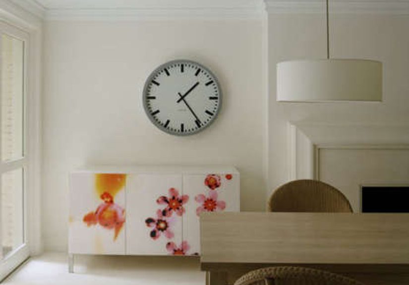
5) The Railway Clock: Graphic, Iconic, and Slightly Nerdy (In a Good Way)
A Swiss railway-style clock is a classic modernist flourish: crisp face, bold hands, instantly readable.
It’s functional wall artclean enough for minimalism, iconic enough to feel intentional.
Steal it: Look for a clock with a high-contrast face and simple typography. The goal is “graphic
punctuation,” not “grandma’s antique shop treasure hunt.”
How to Steal the Look in Real Life: A Step-by-Step Plan
Step 1: Start With a Tight Palette (Then Add Texture, Not Color Chaos)
This look thrives on restraint. Keep your large surfaces calm: light walls (or a soft neutral), simple window
treatments, minimal clutter. Then layer interest through materialoak grain, woven chairs,
linen shade, glossy cabinet finish.
If you love color, use it the way this room uses gloss: as a controlled accent (artwork, a single vase, a runner),
not a full choir of competing voices.
Step 2: Choose the Table First (Yes, Before Chairs)
In the Tsao & McKown-inspired setup, the table is the anchor. A matte wood table is forgiving, timeless,
and pairs easily with mixed seating. If you’re deciding between a trendy base and a classic top, pick the classic.
You’ll thank yourself in five years when your “statement base” feels like it belongs in a themed restaurant.
- Best shapes for the look: rectangle or simple oval
- Best finishes: matte, oiled, low-sheen
- Best vibe: clean edges, minimal detailing
Step 3: Add the “Plot Twist” Storage Piece
A dining room sideboard (or credenza) is both a practical workhorse and your best chance at controlled drama.
Use it to stash linens, serving pieces, candles, and the random items that otherwise live on your table like
squatters.
For this particular look, pick a piece that clearly contrasts the table:
- If your table is matte wood: go glossy, lacquered, or graphic on the sideboard
- If your table is light oak: a darker or high-contrast cabinet can feel intentional
- If your room is small: a low credenza keeps sightlines open and feels modern
Step 4: Bring In Woven Chairs (Comfort Still Matters)
Woven chairs add warmth without bulk. The trick is choosing chairs that don’t visually fight the table.
Keep the lines simple, then let texture do the talking.
Practical tip: if you want people to linger, consider seat cushions in a neutral fabric. “Rigorous simplicity”
doesn’t require uncomfortable dinner parties. (Your guests should remember your food, not your chair’s vendetta.)
Step 5: Hang the Pendant Like a Pro (Not Like a Guess)
A helpful starting point for most dining pendants is hanging the bottom of the fixture roughly
30–36 inches above the tabletop, adjusting upward for taller ceilings and for taller people who
would like to see each other’s faces at dinner.
Choose a shade that diffuses light (linen, paper, opaque glass) and put it on a dimmer. This room’s calm depends
on soft light. Overhead glare is the enemy of “serene modern.”
Step 6: Finish With One Graphic Wall Moment (Clock, Art, or Both)
The railway clock works because it’s bold but not busy. You can replicate the effect with:
- a high-contrast clock
- one oversized piece of art above the sideboard
- a simple grid of two or three frames (kept consistent)
If you’re styling the top of the credenza, use the “odd numbers” idea: group objects in threes (or other odd
counts) for a natural, dynamic feelespecially when your room is otherwise very linear.
Measurements and Layout: The “Calm” Comes From Flow
Minimal rooms can feel tense if the layout is tight. Give the furniture room to breathe so the simplicity reads
as confident, not cramped.
Rug Rules That Save Dinner Parties
If you use a rug, size it so chairs stay on the rug even when pulled out. A solid rule of thumb is adding
about 24 inches on all sides beyond the table footprint. This prevents chair legs from catching
the rug edge and turning your gathering into an accidental slapstick routine.
Choose a low-pile or flatweave rug for easier cleanup (because life happens, and spaghetti has no respect
for your aesthetic).
Traffic Flow Check
Walk the space as if you’re carrying a serving platter. If you’re squeezing sideways like you’re sneaking past
someone in a movie theater row, rethink the scale: slimmer chairs, a narrower table, or a bench on one side can
preserve the look while improving movement.
Budget-Friendly Ways to Nail the Tsao & McKown Vibe
Remodelista’s original “recreate for less” list captured the spirit: a clean-lined veneer table, an affordable
rattan chair, a simple linen-shade pendant, and an iconic clock. You can apply the same strategy today by
shopping for categories rather than exact SKUs.
Where to Spend vs. Where to Save
-
Spend: the table (it’s the anchor and takes daily wear), and comfortable seating (your back is
not a disposable accessory). -
Save: the pendant (many affordable options look high-end with the right bulb + dimmer),
and the “graphic moment” (a clock or art can be found at many price points). - Strategic splurge: the sideboard if it doubles as your storage solution and style statement.
Quick Styling Wins That Keep the Room “Rigorous,” Not Random
- Clear the table when not in useone centerpiece max (a bowl, a branch, or candles).
- Repeat materials: if you have wicker chairs, echo that texture in a basket or pendant.
- Limit small decor: minimal rooms hate tiny clutter like cats hate closed doors.
- Use dimmers: the fastest way to make the room feel expensive and intentional.
Common Mistakes That Break the Look (and Easy Fixes)
Mistake: Everything Is Matte
Matte is beautifulbut if every surface is low-sheen, the room can look flat. The glossy sideboard in the
original room proves the point: you need at least one reflective element (gloss, glass, polished metal, or a
framed piece with sheen).
Mistake: The Chairs Don’t “Belong” to the Table
Mixed seating is great, but keep a unifier: consistent color temperature (warm woods together), consistent
silhouette (simple legs), or consistent texture (woven backs). If each chair feels like it came from a different
decade and a different mood, the room stops reading as edited.
Mistake: Pendant Hung Too High or Too Low
Too high and it feels disconnected; too low and you’ll be staring at a shade during conversation. Use the
tabletop-to-fixture guideline as a starting point, then adjust based on your ceiling height, fixture size, and
how the room feels when you sit down.
Mini FAQ: Steal This Look in Different Homes
Can I do this in a small dining nook?
Yesgo smaller in table scale, keep the pendant as your statement, and choose a low credenza (or even a slim
console) to maintain open sightlines. The look loves compact spaces because editing is easier when you simply
have fewer places to pile stuff.
What if I have kids/pets and fear a glossy sideboard?
Embrace a glossy surface that’s resilient (many lacquered finishes wipe clean), or do the “graphic moment” as
wall art above a simpler cabinet. You’ll keep the contrast without inviting fingerprint museums.
Do I need matching chairs?
Not at all. In fact, a restrained mixlike woven chairs on the sides and two slightly different end chairscan
look more curated than a full matching set. Just keep the silhouettes calm.
Conclusion: The Real Secret Is the Contrast (Not the Shopping List)
The Tsao & McKown dining room isn’t “good” because it’s expensive or custom. It’s good because it’s
intentional. A matte oak table delivers warmth. A glossy, art-forward sideboard adds surprise. Woven chairs
soften the geometry. A diffused pendant creates glow, and a graphic clock punctuates the wall.
Steal the look by stealing the logic: edit harder, choose fewer pieces, and make sure each one contributes a
distinct jobfunction, texture, contrast, or atmosphere. If something doesn’t earn its keep, it can go live in
another room and reflect on its choices.
Real-World Experiences: What It’s Like to Live With This Look (and What People Learn Fast)
Here’s the part design photos don’t show: the lived-in version. When people recreate a Tsao & McKown-inspired
dining roommatte wood, glossy storage, woven chairs, soft pendantthere are a few common “aha” moments that
show up again and again.
The Matte Table Becomes the Most-Used Surface in the House
A matte oak (or oak-look) table quickly stops being “the dining table” and starts being “the everything table.”
Homework sprawls. Packages get opened. Someone decides it’s the perfect place to sort holiday cards. The good
news: matte finishes hide everyday smudges better than glossy ones. The lesson people learn? If you’re investing
anywhere, invest in a table finish that can handle real life. Folks who choose a precious, high-gloss tabletop
often end up babying itcoasters everywhere, constant wiping, and a lingering fear of… existing.
The Glossy Sideboard Is Gorgeous… and Also a Fingerprint Magnet
That “plot twist” storage piece really does elevate the room. In many homes, it becomes the visual anchor that
makes everything else look more intentional. But the lived experience is delightfully human: glossy finishes can
show fingerprints, especially at drawer pulls. People who love the look usually solve it in one of three ways:
(1) they choose hardware that’s easy to grab without pawing the surface, (2) they keep a microfiber cloth in a
drawer like a tiny secret weapon, or (3) they accept a little patina as proof they host actual humans.
Ironically, the minimal room often looks better once it’s slightly lived inbecause it feels warm, not
staged.
Woven Chairs Are the “Soft Landing” Guests Remember
People who add rattan/cane/wicker chairs to a modern dining setup often report the same thing: guests comment on
the texture. Woven seating reads inviting and relaxed, even when the rest of the room is crisp and edited.
The practical learning curve is comfort: some woven chairs feel great for an hour; others are better for quick
meals. Many households end up adding thin seat cushions in a neutral fabric so the chairs stay visually light
but become genuinely linger-worthy. Also: if you have pets who treat furniture like their personal climbing gym,
pick a weave that’s tighter and sturdier (or keep a throw nearby and pretend it’s “styling”).
The Pendant Height Gets Adjusted More Often Than Anyone Admits
In real homes, pendant height is rarely perfect on the first try. People hang it, sit down, and realize it’s in
the direct line of sightsuddenly everyone is having dinner with a lampshade. Or they hang it too high and it
feels like a ceiling decoration, not a dining-room focal point. The common experience is a “tweak weekend”:
one afternoon of small adjustments makes a dramatic difference. Once it’s rightand on a dimmerthe whole room
feels calmer at night. That’s usually the moment homeowners say, “Oh. This is why the photo looked so
good.”
The Biggest Surprise: Editing Is the Hard Part (But Also the Most Rewarding)
The most consistent experience people share when chasing this look is that the shopping is easier than the
editing. Minimal dining rooms ask you to resist “one more cute thing” on the table. They ask you to store the
mail somewhere else. They ask you to choose one centerpiece instead of five. At first, it can feel like you’re
constantly resetting the room. Then it becomes habit, and the payoff is real: the space feels peaceful. Dinner
feels more intentional. And when friends walk in, they don’t just see furniturethey feel a vibe.
In other words: the Tsao & McKown/Remodelista dining room look isn’t fragile. It’s structured. Once you build
the right contrasts (matte + gloss, wood + weave, soft light + clean lines), everyday life can move inwithout
ruining the aesthetic. The room can handle a dinner party, a Tuesday night, and even a dramatic story told with
hand gestures. Just maybe keep the dimmer on standby.