Table of Contents >> Show >> Hide
- Before You Go Red: The 60-Second Game Plan
- 25 Red Bathroom Ideas That Stay Stylish Forever
- 1) The classic red + crisp white contrast
- 2) A deep oxblood vanity with unlabeled “wow” energy
- 3) Tomato red vanity, neutral everything else
- 4) Red subway tile with white grout
- 5) A red tile niche as the “jewelry”
- 6) Terracotta floors for an earthy, timeless red
- 7) Red penny tile (classic, but make it spicy)
- 8) A red-and-cream checkerboard floor
- 9) Red grout with neutral tile
- 10) Color-drench a powder room in deep red
- 11) Red wallpaper: pattern does the timeless heavy lifting
- 12) Red wainscoting with warm white above
- 13) A red ceiling for stealth drama
- 14) The “unexpected red” accent trick
- 15) A vintage-style red runner or Persian rug
- 16) Red towels that look curated (not accidental)
- 17) A red-painted door as the “punctuation mark”
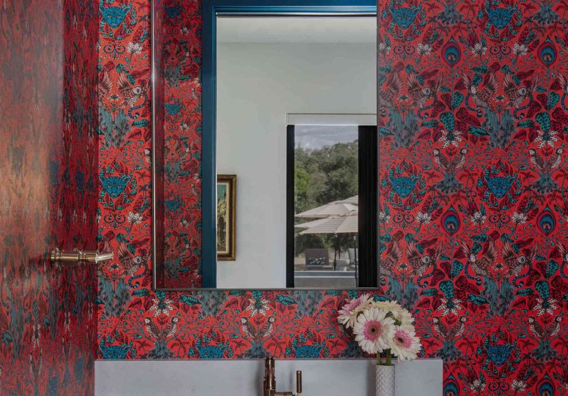
- 18) A red framed mirror (instant focal point)
- 19) Brass + red: the forever romance
- 20) Red tile in a vertical stack for a modern classic
- 21) A red vessel sink (small, sculptural, unforgettable)
- 22) Red marble or stone accents for old-school luxury
- 23) A red mosaic border as a tailored detail
- 24) Red cabinetry paired with warm wood and creamy tile
- 25) Layered reds: blush + brick + burgundy
- Design Notes That Make Red Feel Timeless (Not Trendy)
- Real-World “Experience” Notes: What People Typically Learn After Going Red (About )
- Conclusion
Red in a bathroom is like hot sauce on breakfast: a little can wake up the whole day, and too much can make you question your choices. The good news? “Timeless red” isn’t about turning your bath into a fire truck. It’s about using the right red (tomato, brick, oxblood, terracotta), placing it where it makes sense, and balancing it with classic materials that never clock outtile, stone, brass, porcelain, and warm wood.
Designers keep coming back to red because it’s energetic, flattering, and surprisingly flexibleespecially when you treat it like a power ingredient, not the whole meal. It can be crisp and graphic with white, moody with black, earthy with clay tones, or luxe with marble and metal. Below are 25 ideas that look bold today and still make sense years from now.
Before You Go Red: The 60-Second Game Plan
Pick your “red personality”
Blue-based reds (cranberry, ruby) read cooler and more tailored. Orange-based reds (tomato, poppy) feel sunny and playful. Earthy reds (terracotta, brick) behave like a neutralaka the cheat code for timeless.
Choose your finish like you choose shoes: for the weather
Bathrooms are humid, so use paint and finishes designed for moisture. Matte can look sophisticated, but durability matterslook for products formulated for bath environments and proper ventilation so your gorgeous red doesn’t become a science experiment.
Balance the heat
Red loves a “cooling partner”: crisp white, creamy off-white, black, navy, sage, warm wood, or brass. If your room is small, keep red to one hero surface (vanity, tile wall, or wallpaper) and let everything else be the supporting cast.
25 Red Bathroom Ideas That Stay Stylish Forever
1) The classic red + crisp white contrast
Pair a bold red wall or vanity with bright white tile and fixtures. The look is graphic, clean, and instantly intentionallike a tailored blazer for your bathroom. Add chrome or polished nickel for a sharp, timeless finish.
2) A deep oxblood vanity with unlabeled “wow” energy
A burgundy/oxblood vanity feels rich without screaming. Combine it with white walls, a stone top, and warm metal hardware. It reads classic because it’s grounded, like a great leather bagquietly expensive-looking.
3) Tomato red vanity, neutral everything else
If you want cheerful, choose a bright vanity and keep the room calm: light walls, simple tile, minimal accessories. It’s the easiest way to be bold without committing your entire bathroom to a permanent “look at me” moment.
4) Red subway tile with white grout
Subway tile is already a classic; making it red just turns up the personality. Use it on a shower wall or backsplash and keep the rest white. The white grout keeps it crisp and prevents the red from feeling heavy.
5) A red tile niche as the “jewelry”
Put glossy red tile inside a shower niche (or behind open shelves) and stick to neutral tile everywhere else. It’s a small area, big payoff: a forever-style accent that’s easy to love long-term.
6) Terracotta floors for an earthy, timeless red
Terracotta and clay-inspired tiles deliver a soft red that acts like a neutral. Pair with creamy walls, unlacquered brass, and wood. It feels warm, lived-in, and design-proof against trend whiplash.
7) Red penny tile (classic, but make it spicy)
Penny tile has vintage charm baked in. Use red pennies as an all-over floor or as a pattern with white. Keep grout slightly warm-toned so the floor feels intentional, not like a bag of candy spilled.
8) A red-and-cream checkerboard floor
Checkerboard floors have been around forever for a reason: they’re playful and structured at the same time. Swap black for deep red and cream. The geometry keeps it timeless; the color keeps it fun.
9) Red grout with neutral tile
Want red without committing to red tile? Use white or light neutral tile and choose a red-toned grout (or a warm clay grout). It’s subtle from afar and surprisingly special up close.
10) Color-drench a powder room in deep red
Powder rooms are the perfect place to go dramatic because you’re not taking steamy showers in there for an hour. Use a deep red on walls (and even trim), then add a bold mirror and a classic sconce. Instant boutique vibe.
11) Red wallpaper: pattern does the timeless heavy lifting
A classic print (stripes, botanicals, geometrics) in red feels more enduring than a flat red wall because pattern has built-in texture and history. Keep the vanity simple and let the wallpaper be the main character.
12) Red wainscoting with warm white above
Paint the lower third of the wall in a muted red and keep the upper wall warm white. It’s traditional architecture that never goes out of style, and it visually “grounds” the roomespecially in older homes.
13) A red ceiling for stealth drama
If you love red but fear commitment, paint the ceiling. It’s unexpected, cozy, and doesn’t dominate your sightline the same way red walls do. Works especially well with white tile and a classic lantern pendant.
14) The “unexpected red” accent trick
Add one red objectart, a vase, a small stoolin a bathroom that otherwise leans blue/green/neutral. It instantly energizes the palette without changing permanent finishes. Great for renters and cautious rebels.
15) A vintage-style red runner or Persian rug
A patterned rug with red tones brings warmth and a collected look. Choose a washable option or a low-pile rug that can handle bathroom traffic. It’s the easiest way to make a plain bath feel designed.
16) Red towels that look curated (not accidental)
Pick a single red tone and repeat it: towels, a hand towel, maybe a bath mat. The repetition makes it look intentional. Bonus: you can change the whole vibe in five minutes when you get bored.
17) A red-painted door as the “punctuation mark”
Keep the bathroom mostly neutral and paint just the door (or the inside of the door) in a rich red. It’s a small surface, so it won’t overwhelm, and it feels delightfully custom.
18) A red framed mirror (instant focal point)
Swap a standard mirror for one with a red framelacquer, painted wood, or even a sculptural silhouette. Mirrors are functional art in bathrooms; a red frame adds personality without consuming wall space.
19) Brass + red: the forever romance
Warm metals make red look richer and more “designed.” Use brass sconces, faucet, or cabinet pulls with a muted red vanity or wall. This combo reads classic because it echoes old-world interiors.
20) Red tile in a vertical stack for a modern classic
Take a traditional tile and lay it vertically for a clean, updated look. Use a deeper red for sophistication and keep grout subtle. The shape is modern, but the material is timelessbest of both worlds.
21) A red vessel sink (small, sculptural, unforgettable)
A red sink is a statement that feels artful rather than trendy when the rest of the bathroom is restrained. Pair with a simple counter, neutral walls, and one great sconce. Let the sink be the “gallery piece.”
22) Red marble or stone accents for old-school luxury
A red-veined stone top, a stone shelf, or a small stone ledge can bring in red through natural variation. Stone reads timeless by definitionnature doesn’t do “out of style.” Keep shapes simple to avoid dated vibes.
23) A red mosaic border as a tailored detail
Add a thin red mosaic or liner tile to classic white tile. It’s the interior-design version of a crisp hem. This works beautifully in vintage-style bathrooms and adds color without sacrificing flexibility.
24) Red cabinetry paired with warm wood and creamy tile
If you have space, try red built-ins or a linen cabinet in an earthy red. Balance with wood tones and creamy tile. It feels like a well-designed kitchenjust smaller and with better mirrors.
25) Layered reds: blush + brick + burgundy
Mixing reds keeps the room from feeling flat. Think: muted blush towel, brick-toned rug, burgundy vanity. The key is consistent undertones (all warm or all cool) and plenty of neutrals to let the layers breathe.
Design Notes That Make Red Feel Timeless (Not Trendy)
Use red where you want attention
Red naturally pulls the eye. Put it on the vanity, the shower wall, or the mirrorplaces that can handle being a focal point. Avoid painting every surface bright red in a full-time bath unless you love drama before coffee.
Choose lighting that flatters the shade
Red can swing orange or muddy depending on bulbs. Warm-white lighting typically makes reds look richer and more inviting, while overly cool lighting can make them feel harsh. Always test your red with your actual lighting at night.
Keep the “bones” classic
If you want longevity, use classic bathroom stapleswhite porcelain, simple tile shapes, quality hardwarethen add red as the personality layer. That way, updating later is as easy as changing paint, textiles, or a mirror.
Real-World “Experience” Notes: What People Typically Learn After Going Red (About )
Here’s the part nobody tells you when you fall in love with a red bathroom photo online: red is a social color. It shows up differently at 8 a.m. than it does at 8 p.m., and it has opinions about your lighting. In many homes, the first “experience” is surprisebecause the red you chose in the store can look deeper, brighter, or warmer once it’s surrounded by tile, mirrors, and shiny fixtures. The smartest move is boring but effective: sample first, and view it in morning light, evening light, and “I just showered and now everything is steamy” light.
Another common experience: people love red most when it’s anchored. A bright red wall can feel thrilling for a week and then start to feel loud, especially in a small bathroom where you’re close to every surface. That’s why so many timeless red bathrooms use red on one hero element (a vanity, a tile wall, a wallpaper) and let the rest of the room stay classic. It’s not fearit’s strategy. Red is powerful; it doesn’t need to cover every inch to do its job.
Maintenance is also part of the real-life story. High-traffic bathrooms (kids, guests, the dog who thinks bath mats are a bed) can scuff painted surfaces. If you’re going red on cabinetry or walls, people often end up happier choosing higher-durability paint, adding good ventilation, and picking finishes that forgive lifelike satin on trim or a scrubbable wall formula where appropriate. For tile, the “experience” lesson is simpler: glossy tiles can be easier to wipe, while textured surfaces may need a bit more attention to keep soap and mineral buildup from dulling the vibe.
There’s also a psychology moment. Red can feel energizinggreat for a powder room where you want drama and a little delight. In a primary bath, some homeowners prefer earthy reds (terracotta, clay, brick) because they read calmer and more spa-adjacent. If you want the best of both worlds, an “unexpected red” accent often becomes the long-term favorite: a red mirror frame, a piece of art, a rug with red, or a single red tile detail. People like it because it’s bold, but it still gives you room to change your mind later without a full renovation.
Finally, the most repeated real-life takeaway: red looks most expensive when it’s paired with honest materials. White porcelain, real stone (or convincing quartz), warm metals, and wood tones make red feel intentional and timeless. If you’re ever unsure, follow the simplest formula: keep the bones classic, let red be the personality, and make sure the lighting is doing you a favor.
Conclusion
A red bathroom doesn’t have to be a trend chaseit can be a signature. The secret is choosing a red that fits your home (earthy reds are the easiest to live with), placing it with purpose (one hero moment beats everywhere-all-at-once), and balancing it with classic finishes. Do that, and your bathroom will feel bold today and still look right years from nowno apology tour required.