Table of Contents >> Show >> Hide
- Before the Colors: What Actually Makes Paint Look “Expensive”?
- 1) Creamy Warm White (Not Stark White)
- 2) Soft Greige (The “Designer Neutral”)
- 3) Deep Navy (Tailored, Timeless, and Shockingly Forgiving)
- 4) Charcoal Gray (Moody Without Going Full Batcave)
- 5) Muted Sage or Chalky Green (Quietly Sophisticated)
- 6) Dusty Blue-Gray (The “Expensive Airbnb” Effectin a Good Way)
- Make Any of These Colors Look More Expensive: The Practical Upgrades
- Room-by-Room Cheat Sheet
- Common Mistakes That Make “Expensive” Colors Look Cheap
- Real-World Experiences: What Actually Made My Rooms Look Pricier (500+ Words)
- Wrap-Up
If your home could talk, it would probably say something like: “I don’t need a $9,000 sofa… I need better lighting and a paint color with good manners.”
Because here’s the truth: expensive-looking interiors aren’t always expensivethey’re intentional. And nothing telegraphs “intentional” faster (or cheaper) than the
right paint color applied the right way.
The goal isn’t to pick a shade that screams for attention. It’s to choose one that whispers “custom,” “curated,” and “someone definitely owns a paint fan deck.”
The six paint-color families below show up again and again in designer projects because they play well with real homes: weird lighting, busy floors, mismatched furniture,
and that one wall you swear is straight (it’s not).
Before the Colors: What Actually Makes Paint Look “Expensive”?
A luxury paint color isn’t just “pretty.” It behaves. It looks rich in daylight, flattering at night, and calm next to everything you already own.
Here are the factors that separate a high-end look from “nice effort”:
- Undertones that match your fixed finishes: floors, countertops, tile, and upholstery don’t changepaint does.
- Depth and softness: slightly muted tones often read more sophisticated than loud, high-saturation color.
- Contrast that’s controlled: crisp trim, darker doors, or a deliberate monochrome can look custom when done cleanly.
- Finish (sheen) discipline: the wrong sheen can make a gorgeous color look plastic or blotchy.
- Prep: patching, sanding, and a steady cut line are the unglamorous backbone of expensive-looking walls.
1) Creamy Warm White (Not Stark White)
Warm whites are the “quiet luxury” of paint colors. They make rooms feel brighter, larger, and more finishedwithout the sterile, showroom vibe that bright,
icy whites can create. A creamy warm white reads like great tailoring: simple, clean, and obviously intentional.
Why it looks expensive
- It flatters texture: warm whites make wood grain, linen, plaster, and molding look richer.
- It’s forgiving: you get lightness without highlighting every drywall ripple like a spotlight at an audition.
- It feels curated: creamy whites look “designed,” while stark whites can look like “we moved in yesterday.”
Where it shines
Whole-home wall color, open-concept spaces, hallways, ceilings, and trim (especially when you use the same color in different sheens).
This is also a smart move if you’re trying to make mismatched furniture look cohesive.
Specific examples to try
- Benjamin Moore: White Dove, Swiss Coffee, Chantilly Lace (brighter), Simply White (warm, clean)
- Sherwin-Williams: Alabaster, Shoji White, Pure White (cleaner), Drift of Mist (soft neutral-leaning)
Pro tips
- Warm white + warm metals = instant polish: brass, aged bronze, or champagne nickel look especially luxe.
- Don’t skip trim strategy: if you keep trim the same white, change sheen (satin on trim, matte on walls) for subtle contrast.
- Test at night: warm whites can go “buttery” under very warm bulbs. Swap bulbs before you blame the paint.
2) Soft Greige (The “Designer Neutral”)
Greigepart gray, part beigeis the neutral that designers use when they want a home to feel expensive and lived-in.
It’s the paint equivalent of a cashmere sweater: relaxed, refined, and magically compatible with everything from walnut floors to stainless appliances.
Why it looks expensive
- It adds depth without drama: more sophisticated than plain beige, warmer than many grays.
- It makes rooms feel layered: especially with creamy trim and natural materials.
- It’s a backdrop, not a distraction: art and textiles look more intentional against greige.
Where it shines
Living rooms, bedrooms, stairways, and any space where you want a calm, tailored feel. Greige is also a strong choice for homes with lots of “warm” elements
(oak, tan stone, terracotta, brass).
Specific examples to try
- Benjamin Moore: Revere Pewter, Edgecomb Gray, Pale Oak, Classic Gray
- Sherwin-Williams: Agreeable Gray, Accessible Beige, Perfect Greige, City Loft
Pro tips
- Match undertones to flooring: red/orange wood likes warmer greige; cool gray floors like greige with subtle cool balance.
- Use contrast intentionally: greige walls with crisp white trim looks “custom build,” especially with tall baseboards.
- Layer textures: boucle, wool, leather, and natural wood keep greige from feeling flat.
3) Deep Navy (Tailored, Timeless, and Shockingly Forgiving)
Navy is the tuxedo of paint colorsformal, flattering, and never really out of style. It adds instant sophistication while still feeling classic enough to live with.
The trick is choosing a navy that’s rich and slightly muted (not electric, not cartoonish).
Why it looks expensive
- It creates contrast like a designer: navy + crisp trim looks architectural and deliberate.
- It makes cheap materials look better: basic cabinetry and builder-grade doors suddenly feel “upgraded.”
- It highlights art and hardware: brass, polished nickel, and even matte black pop beautifully.
Where it shines
Dining rooms, offices, powder rooms, built-ins, kitchen islands, and interior doors. Navy is also a great “feature color” for one room that elevates the whole home.
Specific examples to try
- Benjamin Moore: Hale Navy, Boothbay Gray (softer), Newburyport Blue (deep coastal)
- Sherwin-Williams: Naval, Indigo Batik (more playful), In the Navy (classic)
- Behr: Midnight Blue (deep blue-gray)
Pro tips
- Balance with warm elements: add oak, rattan, cognac leather, or warm white textiles so navy doesn’t feel cold.
- Choose the right sheen: matte on walls looks velvety; satin on doors/built-ins looks tailored and durable.
- Try “color drenching”: paint walls, trim, and even the ceiling navy for a boutique-hotel feel (best in smaller rooms).
4) Charcoal Gray (Moody Without Going Full Batcave)
Charcoal is the sweet spot between gray and blackdramatic, but still nuanced. Done well, it reads like a designer chose it on purpose (because they did).
Done poorly, it reads like you tried to paint your room “the color of a rainy Monday.” Let’s aim for the first one.
Why it looks expensive
- It’s rich and grounding: charcoal makes a room feel anchored and intentional.
- It elevates metals and stone: warm brass and veined marble look especially high-end against charcoal.
- It feels architectural: perfect for accent walls, built-ins, and statement doors.
Where it shines
Media rooms, dining rooms, entryways, fireplaces, built-ins, and lower cabinets. Charcoal can also work on an exterior for modern curb appeal,
especially paired with warm wood and soft white trim.
Specific examples to try
- Benjamin Moore: Kendall Charcoal, Chelsea Gray (a bit lighter)
- Sherwin-Williams: Iron Ore, Cyberspace (cooler), Peppercorn (classic)
- Behr: Cracked Pepper (near-black charcoal)
Pro tips
- Use warm lighting: charcoal looks best with layered lightingtable lamps, sconces, and warm bulbs.
- Add natural texture: linen curtains, light oak, and woven accessories keep it from feeling heavy.
- Pick your contrast: crisp white trim is classic; charcoal trim with slightly lighter walls looks modern and custom.
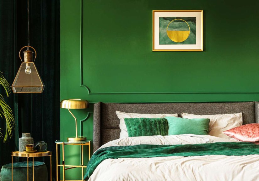
5) Muted Sage or Chalky Green (Quietly Sophisticated)
If you want your home to feel expensive and calmlike a boutique spa that also happens to have snacksmuted greens are your move.
Sage and chalky greens are nature-inspired, soft, and endlessly pairable with wood, stone, and warm metals.
Why it looks expensive
- It feels “collected”: green reads like you have taste, patience, and a linen closet that’s folded.
- It complements natural materials: wood, leather, marble, and travertine all look happier next to sage.
- It’s trendy but not fragile: muted greens feel current without screaming “I did this for social media.”
Where it shines
Kitchens (especially lower cabinets), bedrooms, bathrooms, and any room that needs softness. Sage also looks fantastic on exteriors when you want curb appeal
without a stark contrast palette.
Specific examples to try
- Sherwin-Williams: Evergreen Fog (green-gray with a soft modern vibe)
- Benjamin Moore: Saybrook Sage, October Mist (light, earthy)
- Valspar: Sprig of Sage (cool, gentle green)
Pro tips
- Pair with creamy whites, not icy whites: warm trim keeps sage from feeling medicinal.
- Pick hardware carefully: aged brass and oil-rubbed bronze look rich; shiny chrome can feel sharp.
- Bring in black accents: a little black (frames, faucet, lamp) gives sage a more expensive edge.
6) Dusty Blue-Gray (The “Expensive Airbnb” Effectin a Good Way)
Dusty blue-gray is what happens when “blue” grows up and gets a mortgage. It’s calm, refined, and perfect if you want color without the risk of looking themed.
Think “tailored coastal,” not “beach souvenir shop.”
Why it looks expensive
- It reads soft and complex: blue-gray shifts in light, which makes it feel layered.
- It plays well with neutrals: works with whites, greiges, and warm woods without fighting.
- It elevates bedrooms and bathrooms: instantly feels serene and intentional.
Where it shines
Bedrooms, bathrooms, laundry rooms, and kitchens (especially islands or lower cabinets). It’s also great for a ceiling in a small room if you want subtle drama.
Specific examples to try
- Benjamin Moore: Smoke (soft blue-gray), Boothbay Gray (deeper), Gray Owl (very light, airy)
- Sherwin-Williams: Misty (soft), Stardew (cool, gentle), Waterloo (deeper blue mood)
Pro tips
- Warm it up: add brass, warm wood, or creamy textiles to keep blue-gray from feeling chilly.
- Use it with natural stone: marble and quartz look especially crisp against blue-gray.
- Avoid too-cool bulbs: blue-gray under cool lighting can turn “spa” into “office break room.”
Make Any of These Colors Look More Expensive: The Practical Upgrades
Paint color matters, but the finish line is where the “expensive” happens. Use these tricks to level up your result without changing your zip code:
- Use matte/flat on walls when possible: it looks velvety and hides imperfections (especially on deep colors).
- Use satin or semi-gloss on trim and doors: the subtle sheen contrast reads crisp and custom.
- Paint the ceiling thoughtfully: a ceiling in the same family (or the same color) can look designer-level.
- Commit to clean lines: taped edges are fine, but a steady cut-in line is the real flex.
- Repeat a color across the home: a consistent palette feels more expensive than “every room is a different personality.”
- Upgrade lighting temperature: the wrong bulbs can sabotage even the prettiest paint.
Room-by-Room Cheat Sheet
| Room | Most “Expensive-Looking” Pick | Why It Works | Easy Pairing |
|---|---|---|---|
| Living Room | Soft Greige | Looks tailored, works with most furniture | Creamy trim + wood + linen |
| Dining Room | Deep Navy or Charcoal | Adds drama and contrast; feels “designed” | Brass chandelier + warm art lighting |
| Bedroom | Dusty Blue-Gray | Serene, hotel-like, and easy to live with | White bedding + warm wood nightstands |
| Kitchen | Muted Sage (cabinets) + Warm White (walls) | Fresh, current, and timeless with natural materials | Aged brass pulls + stone backsplash |
| Bathroom | Charcoal (accent) or Sage | Makes tile and fixtures look more intentional | White towels + black hardware |
| Entryway | Deep Navy or Charcoal | Creates instant impact and polish | Mirror + warm sconce lighting |
Common Mistakes That Make “Expensive” Colors Look Cheap
- Ignoring undertones: the prettiest greige can turn green next to the wrong floor or countertop.
- Choosing the wrong sheen: shiny walls can look patchy and highlight every bump.
- Not sampling correctly: test a large swatch in multiple spots and check morning, afternoon, and night.
- Going too trendy, too fast: loud, bright “statement” colors can date faster than a viral dance.
- Skipping the finishing touches: old outlet covers and mismatched bulbs can undo your hard work.
Real-World Experiences: What Actually Made My Rooms Look Pricier (500+ Words)
I used to think “expensive paint” meant buying the priciest gallon and calling it a day. Spoiler: the wall did not magically develop a trust fund.
The first time I painted a room bright white, I expected airy elegance. What I got was a space that looked like it was waiting for an inspection.
The color was technically “clean,” but it also made every shadow and drywall wobble show up like a high-definition close-up. That’s when I learned the
difference between stark and soft. Switching to a creamy warm white didn’t make the room darkerit made it calmer. Suddenly the trim looked
crisp, the furniture looked intentional, and the whole space stopped feeling like a temporary rental.
Then came my greige era (a peaceful time, honestly). I painted a main living area in a soft greige expecting it to be “safe,” but what surprised me was how
expensive it made everything else look. A basic beige sofa looked upgraded. Random wood tones stopped arguing. Even my older decor pieces seemed to cooperate.
The biggest lesson: greige works best when you treat it like a foundation, not wallpaper. Once I added a few layerstextured throw pillows, a wool rug,
and warm lightingthe room started giving off “professional decisions were made here” energy.
Navy was the boldest leap, and it’s the color that taught me the power of contrast. I used a deep navy on a small room and instantly understood why designers love it.
The walls felt like they had depth, like the room was wrapped in a tailored jacket. But navy also taught me that lighting is non-negotiable. Under one harsh overhead
bulb, the room looked flat and gloomy. With layered lighttable lamp, warm bulb, and a little wall art lightingit became cozy, sophisticated, and dramatic in the
best way. The takeaway: dark paint isn’t the villain; bad lighting is.
Charcoal was my “I want drama but I also want to sleep” experiment. I used it on built-ins and a door instead of the whole room, and that was the sweet spot.
It made the architecture look more expensive without turning the space into a cave. Here’s the weirdly specific thing I learned: charcoal looks higher-end when
it has something warm nearby. Warm wood, brass, tan leather, even a creamy white lampshadethose details keep charcoal from feeling cold. Also, the sheen matters
more than you think. A too-shiny charcoal can look streaky or plasticky. Matte on walls and satin on trim/built-ins was the combination that finally looked “designer.”
Sage green was the color that surprised me most. I expected “cute.” What I got was “expensive calm.” Sage made the room feel grounded and fresh, like the
interior version of a deep breath. It also made my plants look like they were thriving on purpose (they weren’t). The key was pairing sage with creamy whites
and warm metals, not icy whites and ultra-cool silver. When I tried cool white next to sage, it felt a little clinical. When I swapped in a warmer white, the space
instantly felt softer and more elevated.
Finally, dusty blue-gray taught me restraint. It’s one of the easiest colors to live with, but it can turn chilly if you don’t balance it. The fix was simple:
warm wood, brass accents, and cozy textiles. Once I stopped pairing blue-gray with “all cool everything,” it looked like a boutique hotel rather than a conference room.
My overall conclusion from all these paint adventures is embarrassingly practical: the “expensive” look comes from choosing a color with the right undertone,
using the right sheen, and finishing the job like you mean it. Paint isn’t just colorit’s atmosphere. And atmosphere is what people mistake for luxury.
Wrap-Up
If you want paint colors that make your home look expensive, think in “families,” not one-off shades: creamy warm whites, soft greiges, deep navy, charcoal,
muted sage, and dusty blue-gray. These tones look luxurious because they’re versatile, layered, and flattering in real homesespecially when you pair them with
smart sheen choices, warm lighting, and clean, deliberate contrast.