Table of Contents >> Show >> Hide
- How to Coordinate Cabinet Stain Colors Without Guessing
- 1. Blonde Oak
- 2. Natural White Oak
- 3. Honey Oak
- 4. Golden Pecan
- 5. Classic Chestnut
- 6. Weathered Greige
- 7. Mushroom Taupe
- 8. Rich Walnut
- 9. Espresso or Soft Black
- Which Cabinet Stain Color Is Best for Your Kitchen?
- Experience Notes: What Real Cabinet Stain Projects Teach You
- Conclusion
Painted cabinets have had a long, glamorous run, but stained wood cabinets are back in a big way. And honestly? It makes sense. A good cabinet stain color brings warmth, depth, and that magical “someone actually thought about this kitchen” feeling. Instead of hiding the wood, stain lets the grain do a little showing off. The result can lean modern, rustic, classic, Scandinavian, or somewhere in that sweet spot between “designer kitchen” and “I still eat cereal over the sink.”
If you are choosing cabinet stain colors, the goal is not just picking a pretty shade on a tiny sample card. It is choosing a tone that works with your countertops, backsplash, flooring, wall color, hardware, and lighting. That is where many remodels go sideways. The stain may be beautiful on its own, but if the undertones fight the room, the whole space can feel slightly off in a way no one can explain and everyone can somehow sense.
This guide breaks down 9 cabinet stain colors that work across a range of kitchen styles and explains exactly how to coordinate each one. Whether you love airy blonde oak, rich walnut, or moody espresso, here is how to make your wood cabinet stain look intentional, polished, and timeless.
How to Coordinate Cabinet Stain Colors Without Guessing
1. Start with undertones, not just depth
Every stain color has an undertone. Some lean warm with hints of yellow, orange, or red. Others lean cool with gray, taupe, or smoky notes. Coordination gets easier when the surrounding finishes speak the same language. Warm oak cabinets usually look better with creamy whites, greige, brass, and warm stone. Cooler gray-brown stains tend to pair better with crisp whites, charcoal, black, and cooler marbles.
2. Decide how much contrast you want
Light cabinets with light counters create an airy, low-contrast look. Dark cabinets with pale counters create drama. Mid-tone stains are the peacekeepers of the design world: not too loud, not too sleepy, just quietly competent. Before choosing a stain, decide whether you want the cabinetry to blend in or anchor the room.
3. Repeat the temperature around the room
If your cabinets are warm, repeat that warmth somewhere else: wood flooring, brass hardware, creamy walls, or a backsplash with beige or sand undertones. If the stain is cooler, echo it with black fixtures, soft white quartz, blue-gray tile, or nickel hardware. Rooms feel more pulled together when the warm and cool elements are balanced on purpose rather than by accident.
4. Test the stain on the actual wood species
This matters more than people expect. White oak, red oak, maple, birch, alder, and walnut all take stain differently. A honey stain on oak may look glowing and dimensional, while the same stain on maple can read flatter or slightly different in color. Always sample your kitchen cabinet stain ideas on the actual cabinet wood and check them in morning light, afternoon light, and evening light.
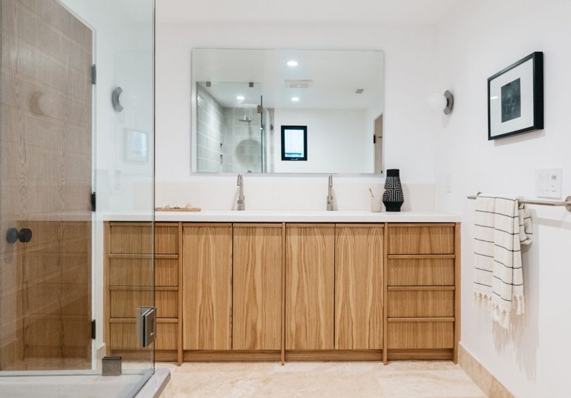
1. Blonde Oak
Blonde oak is the clean, modern favorite that keeps showing up in kitchens that look calm, expensive, and suspiciously free of junk mail. It has a pale, natural appearance that often works beautifully with white oak because the grain stays visible while the color stays soft.
How to coordinate it
Pair blonde cabinet stain with warm whites, off-whites, soft greige, pale limestone, or honed quartz countertops. It also looks excellent with light backsplash tile, especially zellige, handmade-look ceramic, or simple stacked subway tile. For hardware, choose brushed brass if you want warmth or matte black for a more graphic contrast. Blonde oak also plays nicely with muted greens and dusty blues, making it a strong choice for people who want color elsewhere in the room without making the cabinets the loudest object in the kitchen.
Best for: Scandinavian, Japandi, modern organic, and transitional kitchens.
2. Natural White Oak
Natural white oak is slightly deeper than blonde oak and often feels more grounded. It is still light, but it has enough golden-beige body to avoid looking washed out. If blonde oak is coffee with oat milk, natural white oak is coffee with a splash of cream and actual personality.
How to coordinate it
Natural white oak cabinets look fantastic with green-veined stone, soapstone-inspired quartz, warm marble looks, and earthy backsplash colors. This stain also works well in two-tone kitchens, especially when paired with painted lower cabinets in olive, navy, charcoal, or a muted mushroom color. Choose aged brass, bronze, or black hardware for contrast. To keep the look current, avoid pairing it with overly pink beige walls or orange-toned flooring.
Best for: Transitional kitchens, warm contemporary spaces, and open-concept homes where the kitchen needs to connect with wood furniture nearby.
3. Honey Oak
Yes, honey oak can work again. The trick is not recreating a 1997 kitchen that also came with a grapevine border and a fruit bowl mural. Today’s honey oak looks better when the stain is cleaner, the cabinet style is simpler, and the surrounding finishes are less busy.
How to coordinate it
Use creamy wall paint instead of stark white, because super-cool white can make honey oak turn more orange. Countertops in soft white, warm gray, beige, or lightly veined quartz work well. For the backsplash, go with an understated tile in ivory, sand, or soft greige. Black hardware can modernize honey oak quickly, while unlacquered brass can make it feel classic and warm. If your flooring is also wood, choose either a similar undertone for a cohesive look or enough contrast that it feels intentional.
Best for: Traditional kitchens, family homes, and remodels where warmth matters more than trend-chasing.
4. Golden Pecan
Golden pecan sits between honey and chestnut. It has warmth, but less orange. It has richness, but not the heaviness of darker stains. This is a great option if you want stained cabinets that feel welcoming without reading rustic.
How to coordinate it
Golden pecan works especially well with creamy quartz, travertine-inspired surfaces, warm white walls, and mixed-metal kitchens. It looks elegant with champagne bronze, antique brass, or even polished nickel if you want a little shine. Backsplashes in soft taupe, pale sage, or handmade white tile help keep the overall look layered rather than flat. If you want to add color, try muted blue-green or earthy green accents instead of bright primary shades.
Best for: Transitional, cottage, and classic kitchens that want warmth without heaviness.
5. Classic Chestnut
Classic chestnut is the middle child of cabinet stain colors, but in the good way. It is balanced, versatile, and rarely causes drama. It gives you a medium brown cabinet with visible wood character and enough depth to feel substantial.
How to coordinate it
Chestnut cabinets are easy to pair with white or ivory counters, warm marble looks, creamy paint, terracotta accents, and medium-toned flooring. If you want the kitchen to feel timeless, add simple shaker doors, satin brass hardware, and a backsplash with gentle variation rather than a loud pattern. Chestnut can also support black accents nicely, especially on pendant lights and faucets. For wall color, think soft white, mushroom, or pale clay rather than icy gray.
Best for: Timeless kitchen design, resale-friendly remodels, and homeowners who want a stain that is neither too pale nor too dramatic.
6. Weathered Greige
Weathered greige is where wood stain meets modern neutrality. It blends brown and gray in a way that softens wood grain and gives cabinetry a more contemporary feel. This finish can be a smart choice when you want stain but do not want obvious gold or red undertones.
How to coordinate it
Pair weathered greige cabinets with crisp white counters, concrete-look surfaces, charcoal accents, and cool-toned backsplash tile. It also works with black hardware, stainless appliances, and slate-like flooring. The one caution: do not let the whole room go flat and chilly. Add texture through woven stools, linen window treatments, warm wood shelves, or brass lighting to keep the space from feeling like a very stylish cloud.
Best for: Modern farmhouse, contemporary, and loft-inspired kitchens.
7. Mushroom Taupe
Mushroom taupe is subtle, sophisticated, and quietly excellent. It is a softer alternative to gray stain and a cooler alternative to traditional brown. If you want your cabinets to feel refined without stealing the spotlight, this is your shade.
How to coordinate it
Mushroom-taupe stained cabinets look beautiful with off-white quartz, pale greige walls, creamy backsplash tile, and mixed materials like wood, stone, and plaster. Hardware in antique brass, pewter, or matte black all work, depending on how much contrast you want. This stain is particularly good in homes with adjoining rooms painted in warm neutrals because it bridges warm and cool tones better than a strict gray.
Best for: Soft contemporary kitchens, elegant bathrooms, and homes with layered neutral palettes.
8. Rich Walnut
Walnut is one of the most beloved cabinet finishes for a reason. It is deep, smooth, luxurious, and dramatic without being loud. A rich walnut stain or walnut-like tone instantly adds visual weight and sophistication.
How to coordinate it
Walnut cabinets look stunning with creamy counters, warm marble, black accents, and deep paint colors like navy, olive, charcoal, or even muted aubergine in nearby spaces. If you want a modern look, combine walnut with slab-front doors, minimal hardware, and a streamlined backsplash. If you want something more classic, use paneled doors and warm brass. Walnut also works beautifully in two-tone kitchens, especially on islands or lower cabinets paired with lighter uppers.
Best for: Midcentury modern, luxurious transitional kitchens, and statement islands.
9. Espresso or Soft Black
Espresso and near-black stains are dramatic, polished, and surprisingly versatile when the rest of the room balances them. They can make cabinetry feel architectural, especially in larger kitchens or rooms with strong natural light.
How to coordinate it
Dark cabinet stain needs relief. Pair it with light counters, pale walls, reflective backsplash materials, or at least one other bright surface to keep the room from feeling cave-like. White quartz, marble-look slabs, warm plaster tones, and light oak flooring all help. For hardware, brass adds warmth while black keeps the look sleek. If you want a moody palette, layer in dark green or navy, but keep enough contrast through counters, lighting, and ceiling color.
Best for: Dramatic kitchens, traditional homes, and spaces with high ceilings or abundant daylight.
Which Cabinet Stain Color Is Best for Your Kitchen?
If your kitchen is small or lacks natural light, start with blonde oak, natural white oak, or mushroom taupe. These shades keep the room bright while still adding the texture and authenticity of real wood. If you want cozy and classic, look at golden pecan, chestnut, or honey oak. If you want sophistication with more contrast, rich walnut and espresso are hard to beat. And if your style leans more modern, weathered greige gives you a cleaner, cooler take on stained wood cabinets.
The smartest way to choose is to look at your fixed finishes first. Countertop, flooring, backsplash, and wall color usually cost more to replace than cabinet stain. Let the stain support those elements instead of fighting them. Great coordination is often less about picking the trendiest stain and more about choosing one that makes everything else in the room look better.
Experience Notes: What Real Cabinet Stain Projects Teach You
After looking at enough cabinet updates, remodel photos, and real-life kitchens to make a hardware aisle feel like a thrilling Friday night, a few patterns become obvious. First, people almost always underestimate undertones. A stain that looked perfectly neutral in the store suddenly pulls orange at home. Or what seemed like a cool taupe sample turns muddy once it lands next to a creamy countertop. This is why the most successful cabinet projects do not start with, “I like this color,” but with, “What else is already in the room?”
Another common lesson is that lighting changes everything. A stain that looks elegant at noon can look heavier at 7 p.m. under warm bulbs. North-facing rooms often cool down colors, while strong southern light can amplify warmth. That is why samples should never be judged in one five-minute burst of optimism. Tape them up, walk away, make coffee, come back later, and look again. Design wisdom is sometimes just patience wearing better shoes.
There is also the issue of wood species, which many homeowners discover a little too late. White oak is forgiving and stylish because its grain adds movement without turning chaotic. Maple tends to read smoother and can show stain differently, especially in darker colors. Red oak has stronger grain and can pull more pink or red than expected. When someone says, “But the sample online looked different,” the wood itself is often the missing part of the story. The stain color is only half the equation; the wood is the other half, and it gets a vote.
One of the best practical tricks is coordinating cabinet stain with the room’s visual temperature. Warm stain colors tend to feel best with creamy paint, warm whites, natural stone looks, brass, and earthy accents. Cooler stains often pair more naturally with crisp white, black, charcoal, nickel, and blue-gray or green-gray details. Problems happen when every finish is technically beautiful but emotionally unrelated. A kitchen can have excellent individual pieces and still feel like they met each other for the first time that morning.
Two-tone kitchens also teach a useful lesson: cabinet stain does not have to do all the work alone. Sometimes the smartest move is stained lowers with painted uppers, or a stained island paired with perimeter cabinets in a warm neutral. This keeps the room from feeling too heavy while still bringing in the richness of wood. It also helps people get over the fear that one wrong stain choice will dominate the whole kitchen forever. Design is flexible. Deep breaths are allowed.
Finally, the most satisfying cabinet stain projects usually share one quality: restraint. They do not try to force every trend into one room. The stain looks intentional because the backsplash is not screaming, the countertop is not competing, and the hardware is helping rather than auditioning for its own show. Good coordination is not boring. It is what makes the room feel settled, layered, and expensive in the best way. If a kitchen ends up looking effortless, it probably took quite a bit of thought. That is not failure. That is the whole art of it.
Conclusion
The best cabinet stain colors are not just beautiful on their own. They make the entire room feel more cohesive. Blonde oak and natural white oak keep things light and current. Honey, pecan, and chestnut bring warmth and familiarity. Weathered greige and mushroom taupe offer a more nuanced neutral path. Walnut and espresso deliver depth and drama. Once you understand undertones, contrast, wood species, and lighting, choosing the right cabinet stain ideas gets much easier.
In other words, your cabinets do not need to shout. They just need to get along with everyone else in the room. Like the best dinner party guests, only made of wood.