Table of Contents >> Show >> Hide
- What Is All White No. 2005?
- Why All White No. 2005 Stands Out
- Undertones: The Part Nobody Sees Until They Definitely See It
- Where All White No. 2005 Works Best
- Colors That Pair Well With All White No. 2005
- Best Finishes and Application Tips
- Common Mistakes to Avoid With All White No. 2005
- Is All White No. 2005 the Right White Paint for Your Home?
- Experiences With All White No. 2005 in Real-Life Decorating
- Final Thoughts
Choosing white paint sounds easy right up until you are standing in front of 47 nearly identical swatches, questioning your eyesight and your life choices. That is exactly why All White No. 2005 has built such a loyal following. It is a shade that sounds simple, looks clean, and still manages to be more thoughtful than the average “just make it white” paint pick.
Farrow & Ball All White No. 2005 is often described as a pure white, but its charm is not that it feels stark or sterile. The magic is that it reads bright and crisp without veering into the cold, blue-heavy territory that makes some whites feel like a dentist’s waiting room with better lighting. In other words, it gives you that fresh white look without acting like it is auditioning for a sci-fi lab.
This article breaks down what makes All White No. 2005 special, how it behaves in real rooms, where it works best, what colors pair beautifully with it, and how to avoid common mistakes. If you are wondering whether this is the right white paint for walls, trim, ceilings, cabinetry, or even an all-white room, you are in the right place.
What Is All White No. 2005?
All White No. 2005 is one of Farrow & Ball’s best-known white paints. It is designed to deliver a clean, uncomplicated white that still feels soft enough to live with every day. That balance matters. Many so-called pure whites can feel hard, chilly, or overly reflective, especially in rooms with cool light. All White aims for a fresher kind of neutrality.
What sets it apart is its reputation as a white that looks truly bright while avoiding the icy cast that can show up in sharper commercial whites. That makes it especially appealing for homeowners who want a modern look but do not want their space to feel clinical. It is also one of those shades that plays well with both minimalist interiors and more traditional architecture, which is harder to pull off than paint brands like to admit.
In practical terms, All White No. 2005 is often chosen for:
- walls in modern or transitional spaces,
- trim and woodwork when a cleaner outline is desired,
- ceilings to create a bright, airy envelope,
- cabinetry in kitchens and mudrooms,
- paired white schemes with warmer neutrals and stone shades.
Why All White No. 2005 Stands Out
It feels crisp without feeling cold
That is the headline. Plenty of white paints are bright. Fewer are bright and easy to live with. All White has a more sympathetic quality than harsh brilliant whites, which is why it often appeals to people who want a fresh backdrop but still want their furniture, textiles, wood tones, and skin tones to look normal. A low bar, perhaps, but an important one.
It works across design styles
This shade can sit comfortably in a sleek contemporary kitchen, a cottage bedroom, a renovated townhouse, or a gallery-style living room. In modern spaces, it looks precise and architectural. In traditional rooms, it can feel quietly polished rather than flashy. That versatility is one reason white paint remains such a design staple: when it is chosen well, it lets the architecture and materials do the talking.
It pairs beautifully with layered neutrals
One of the smartest ways to use All White is not as a lonely paint island, but as part of a layered neutral palette. It looks especially strong next to warm stony whites, pale greiges, chalky taupes, and natural wood finishes. The result feels curated, not flat. White on white on white can be beautiful, but only when the undertones are in conversation instead of silently fighting in the corner.
Undertones: The Part Nobody Sees Until They Definitely See It
White paint is never just white. That is one of the biggest lessons repeated by designers and paint brands alike. Every white leans somewhere: warm, cool, neutral, creamy, grayish, blueish, pinkish, greenish. With All White No. 2005, the appeal is that it reads as a true, bright white while avoiding the colder blue undertones that make some bright whites feel severe.
That does not mean it behaves the same way in every room. Light always gets the final vote.
North-facing rooms
In cooler, north-facing spaces, All White can look cleaner and slightly sharper. Because north light tends to flatten and cool paint colors, this shade may feel more modern and crisp there. If the room already has cool flooring, gray stone, or blue decor, sampling first is essential so the space does not tip too far into chilly territory.
South-facing rooms
In strong natural light, All White tends to feel soft, bright, and open. South-facing exposure usually brings out the friendlier side of white paint, so this is where All White can really shine. It often looks especially good in kitchens, breakfast rooms, and open-plan living areas that get generous daylight.
East- and west-facing rooms
These rooms change personality throughout the day. Morning light may make All White feel clearer and fresher, while evening light can warm it up. If you are painting a room that is used heavily at one specific time of day, test the color on multiple walls and check it in changing light before committing. White paint is a drama queen under shifting light, and samples are the therapy.
Where All White No. 2005 Works Best
Living rooms
In living spaces, All White creates a bright background that lets artwork, books, lighting, and textiles stand out. If your room has architectural details such as crown molding, built-ins, or tall windows, this paint can make those features feel sharper without overwhelming the room.
Kitchens
All White is an excellent fit for kitchens that need a fresh, light-reflective look. It works especially well with marble, quartz, pale oak, unlacquered brass, matte black hardware, and classic subway tile. If you want a white kitchen that feels clean but not icy, this shade deserves a serious look.
Bedrooms
In bedrooms, the success of All White depends largely on the materials around it. Layer it with linen, textured throws, warm woods, and soft lighting, and it feels restful. Pair it with too many cold grays and shiny surfaces, and it can lose some warmth. The paint is only one player on the team; styling matters.
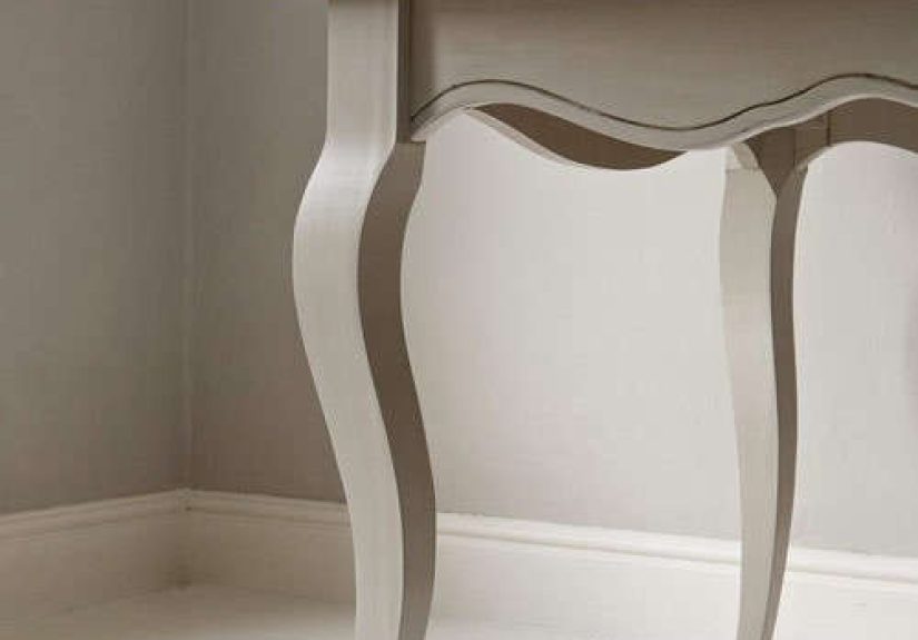
Trim and woodwork
For trim, doors, baseboards, and millwork, All White can create a cleaner, more architectural outline than creamier whites. It is especially effective when you want crisp edges around a darker wall color or a warm neutral backdrop. That said, if the surrounding wall color is noticeably creamy or pink-toned, an ultra-clean trim white can exaggerate the mismatch.
Ceilings
White ceilings are popular for good reason: they reflect light and keep a room feeling taller and more open. All White is a strong choice if you want the ceiling to disappear in the best possible way. For a softer, more enveloping effect, you can also use the same shade on walls, trim, and ceiling and let sheen differences create subtle contrast.
Colors That Pair Well With All White No. 2005
One reason All White remains so useful is that it plays nicely with a wide range of companion shades. If you want a room that feels layered rather than blindingly bright, pairing matters.
Warm neutrals
Stone, chalk, putty, beige-gray, and soft taupe tones are some of the best partners for All White. These shades soften the crispness and help the white feel intentional rather than unfinished.
Other Farrow & Ball favorites
All White is often paired with Strong White and Skimming Stone for a warm, sophisticated neutral scheme. If you want sharper contrast, deeper tones such as Pitch Black or bold blue accents can create a more graphic result.
Natural materials
Oak, walnut, limestone, travertine, rattan, linen, and brushed brass all help All White feel richer and more grounded. This is one of the easiest ways to keep a bright white room from feeling flat. Texture does the emotional heavy lifting.
Best Finishes and Application Tips
Choose the right finish for the job
Not all white paint problems are color problems. Sometimes the issue is sheen. Flat and matte finishes are forgiving and elegant on walls and ceilings, while eggshell or satin may be more practical in busier areas. Higher-sheen finishes bounce more light and are easier to wipe down, but they also highlight surface imperfections. If your walls resemble an archaeological dig, glossy paint will not be kind.
Prep matters more with bright whites
Bright whites reveal flaws fast. Patch, sand, clean, and prime properly before painting. All White looks best when the surface underneath is smooth and the primer is appropriate for the color family. Good prep is not glamorous, but neither is staring at every roller mark for the next five years.
Sample first, always
This is not optional. Paint large swatches on several walls, look at them during the day and at night, and compare them to flooring, countertops, upholstery, and trim. White paint changes with light, and the “perfect white” in someone else’s Instagram kitchen may become a suspiciously cold marshmallow in your house.
Common Mistakes to Avoid With All White No. 2005
- Ignoring undertones in nearby materials: White paint interacts with stone, tile, fabric, and wood. If those elements lean warm, gray, pink, or yellow, the paint will read differently.
- Mixing unrelated whites: Using several whites with clashing undertones can make the cleanest shade look wrong. Coordinated whites work. Random whites fight.
- Using a very glossy finish on rough surfaces: Shine emphasizes texture, dents, and patchwork.
- Assuming white is automatically warm or cool-proof: Light direction still matters.
- Forgetting the room’s mood: A crisp white can feel airy and elegant, but if your goal is cozy softness, you may need warmer textiles, lighting, and furnishings to balance it.
Is All White No. 2005 the Right White Paint for Your Home?
Choose All White No. 2005 if you want:
- a bright white paint that feels clean but not overly icy,
- a modern, architectural look,
- a strong trim, ceiling, or cabinetry white,
- a flexible base for black accents, natural wood, or stone neutrals,
- a white that works in layered neutral interiors.
You may want to keep looking if you want:
- a creamy, buttery, or off-white appearance,
- a white that softens darker north-facing rooms dramatically,
- a more obviously warm white for traditional interiors,
- a white that hides wall flaws without careful prep.
In short, All White No. 2005 is best for people who genuinely want white paint to look white, but still livable. It is clean, sharp, adaptable, and surprisingly nuanced for a color that sounds like it should come with no personality at all.
Experiences With All White No. 2005 in Real-Life Decorating
One of the most common experiences people have with All White No. 2005 is surprise. Not because the paint color is shocking, but because it proves that a white room does not have to feel empty. In many homes, the first reaction after painting with All White is that the space suddenly looks more finished, not less. Edges feel cleaner. Furniture looks more intentional. Daylight seems to stretch farther into the room. Even ordinary things like wood floors or woven baskets get a little design glow-up.
Another recurring experience is that this color changes less dramatically than many creamy whites when surrounding decor evolves. Homeowners often start with one style in mind, maybe modern farmhouse, maybe minimalist, maybe “I bought this sofa during a sale and now I am building a room around it.” What makes All White useful is that it gives those changes room to happen. Black accents look sharp against it. Brass looks warmer. Art feels more prominent. Green plants look suspiciously expensive.
In kitchens, people tend to notice how clean and bright the paint feels without tipping too far into sterile. With the right balance of texture, such as wood stools, zellige tile, soapstone, or brushed metal hardware, the room keeps warmth while still reading fresh. In bathrooms, the experience is often similar. The paint reflects light beautifully and can make compact spaces feel more open, especially when used on walls and trim together for a seamless envelope.
There is also a practical side to living with a bright white paint. All White tends to reward thoughtful styling. Rooms that include layered textiles, natural materials, soft window treatments, and warm light bulbs usually feel calm and polished. Rooms that rely only on white paint to do all the emotional work can feel unfinished. The lesson here is not that the paint fails. It is that white paint is honest. It will not hide awkward furniture layouts, harsh lighting, or neglected trim any more than a white T-shirt hides coffee stains.
For people using All White on trim or woodwork, the experience is often about precision. Baseboards look crisper. Doors look more tailored. Built-ins feel more custom. This is especially true in homes where the wall color is slightly deeper or warmer, because the contrast helps architectural details stand out. At the same time, many decorators discover that this effect is best when the other whites in the room are coordinated. If one white leans creamy and another is sharply clean, the eye notices immediately.
Perhaps the biggest long-term experience with All White No. 2005 is that it gives a home flexibility. Seasonal decor changes do not clash with it. Rugs can change. Art can change. Upholstery can change. The room stays fresh. That adaptability is a big reason white paint remains popular year after year. And when the specific white is as bright, balanced, and versatile as All White, the result can feel timeless rather than trendy. That is the sweet spot: a color that looks effortless, even though choosing it absolutely was not.
Final Thoughts
All White No. 2005 paint succeeds because it understands the assignment. It is meant to be white, not vaguely oatmeal, not secretly blue, not one bad lamp away from looking dingy. Yet it also has enough softness to feel livable in real homes. If you want a crisp white paint color that works on walls, trim, ceilings, and cabinetry, and you are willing to sample carefully and pay attention to light, this shade is a strong contender.
White paint may never be the most dramatic choice in the room, but when it is right, everything else looks better. That is not boring. That is power.