Table of Contents >> Show >> Hide
- The “Before” Phase: What Most Antique Stores Struggle With
- The Renovation North Star: What “After” Should Feel Like
- Before vs. After: A Quick Visual (Without the Dramatic TV Music)
- Step 1: Fix the Layout (Because “Treasure Hunt” Shouldn’t Mean “Emergency Exit Drill”)
- Step 2: Upgrade Lighting (The Fastest Way to Make Patina Look Expensive)
- Step 3: Displays That Sell (Without Looking Like You Tried Too Hard)
- Step 4: Restore the Storefront (If You’re Lucky Enough to Have One)
- Step 5: Accessibility and Safety (Because Everyone Deserves the Treasure Hunt)
- Step 6: Permits, Phasing, and the “Open During Renovation” Olympics
- Step 7: The “After” PlaybookHow to Keep It Looking Renovated
- Measuring Success: Did the Renovation Work?
- Conclusion: Renovate for Wonder, Not Sterility
- Field Notes: Real-World Experiences from the Renovation Trenches (Extra )
An antique store is basically a museum where you’re allowed to touch everything (and then immediately feel guilty about it). Done well, it’s a treasure hunt with great lighting and better vibes. Done poorly, it’s a maze of wobbling tables, mysterious corners, and one “AUTHENTIC” sign that’s doing a lot of emotional labor.
This article breaks down what a before and after antique store renovation really looks like: the design choices, the practical upgrades, and the small details that turn “dusty curiosity shop” into “I only came in for five minutes and now I’m naming this chair.”
The “Before” Phase: What Most Antique Stores Struggle With
Antique stores aren’t messy because owners don’t care. They’re messy because every object is a story, and stories multiply like rabbits with top hats. The most common “before” issues usually fall into a few buckets:
- Cluttered traffic flow: shoppers can’t tell where the store begins, ends, or turns into Narnia.
- Lighting that fights the merchandise: dim aisles, harsh fluorescents, or spotlights aimed at… the floor.
- Displays that don’t flex: fixed shelving and heavy cases make seasonal resets feel like moving a piano uphill.
- Hidden gems stay hidden: high-margin pieces blend into the background instead of starring in the show.
- Old-building quirks: charming brick walls + ancient wiring + drafty storefront = romance… and maintenance.
In a typical antique shop “before,” customers may love the inventory but feel overwhelmed. They browse faster, miss sections, and leave thinking, “I’ll come back when I have more time.” (Spoiler: they won’t. People treat “more time” like a mythical creature.)
The Renovation North Star: What “After” Should Feel Like
The best antique shop makeovers don’t sterilize the charm. They curate it. Think “organized wonder,” not “big-box bland.” Before you touch a hammer, write a one-sentence goal you can repeat when you’re tired and holding a paint swatch at 11:47 p.m.:
Example North Star: “A warm, walkable store where customers discover one great thing every 10 feet.”
Three renovation outcomes that matter
- Flow: shoppers intuitively know where to go next.
- Focus: your best items get the attention (and lighting) they deserve.
- Flexibility: displays can change without a full-body workout.
Before vs. After: A Quick Visual (Without the Dramatic TV Music)
Before
- Entrance packed with merchandise (aka the “Welcome, Please Trip” zone)
- Narrow aisles and dead ends
- Single lighting type everywhere
- Random pricing/signage styles
- Checkout feels like it was added as an afterthought
After
- Clear entry area with a strong first display and brand cue
- A main pathway that loops customers through key zones
- Layered lighting: ambient + accent + task
- Consistent signage and “story cards” that justify value
- Checkout placed to catch the natural end of the journey
Step 1: Fix the Layout (Because “Treasure Hunt” Shouldn’t Mean “Emergency Exit Drill”)
Layout is the backbone of any antique store remodel. A great layout doesn’t force a single path, but it gently suggests onelike a friendly golden retriever nudging you toward the snack cabinet.
Start with the decompression zone
Many retail planners recommend keeping the first few steps inside the door more open than you think you “can afford.” This transition space helps shoppers adjust, orient, and slow down. If the entrance is jammed with furniture, your store feels stressful before it feels magical.
Build a “loop” with micro-adventures
A loop (or racetrack) layout can work beautifully in antique shops because it provides direction without killing discovery. The trick is to create micro-zones along the path: a vintage kitchen vignette, a mid-century corner, a books-and-maps nook. Each one is a mini “before and after” moment: from randomness to story.
Use anchors: power walls and hero displays
Early sightlines matter. A strong wall display just beyond the entrance can set quality expectations instantly: an elevated shelf of smalls (glass, ceramics), a curated mirror gallery, or a rotating “New Finds” wall. You want customers thinking, “Okay, someone with taste lives here.”
Step 2: Upgrade Lighting (The Fastest Way to Make Patina Look Expensive)
Lighting is the most dramatic “after” upgrade because it changes how every item reads: texture, color, sparkle, even perceived cleanliness. In antiques, that’s everything. A brass lamp can look like heirloom gold or garage-sale regret depending on the beam.
Layer it: ambient, accent, and task
- Ambient: overall comfortno spooky corners.
- Accent: highlight displays, vignettes, and high-margin items.
- Task: checkout, wrapping, appraisal desk, and “read this label without squinting” areas.
Why LEDs are renovation MVPs
Modern LED upgrades typically reduce energy use compared with older incandescent lighting, while lasting longergreat for stores that run lights all day. They also reduce heat, which is a quiet win when you’re trying to keep customers browsing comfortably instead of speed-walking to the exit like they’re escaping a sauna.
Use track lighting like a director, not a flashlight
Track heads and adjustable spotlights are popular in retail because you can move them as displays change. That matters in an antique shop where inventory is constantly rotating. Consider aiming accent light toward “hero” pieces: a grandfather clock, a set of stained-glass windows, a statement credenza.
Many retail lighting guides also suggest that accent light should be noticeably brighter than ambient light to create contrast. Think “spotlight the story,” not “blind the customer.” If you’re restoring a historic storefront, lighting can also help emphasize original brick, wood trim, and architectural detailswithout painting everything white and calling it a day.
Step 3: Displays That Sell (Without Looking Like You Tried Too Hard)
Displays are where your antique shop makeover becomes an experience. A good display doesn’t just show items; it explains why they matter. The goal is to make shoppers say, “I didn’t know I needed an antique butter churn, but now I do.”
Vignettes beat “shelf soup”
Group items by lifestyle or era. Examples:
- 1920s writing desk vignette: fountain pens, letterpress blocks, framed sheet music.
- Coastal cottage corner: weathered oars, vintage blue glass, woven baskets.
- Mid-century bar moment: decanters, glassware, a bold print, one “wow” chair.
Make signage do the heavy lifting
Simple “story cards” can justify price and reduce awkward haggling. A small tag that says: “1930s oak dresser. Original hardware. Refinished with low-sheen oil. Dovetail drawers.” tells a shopper this isn’t just furnitureit’s craft.
Choose fixtures that can evolve
Modular shelving, rolling tables, and adjustable cases let you refresh zones seasonally. This is where retail renovation thinking helps antiques: flexibility is profit.
Step 4: Restore the Storefront (If You’re Lucky Enough to Have One)
Many antique stores live in older buildings, which is both charming and complicated. If your shop has historic character, preservation-minded renovations can protect that value while still improving function.
Plan before you rip
Preservation guidance commonly recommends evaluating existing storefront materials and features before choosing treatments, so you retain historic character rather than replacing it with something “close enough.”
Rehabilitation, not erasure
A solid approach is “repair what you can, replace what you must, and don’t fake history badly.” Restoring original transom windows, repairing wood framing, or refinishing brick can become part of your brand story. Customers love buying antiques in a building that’s been treated like an antiquewith respect.
Step 5: Accessibility and Safety (Because Everyone Deserves the Treasure Hunt)
Accessibility upgrades can be one of the most meaningful parts of a renovation. ADA standards apply broadly to places of public accommodation, and many store updates focus on practical improvements like clear paths, door access, and turning space in key areas.
Design for real humans, not just ideal floor plans
- Clear routes: keep major aisles comfortably navigableeven when you’re tempted to add “just one more” table.
- Entry usability: if you have a threshold lip, explore compliant transitions.
- Checkout reach: ensure at least part of the counter is usable for more customers.
Safety matters tooespecially in a shop full of heavy furniture, glass, and the occasional sword cane (yes, those exist). OSHA guidance emphasizes that exit routes must remain free and unobstructed. In plain English: don’t block exits with inventory, even temporarily, even if the armoire “looks perfect there.”
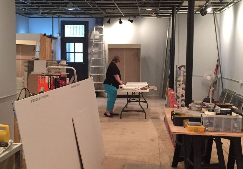
Step 6: Permits, Phasing, and the “Open During Renovation” Olympics
Renovation reality: permits and requirements vary by location and business activity, so you’ll often need to check local rules. Plan your renovation in phases if you want to keep selling while improving.
A practical phased approach
- Phase 1 (1–2 weeks): lighting + paint + entry zone reset (highest visual impact).
- Phase 2 (2–4 weeks): layout changes, new fixtures, signage system.
- Phase 3 (as needed): storefront restoration, flooring, deeper electrical/HVAC updates.
If your building is historic, you may also coordinate renovation decisions with preservation guidanceespecially for storefront elements. And if you’re doing construction while open, keep customer paths obvious and employee exit routes clear.
Step 7: The “After” PlaybookHow to Keep It Looking Renovated
Renovation isn’t a finish line. It’s a system. The stores that look great six months later do a few consistent things:
- Weekly reset: straighten vignettes, refresh hero displays, clear the decompression zone.
- Monthly rotation: swap feature zones (seasonal themes, holiday gifting, collectors’ corner).
- Lighting check: re-aim accent lights whenever you move major displays.
- Story discipline: every section should have a “why this exists” theme.
Measuring Success: Did the Renovation Work?
You don’t need fancy analytics to tell if the makeover is landing. Watch for:
- Longer dwell time: customers browse deeper into the store.
- More “touch points”: people pick up items (carefully!) and ask questions.
- Higher conversion: fewer “just looking” exits, more “I found something!” moments.
- Better average ticket: curated displays make add-on purchases feel natural.
The best part of a before and after antique store renovation isn’t the new paint or the prettier shelves. It’s the shift in customer behavior: people relax, explore, and buy with confidence because the store feels intentional.
Conclusion: Renovate for Wonder, Not Sterility
A great antique store renovation doesn’t remove the quirksit edits them. You keep the soul, fix the flow, upgrade the light, and tell clearer stories with your merchandise. The “after” should feel like the “before,” but with better posture.
Field Notes: Real-World Experiences from the Renovation Trenches (Extra )
Here’s the part nobody tells you about renovating an antique store: it’s emotionally similar to reorganizing a garage that contains your entire personality. You start with confidenceclipboard, coffee, big dreamsand end up sitting on the floor, staring at a stack of vintage frames like they personally betrayed you.
The first “experience” lesson is that decisions compound. You don’t just pick a paint color. You pick a paint color that reacts to your lighting, that flatters your wood tones, that doesn’t make brass look green, that still looks good at night, and that won’t make customers feel like they’re shopping inside a lemon. This is why lighting upgrades often feel like magic: once the light is right, half your other choices suddenly look smarter.
The second lesson: you can’t curate while you’re drowning in inventory. Many owners try to “renovate around” everything. But the most dramatic before-and-after transformations usually include a temporary purgeboxing up backstock, moving bulky pieces, and giving yourself visual breathing room. It’s not about having less; it’s about giving the good stuff space to perform. That mid-century chair can’t be a star if it’s wedged between six lamp shades and a suspiciously loud clock.
Another very real experience: customers will narrate the renovation in real time. Some will cheer you on. Some will mourn the old chaos (because it felt like a secret). And a few will stand in the doorway like historical reenactors announcing, “Well, it’s different.” Your job is to keep the charm while improving the shop’s readabilityclear zones, cleaner paths, and displays that invite browsing instead of triggering a fight-or-flight response.
If you stay open during renovations, you’ll develop a strange new talent: building a temporary shopping path that feels intentional. Painter’s tape becomes your best friend. A well-placed sign becomes a small miracle. And you’ll start thinking like a theme-park designer: “Where do I want the next ‘wow’ moment to happen?” In an antique store, the “wow” might be a glowing cabinet of vintage jewelry, a wall of mirrors that suddenly makes the room feel bigger, or a perfectly lit vignette where everything looks like it belongs together.
Finally: the day you finish, the store will feel too empty. This is normal. You’ll be tempted to fill every surface again because you’re used to the old density. Resist that impulse. The “after” version needs negative space the way antiques need patina: it’s what makes everything else feel authentic. The best compliment you can get isn’t “You added more stuff.” It’s “I can actually see everything… and now I want all of it.”