Table of Contents >> Show >> Hide
- How to Make Gold Work in a Color Palette
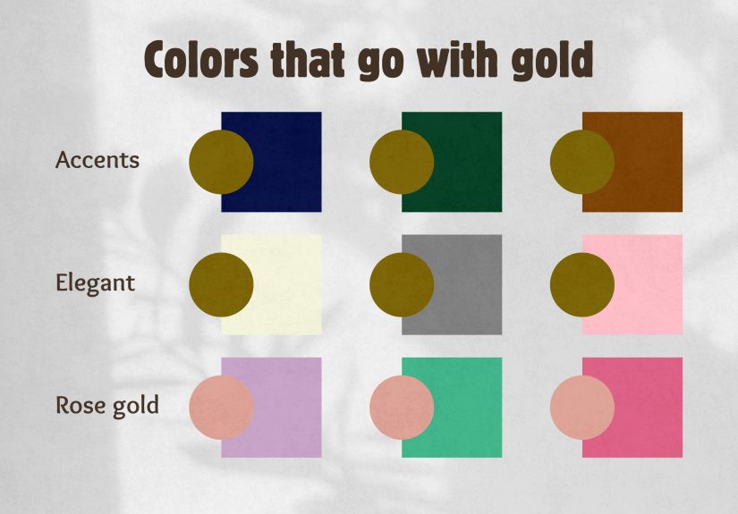
- 20 Colors That Go With Gold
- 1. White and Gold
- 2. Ivory and Gold
- 3. Black and Gold
- 4. Charcoal Gray and Gold
- 5. Navy Blue and Gold
- 6. Cobalt Blue and Gold
- 7. Teal and Gold
- 8. Turquoise and Gold
- 9. Emerald Green and Gold
- 10. Olive Green and Gold
- 11. Sage Green and Gold
- 12. Blush Pink and Gold
- 13. Dusty Rose and Gold
- 14. Mauve and Gold
- 15. Lavender or Plum and Gold
- 16. Burgundy and Gold
- 17. Terracotta and Gold
- 18. Rust and Gold
- 19. Chocolate Brown and Gold
- 20. Beige or Taupe and Gold
- How to Choose the Best Gold Pairing for Your Space
- Common Mistakes to Avoid When Decorating With Gold
- Final Thoughts
- Experience and Real-Life Styling Notes on Gold Color Pairings
- SEO Tags
Gold is one of those colors that walks into a room like it already owns the deed. It is warm, shiny, a little dramatic, and somehow capable of looking both ancient and trendy at the same time. But here is the tricky part: gold can look wildly elegant or wildly “why does this room feel like a treasure chest exploded?” depending on what you pair it with.
If you want gold to look intentional rather than accidental, you need the right supporting cast. The good news is that gold is surprisingly flexible. It plays nicely with crisp neutrals, moody jewel tones, earthy colors, and even a few soft romantic shades that seem too shy to hang out with anything metallic. In this guide, we will break down 20 creative color combinations with gold, explain why they work, and share practical ideas for using them in real spaces.
Whether you are planning a living room refresh, choosing paint, styling a bedroom, or simply trying to make that gold mirror feel less lonely, these color pairings can help you create a palette that feels polished, balanced, and a little bit fabulous.
How to Make Gold Work in a Color Palette
Before we jump into the pairings, one important note: not all gold looks the same. Bright yellow-gold, muted antique gold, champagne gold, and brushed brass each behave a little differently. That means the best color combinations often depend on the undertone and finish of your gold.
Three quick rules before you decorate
- Match the mood: Pair gold with dark, saturated tones for drama and with soft neutrals for calm elegance.
- Watch the undertones: Warm gold works beautifully with creamy whites, terracotta, and olive, while cooler champagne gold often looks best with gray, blush, and icy blue.
- Use restraint: Gold is like hot sauce. A little can be brilliant. Too much and everyone starts sweating.
20 Colors That Go With Gold
1. White and Gold
This is the cleanest, easiest, and most forgiving pairing on the list. White gives gold room to shine without competition. The result feels bright, airy, and upscale. Use this combination in kitchens, bathrooms, entryways, or bedrooms where you want a fresh look with a polished finish. Think white walls, gold hardware, and simple natural textures for balance.
2. Ivory and Gold
If white and gold feels a little too crisp, ivory and gold deliver a softer version. This combination feels elegant, warm, and slightly more traditional. It works especially well in formal dining rooms, classic bedrooms, and cozy living spaces. Ivory curtains, cream upholstery, and brushed gold accents can make a room feel expensive without trying too hard.
3. Black and Gold
Black and gold is the design-world equivalent of wearing sunglasses indoors and somehow pulling it off. Black grounds gold and makes it look richer, sharper, and more dramatic. This duo is ideal for powder rooms, dining rooms, office nooks, and statement furniture. To keep it from looking too heavy, add texture through velvet, linen, wood, or matte finishes.
4. Charcoal Gray and Gold
Charcoal gives you the sophistication of black but with a softer landing. Gold instantly warms gray, preventing the space from feeling cold or flat. This pairing is excellent in modern bedrooms, media rooms, and contemporary living rooms. If you want a moody palette that still feels inviting, charcoal and gold deserve a serious look.
5. Navy Blue and Gold
Navy and gold is one of the most classic combinations for a reason. Navy provides depth and authority, while gold adds warmth and a hint of glamour. Together, they feel refined and confident. Use navy walls with gold sconces, or add gold-framed art to a room with deep blue upholstery. It works in everything from tailored offices to dramatic bedrooms.
6. Cobalt Blue and Gold
For a bolder, more energetic version of the blue-and-gold story, try cobalt. This combo feels lively, artistic, and full of personality. It is especially effective in accent pieces, tile, pillows, or artwork. Cobalt and gold can easily steal the show, so keep the background neutral and let the duo do the heavy lifting.
7. Teal and Gold
Teal has enough blue to feel calm and enough green to feel lush, which makes it an excellent partner for gold. Together, they create a palette that feels rich but not stuffy. Teal sofas with gold legs, teal wallpaper with gold lines, or teal cabinetry with brass pulls all look fantastic. This pairing works in both contemporary and eclectic rooms.
8. Turquoise and Gold
Turquoise and gold bring a sunnier, more playful energy. This combination can lean coastal, bohemian, or vintage depending on how you style it. If your gold is slightly weathered or antique, turquoise makes it feel collected and storied. Add white or sand tones to keep the palette from becoming too loud.
9. Emerald Green and Gold
Emerald and gold are basically the prom king and queen of jewel tones. This combination feels luxurious, lush, and unmistakably dramatic. Emerald velvet chairs, dark green walls, and gold lighting fixtures create instant impact. It is a wonderful choice for dining rooms, home bars, dramatic bedrooms, and holiday-ready living rooms.
10. Olive Green and Gold
Olive green tones down the flashiness of gold and gives it a natural, earthy context. This pairing feels grounded, stylish, and quietly sophisticated. It works well in living rooms, kitchens, and bedrooms with wood tones, leather, and woven materials. If you want gold to feel warm rather than glitzy, olive is one of your best bets.
11. Sage Green and Gold
Sage brings softness to gold. The result is calm, pretty, and very easy to live with. This pairing has become especially popular in kitchens, bathrooms, and nurseries because it feels fresh without being sterile. Sage cabinets with gold knobs are a classic move, but sage textiles and gold-framed mirrors also do the job beautifully.
12. Blush Pink and Gold
Blush and gold create a light romantic look that feels soft, feminine, and surprisingly modern when done right. The trick is to keep the blush muted rather than bubblegum bright. Use blush bedding with gold lamps, blush curtains with champagne-gold hardware, or blush chairs against a neutral background. The mood is graceful, not sugary.
13. Dusty Rose and Gold
Dusty rose has more depth than blush, which makes it a stronger match for antique or brushed gold. This pairing feels mature, layered, and slightly vintage. It is excellent in bedrooms, sitting rooms, and event styling. Add cream, taupe, or walnut wood to keep the palette grounded and avoid making it look overly precious.
14. Mauve and Gold
Mauve sits in that magical middle ground between pink, purple, and gray, which gives gold a refined, subtle partner. Together, they look polished and a bit unexpected. Mauve walls with gold-framed artwork can feel serene and upscale, while mauve textiles with brass accents create a softer version of glam.
15. Lavender or Plum and Gold
Purple and gold have royal energy, but you get to choose how loud the crown should be. Lavender and gold feel airy and romantic, while plum and gold feel rich and theatrical. Either way, the combination has a strong visual identity. This is a great palette for bedrooms, powder rooms, and statement decor moments where you want color with personality.
16. Burgundy and Gold
Burgundy and gold are warm, moody, and full of old-world charm. They look especially beautiful in spaces with wood furniture, traditional details, or layered textiles. Burgundy can make gold feel deeper and more luxurious, especially when paired with velvet, wallpaper, or dramatic drapery. It is not shy, but it is undeniably beautiful.
17. Terracotta and Gold
Terracotta and gold feel sunbaked, relaxed, and welcoming. This pairing works because both colors share warmth, but they bring different textures to the table. Terracotta has an earthy, matte quality, while gold adds light and polish. Use this palette in Mediterranean, desert-inspired, or rustic-modern interiors for a look that feels both grounded and glowy.
18. Rust and Gold
Rust gives gold a deeper, autumnal companion. This pairing is bold but very livable, especially in rooms with natural materials like wood, cane, linen, or leather. Rust pillows on a neutral sofa with gold lighting can create instant character. It is ideal for people who want warmth and depth without going full holiday ornament.
19. Chocolate Brown and Gold
Chocolate brown and gold are rich in the best possible way. Brown makes gold feel warmer, more intimate, and less flashy. In a room with walnut furniture, caramel leather, and layered neutrals, gold accents can act like jewelry rather than the entire outfit. This is a lovely combination for libraries, bedrooms, and traditional living spaces.
20. Beige or Taupe and Gold
Beige, greige, and taupe are some of the easiest colors to pair with gold because they let the metallic finish shine without much risk. But “easy” does not mean boring. Taupe and gold can look incredibly sophisticated when you add texture through boucle, stone, linen, or plaster finishes. This palette is perfect if you want a quiet luxury look without screaming, “Please admire my throw pillows.”
How to Choose the Best Gold Pairing for Your Space
For a calm and airy room
Choose white, ivory, sage, blush, or taupe with gold. These combinations feel light, fresh, and easy to live with.
For a dramatic and moody room
Go for black, charcoal, navy, emerald, plum, or burgundy. These colors make gold look intense, luxurious, and more architectural.
For a warm and earthy room
Try olive, terracotta, rust, chocolate brown, or beige. These colors make gold feel grounded, natural, and welcoming rather than flashy.
For a playful or eclectic room
Mix gold with cobalt, teal, turquoise, or mauve. These combinations add energy and personality while still feeling curated.
Common Mistakes to Avoid When Decorating With Gold
- Using too many shiny finishes: If everything reflects light, nothing feels special. Mix matte, brushed, and natural textures.
- Ignoring undertones: Warm gold can clash with icy grays or blue-heavy whites if you do not test the palette first.
- Overcrowding the room: Gold has visual weight. Let it breathe by balancing it with solids, neutrals, or negative space.
- Forgetting scale: Small gold accents feel chic. Too many oversized gold pieces can make the room feel heavy or theme-y.
Final Thoughts
Gold is not just a color; it is a mood. It can make a space feel bright, glamorous, earthy, regal, cozy, or quietly luxurious depending on what you pair it with. The smartest way to use it is not to treat it like the star of every scene, but like the perfect supporting actor who makes everyone else look better.
If you love crisp elegance, pair gold with white or ivory. If you crave drama, reach for navy, black, emerald, or burgundy. If you want something warmer and more organic, olive, rust, terracotta, and taupe can make gold feel beautifully grounded. And if you are in a more adventurous mood, mauve, cobalt, and turquoise are ready to have some fun.
In other words, gold is versatile, stylish, and a little bit theatrical. Which, frankly, is more than can be said for most paint chips.
Experience and Real-Life Styling Notes on Gold Color Pairings
One of the most interesting things about decorating with gold is how differently it behaves from room to room. In bright natural light, gold often reads softer and warmer than people expect. It can look almost buttery in the morning, especially next to white walls or pale wood. But at night, under lamps or overhead fixtures, that same gold can suddenly look richer, deeper, and more dramatic. That shift is one reason so many people either fall in love with gold or become suspicious of it after one badly lit evening.
In real homes, the most successful gold palettes usually are not the loudest ones. They are the ones that balance shine with something calm. A gold mirror above a taupe console. Sage cabinets with simple brass pulls. A navy pillow with a thin metallic trim. These small combinations often have more staying power than an all-out “gold everywhere” approach. Gold tends to look best when it feels layered into a room, not dropped into it like a trophy.
Another common experience is that people think they want bold gold pairings, but end up living more happily with softened versions. Instead of fire-engine red and bright gold, they choose burgundy and brushed brass. Instead of lemon yellow and metallic gold, they lean toward terracotta and antique gold. That softening matters. It makes the palette easier to live with every day, especially in rooms where you want comfort instead of constant visual fireworks.
Texture also changes everything. Gold next to velvet feels lush. Gold next to linen feels relaxed. Gold next to concrete or plaster feels modern. Gold next to dark wood feels classic. In other words, the color pairing is only half the story. The finish and material can completely change the vibe. A teal lacquer cabinet with polished gold hardware feels glamorous, while a teal linen pillow with a brushed-gold lamp feels casual and collected.
People also tend to underestimate how forgiving gold can be. It sounds fancy, but in practice it works across a wide range of styles. It can live in a farmhouse kitchen, a modern condo, a traditional dining room, or a boho bedroom. The secret is choosing the right gold. Shiny yellow gold can feel formal and flashy, while champagne, brass, or antique gold often feel softer and easier to integrate.
If you are nervous about trying gold, start small. Hardware, frames, tray tables, lighting, and decorative accents are all low-risk ways to test a palette. Once you see which colors make the gold sing instead of shout, you can build from there. In most cases, gold does not need a whole room devoted to it. It just needs the right company. And like most good design decisions, the magic usually happens when confidence meets restraint.