Table of Contents >> Show >> Hide
- Why Black and White Checks Still Work So Well
- Not All Checks Are the Same, and That Matters
- Why Linen Is the Perfect Partner for Black and White Checks
- Where Black and White Checked Linen Works Best
- How to Style the Pattern Without Overdoing It
- Choosing the Right Fabric Blend
- Care Tips for Black and White Linen and Checked Fabrics
- Common Mistakes to Avoid
- The Last Word on Black and White Checks
- Real-Life Experiences With Black and White Checked Linen
- SEO Tags
Some patterns whisper. Black and white checks walk into the room, pull out a chair, and casually become the entire personality of the space. That sounds dramatic, but honestly, the pattern has earned it. Whether it shows up as crisp gingham, bold buffalo check, or clean checkerboard, black and white checks have a rare talent: they feel classic without feeling sleepy, graphic without feeling cold, and charming without trying too hard.
Pair that visual snap with linen, and things get even better. Linen takes the sharp edges off a high-contrast pattern. It adds softness, texture, airiness, and that slightly rumpled “I definitely have my life together, but I’m not going to brag about it” energy. The result is a look that works in farmhouse kitchens, modern bedrooms, casual dining rooms, cottage spaces, and even more polished interiors that need a little heartbeat.
This is what makes black and white checked fabrics so enduring: they can be playful or tailored, rustic or refined, cozy or crisp. The secret is not just the pattern. It is the material, the scale, the setting, and the styling choices around it. And if you choose linen or a linen-forward blend, you get one of the easiest ways to make this graphic look feel more elevated and less costume-y.
Why Black and White Checks Still Work So Well
Trends come and go, but black and white checks keep finding new jobs. One decade they are country kitchen darlings. The next, they are modern café curtains. Then they reappear on bedding, tea towels, slipcovers, or a statement chair and somehow feel fresh again. That is the magic of a simple geometric pattern in the most classic contrast possible.
Black and white is one of the easiest decorating combinations to build around because it behaves almost like a neutral palette. It is high contrast, yes, but it also plays nicely with wood, brass, chrome, rattan, stone, leather, painted furniture, and nearly every accent color imaginable. Add olive green, and the room feels earthy. Add blush, and it softens immediately. Add red, and suddenly the whole thing looks like it belongs in a very stylish country house with excellent pie.
Checks also bring order. Florals can be romantic. Abstract prints can be artsy. Stripes can be sharp. But checks feel grounded. They give the eye a grid to land on, which makes them useful in rooms that need structure, especially when everything else is soft, layered, or organic. That is one reason checked linens work so beautifully in casual interiors: the pattern keeps all that softness from drifting into visual mush.
Not All Checks Are the Same, and That Matters
Before you buy a single pillow cover or tablecloth, it helps to know which version of the look you actually want. “Black and white checks” is a broad family, and the cousins have very different personalities.
Gingham
Gingham is the friendliest member of the group. It is clean, balanced, and usually feels lighthearted. In black and white, gingham can lean cottage, French country, or modern-preppy depending on scale and fabric. Small gingham reads tidy and sweet. Medium gingham feels classic. Oversized gingham makes more of a statement and can look surprisingly contemporary.
Buffalo Check
Buffalo check is bolder and more rugged. The squares are generally larger, the visual weight is heavier, and the mood is less picnic-on-the-lawn, more cozy-weekend-cabin-with-better-lighting. In black and white, buffalo check can still look sophisticated, especially when used sparingly on upholstery, throws, or bench cushions.
Checkerboard
Checkerboard is the cleanest and most graphic option. It feels less textile-traditional and more design-forward. This is the version that works beautifully when you want the room to feel slightly modern, slightly artsy, or just less overtly “country.” On linen napkins, curtains, and cushions, checkerboard can feel playful without becoming childish.
So yes, they are all checks. No, they are not interchangeable. Choosing the right one is the difference between “cozy and collected” and “why does my breakfast nook look like it is auditioning for a pie festival?”
Why Linen Is the Perfect Partner for Black and White Checks
If black and white checks bring the graphic drama, linen brings the emotional intelligence. Linen softens the pattern without erasing its charm. Because linen has visible texture, a matte finish, and a more relaxed drape than many cottons or synthetics, it makes a strong pattern feel lived-in rather than loud.
This matters more than people think. On a slick, shiny surface, black and white checks can veer hard into novelty. On linen, they settle down. The pattern still reads clearly, but the fabric introduces depth and irregularity. It looks richer. More natural. Less like it was printed five minutes ago and more like it belongs in the room.
Linen is also practical for the categories where checks thrive. In bedding, it is breathable and comfortable. In table linens, it looks intentionally relaxed, even with a few wrinkles. In curtains, it filters light in a way that feels soft and architectural. In kitchen textiles, it brings that effortless European-market energy people keep trying to fake with décor mood boards and very expensive breadboards.
Another advantage is that linen ages well visually. Many fabrics look tired when they crease. Linen usually just looks like linen. That is not a flaw. It is part of the appeal. A slightly rumpled black and white checked linen runner feels charming. A heavily wrinkled polyester one feels like someone gave up halfway through hosting.
Where Black and White Checked Linen Works Best
In the Kitchen
This is the most natural habitat for the pattern. Black and white checks in the kitchen feel timeless because they connect to utility, comfort, and tradition. Think café curtains, cabinet skirts, tea towels, chair pads, or a simple tablecloth. Linen is especially strong here because it softens the contrast and makes even basic functional items feel stylish.
A black and white checked linen Roman shade above a sink can make an otherwise plain kitchen feel intentional. A runner on a farmhouse table adds rhythm without overwhelming the room. Even a pair of checked tea towels draped casually over the oven handle can pull together a space that has white cabinets, wood shelves, and matte black hardware.
In the Dining Room
Dining spaces love pattern, but they also need balance. A full black and white checked tablecloth makes a cheerful statement, while linen napkins or placemats give you a subtler entry point. If the room already has patterned wallpaper or dramatic lighting, go smaller. If the room is neutral and spare, go bigger. A great table setting often comes down to contrast, and checks provide it instantly.
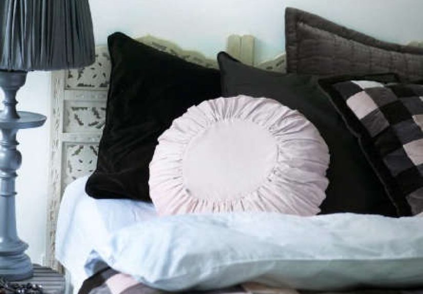
In the Bedroom
Black and white checks on bedding can look crisp, cozy, or both. Linen duvet covers and shams in a checked pattern have more depth than flat cotton prints, which makes the bed feel layered before you even add a throw blanket. The key is not to let the pattern take over everything. One checked duvet cover with solid sheets and a textured throw works. So does a solid duvet with checked pillow shams. An entire bed in competing checks starts to look like a board game.
In the Living Room
This is where scale matters most. A small black and white checked linen pillow can feel classic and versatile. An oversized checked armchair becomes the focal point of the room. Both can work. What you do not want is a dozen small checked accents sprinkled around like decorative confetti. That makes the pattern feel accidental instead of deliberate.
In Entryways and Utility Spaces
Never underestimate a humble hallway bench cushion or laundry room curtain. Black and white checks shine in transition spaces because they add personality fast. Linen keeps these little moments from feeling too precious. The look says, “Yes, this is the mudroom. But it is the mudroom of someone with standards.”
How to Style the Pattern Without Overdoing It
Let One Item Lead
Choose one hero piece: a curtain, a duvet, a tablecloth, or a chair. Then let everything else support it. This keeps the room from feeling over-patterned and gives the eye a clear place to land.
Warm It Up
Black and white can feel stark if everything around it is also cold. Add oak, walnut, seagrass, linen solids, ceramic pieces, antique brass, or soft cream tones. Warm materials make the contrast feel inviting rather than severe.
Mix Pattern Carefully
Checks can absolutely coexist with florals, stripes, and even more abstract prints. The trick is varying scale and keeping the color story consistent. A large black and white check with a small floral in muted greens can feel beautiful. A medium check with a medium stripe in the same visual weight can turn into a referee uniform situation.
Use the Pattern in Unexpected Ways
If you are bored of the obvious tablecloth-and-napkin route, try checked linen lampshades, framed fabric panels, a bed valance, or simple tie-top curtains. Small architectural uses often look more custom than buying another throw pillow and hoping for the best.
Choosing the Right Fabric Blend
Not every black and white check needs to be pure linen, but understanding the fabric options helps you pick the right item for the job.
100% Linen
Best for: curtains, table linens, decorative pillow covers, and elevated bedding. This option offers the most texture and the most relaxed drape. It also wrinkles the most, which is either part of the charm or your personal villain origin story, depending on your tolerance.
Linen-Cotton Blend
Best for: everyday use. This is the sweet spot for many households because it gives you some of linen’s texture and softness with a little more structure and easier care. Great for kitchen textiles, casual bedding, and family-friendly spaces.
Cotton Percale or Cotton Twill
Best for: crisp bedding, sturdier upholstery accents, and people who want checks without the relaxed rumple. Cotton tends to read cleaner and slightly more tailored. If linen is the charming weekend house, cotton is the polished guest room.
Care Tips for Black and White Linen and Checked Fabrics
If you invest in good checked linens, care matters. Wash dark-and-light contrasts carefully so the black stays rich and the white does not turn sad and gray. Follow the care label, use gentle detergent, and avoid blasting delicate pieces with high heat. Linen generally prefers cooler water, gentle cycles, and either low heat or air drying when possible.
Remove items promptly from the dryer to control wrinkling. For table linens and curtains, a steamer is your best friend. For bedding, embrace a little texture. Nobody expects linen to look laser-flat, and frankly, if your duvet looks too perfect, people may suspect you are hiding something.
Store clean linens fully dry and folded loosely. For seasonal tablecloths or guest bedding, keeping them in a cool, dry spot helps preserve both the fibers and the contrast in the pattern.
Common Mistakes to Avoid
Using checks everywhere at once. One strong checked fabric can be delightful. Five in one room can feel like visual yelling.
Ignoring scale. Tiny checks disappear from across the room. Giant checks can dominate a small space. Match the scale to the size of the room and the role of the item.
Forgetting texture. Black and white checks need something to play off. Wood, woven fibers, matte ceramics, and soft solids keep the look layered.
Choosing the wrong mood. Want refined and relaxed? Go linen. Want crisp and tailored? Go cotton. The pattern alone does not set the tone; the fabric finishes the sentence.
The Last Word on Black and White Checks
Black and white checked fabrics survive every decorating cycle for a reason. They are familiar, graphic, versatile, and full of personality. They can nod to country style, vintage kitchens, French-inspired interiors, modern minimalism, or cheerful cottage rooms without losing their identity. That is rare.
Linen makes the pattern even better by bringing in softness, breathability, movement, and texture. Instead of looking flat or too theme-driven, black and white checks on linen feel grounded and stylish. They are the design equivalent of a person who knows exactly who they are and does not need to announce it.
If you want a home textile that can be charming, crisp, practical, and a little dramatic in the best possible way, this combination is hard to beat. Just remember the golden rule: let the pattern make a point, and let the fabric make it feel human.
Real-Life Experiences With Black and White Checked Linen
Living with black and white checked linen is very different from admiring it in a photo. In pictures, it looks perfectly styled, casually folded, and suspiciously wrinkle-free. In real homes, it is better. It looks used, touched, washed, draped, and lived with. That is exactly why people keep coming back to it.
In a kitchen, for example, checked linen does not have to be precious to be beautiful. A slightly rumpled tea towel hanging from the oven, a softened runner on the table, or a café curtain that catches morning light all develop more character over time. The pattern gives the room energy, while the linen stops it from looking too crisp or too staged. Even after repeated washing, good linen tends to become more inviting rather than less. It relaxes. It settles in. It starts to feel like part of the daily rhythm of the house.
On a bed, black and white checked linen creates a mood that is hard to fake with smoother fabrics. It can look classic one week, playful the next, and slightly European after you toss a knit blanket across the foot of the bed and pretend that was effortless. The real experience is that it makes the room feel finished even when the rest of the décor is simple. You do not need six decorative pillows performing a Broadway number on the mattress. The pattern already did the work.
There is also something satisfying about how adaptable it feels through the seasons. In spring and summer, black and white checked linen reads fresh and airy, especially when paired with white walls, natural wood, and green branches in a vase. In fall and winter, the same pattern can feel cozier with darker woods, a wool throw, or warm brass accents. It does not demand a full redesign every time the weather changes. It just changes mood with the supporting cast.
One of the most useful real-world lessons is that this look does best when it is allowed to breathe. People often make the mistake of buying the checked curtains, the checked pillows, the checked napkins, and the checked bench cushion all at once. Then the room starts looking less curated and more like a very committed tribute act. In actual lived spaces, black and white checked linen is strongest when one or two pieces carry the theme and everything else gives them room to shine.
Another experience many homeowners discover quickly: linen forgives more than you think. The wrinkles do not read messy in the way they might on a shinier fabric. Instead, they add softness and realism. You stop trying to force perfection and start appreciating texture. That shift changes how the whole room feels. It becomes easier, more comfortable, and less concerned with looking untouched.
Ultimately, the appeal of black and white checked linen is not just that it photographs well. It is that it lives well. It works on ordinary weekdays, not just during holiday tablescapes or magazine-worthy resets. It can handle coffee, breakfast, houseguests, lazy Sundays, and the occasional design crisis. And somehow, after all that, it still looks charming. That is not just a trend. That is a keeper.