Table of Contents >> Show >> Hide
- Why This Idea Hits So Hard
- The Real Meaning Behind the Worst Client Comments
- 1. “Make It Pop” Means “I’m Not Sure What’s Wrong”
- 2. “I’ll Know It When I See It” Means “We Skipped Alignment”
- 3. “Can You Try a Few More Options?” Means “The Brief Was Too Soft”
- 4. “Can We Make It More Premium but Also More Approachable?” Means “We Want Contradictions Resolved by Magic”
- 5. “The CEO’s Niece Preferred the First Version” Means “The Review Process Has Left the Building”
- How You Turn Nonsense Into Poster-Worthy Design
- Ten Terrible Client Comments That Deserve the Poster Treatment
- What These Posters Actually Say About Creative Work
- How Creative Teams Can Avoid Becoming Poster Quotes
- What It Feels Like in Real Life: Studio Experience, War Stories, and Why This Topic Never Dies
- Conclusion
Every creative person has heard it. The soul-leaving-the-body phrase. The feedback note that arrives with the confidence of a TED Talk and the clarity of a haunted fog machine. “Can you make it pop?” “I’ll know it when I see it.” “Let’s try something cleaner, but also bolder, warmer, cooler, more premium, more fun, and somehow less expensive.” At some point, you either cry into your cold coffee or do what smart designers, writers, and agency teams have always done: turn the pain into material.
That’s the spirit behind “Fuckilarious Bullshit: We Turned The Worst Client Comments Into Posters”a deliciously sharp concept that takes the worst client comments and transforms them into something useful, funny, and weirdly beautiful. On the surface, it’s a design joke. Underneath, it’s a commentary on creative work, bad feedback, messy approval chains, scope creep, and the strange little circus that happens when business language tries to wear a creative hat.
The idea works because it does two things at once. First, it entertains. Second, it reveals a real truth about agency life and freelance design: terrible client comments usually aren’t random. They’re symptoms. They point to missing briefs, unclear goals, too many stakeholders, vague review processes, and a fundamental mismatch between what the client wants and what they know how to articulate. So yes, the posters are funny. But they’re also tiny framed case studies in how creative projects go sideways.
Why This Idea Hits So Hard
Creative professionals love this concept because it gives shape to a shared experience. Whether you work in branding, copywriting, illustration, advertising, UX, social media, or content marketing, you’ve likely collected a mental scrapbook of absurd feedback. The words change, but the energy stays the same: high emotion, low specificity, and one urgent desire to change everything without technically changing anything.
That tension has been part of the creative process forever. Good work depends on feedback, but bad feedback creates chaos. Constructive critique is grounded in goals, audience, tone, hierarchy, usability, and business outcomes. Bad critique sounds like a horoscope written by a committee. It turns revision rounds into archaeological digs where the team tries to uncover what the client actually meant three emails ago.
Turning these comments into posters is brilliant because posters thrive on contrast, hierarchy, brevity, and attitude. A ridiculous line like “Can we make the logo bigger but less noticeable?” suddenly becomes visual art. You place it in oversized type, give it too much confidence, pair it with minimalist composition, and now the thing that once caused emotional damage has become office decor. That’s not just revenge. That’s alchemy.
The Real Meaning Behind the Worst Client Comments
Funny as they are, bad client comments usually fall into a few recognizable categories. Once you understand those categories, the joke gets even betterand the creative process gets easier to manage.
1. “Make It Pop” Means “I’m Not Sure What’s Wrong”
This is the king of vague feedback. The client senses the work is missing something but can’t define the issue. Maybe the visual hierarchy is weak. Maybe the call to action is buried. Maybe the color contrast is flat. Maybe the concept itself lacks tension. “Make it pop” sounds silly, but it often signals a real need for stronger emphasis, better contrast, or a clearer focal point.
2. “I’ll Know It When I See It” Means “We Skipped Alignment”
Translation: nobody agreed on the destination before the project began. When goals, references, audience expectations, and success metrics aren’t nailed down early, the review stage turns into speed dating with disappointment. The poster version of this comment is hilarious because it captures a truth every freelancer knows: uncertainty becomes expensive when it shows up late.
3. “Can You Try a Few More Options?” Means “The Brief Was Too Soft”
Exploration is normal. Endless exploration is a budget-eating swamp creature. If a client keeps asking for more versions without providing sharper direction, the issue usually isn’t the designer’s effort. It’s the absence of constraints. Good creative work needs a lane. Bad process keeps repainting the road.
4. “Can We Make It More Premium but Also More Approachable?” Means “We Want Contradictions Resolved by Magic”
Some tension in a brief is healthy. Brands do need balance. But when feedback piles opposing adjectives into one sentence, the creative team ends up trying to design a unicorn in loafers. Posterizing that kind of comment works because the line already has built-in comedy. It’s corporate poetry accidentally written in panic.
5. “The CEO’s Niece Preferred the First Version” Means “The Review Process Has Left the Building”
Nothing derails a project faster than random stakeholder gravity. Once unauthorized opinions start steering decisions, the work stops responding to strategy and starts responding to politics. That’s not collaboration. That’s creative pinball.
How You Turn Nonsense Into Poster-Worthy Design
If you were actually producing a poster series based on the worst client comments, the magic would live in the contrast between trash feedback and high-quality execution. The quote is the joke, but design makes the joke land.
Lead with typography
Poster design lives or dies on hierarchy. The comment should be the hero. Big type, clean spacing, deliberate line breaks, and enough negative space to let the absurdity breathe. When the phrase is chaotic, the layout should be calm. That contrast makes the humor sharper.
Use visual restraint
The best poster concepts don’t scream every idea at once. They pick one attitude and commit. A single grotesk font, one punchy accent color, and a dead-serious layout can make an absurd client line feel ten times funnier. Think museum wall meets creative meltdown.
Turn subtext into art direction
If the quote is “Can it be more modern?” the poster could mimic every trend the internet has overused in the past five years. If the quote is “Please make the logo bigger,” the logo could consume 90% of the poster while somehow still looking insecure. The best execution takes the hidden meaning of the comment and pushes it one click past reasonable.
Make the format feel collectible
This concept gets stronger when the posters feel like a real series rather than one-off jokes. Shared grids, recurring type treatments, limited color systems, and consistent tone make the whole project feel intentional. That matters because satire lands harder when it looks polished enough to buy.
Ten Terrible Client Comments That Deserve the Poster Treatment
“Can you make it pop?”
The all-time classic. It deserves a giant headline, aggressive contrast, and maybe one tiny footnote that reads, “No additional information was provided.”
“I love it, but can we start over?”
Equal parts breakup text and creative brief. It belongs on a poster with elegant serif type and the emotional energy of a luxury disaster.
“Can you make it viral?”
Nothing says “we misunderstand both marketing and the internet” like treating virality as a button in the toolbar. This one practically designs itself.
“Let’s keep it simple, but add more information.”
A timeless ode to overcrowded brochures, overstuffed landing pages, and event posters with the density of a tax form.
“The logo needs to be bigger.”
This isn’t feedback. It’s a genre. It deserves an oversized treatment so dramatic it starts to feel like parody and ends up as documentary evidence.
“Can we see 27 more options?”
Great poster line, especially when set in beautifully restrained type that implies the designer has already left the chat emotionally.
“It doesn’t feel luxury enough.”
The poster version should look expensive enough to make everyone uncomfortable, then reveal nothing specific about what “luxury” means.
“Can you just…”
Perhaps the two most dangerous words in client services. “Can you just” has launched a thousand unpaid revisions and at least six existential crises.
“Our intern had a few thoughts.”
The issue isn’t interns. The issue is when project governance collapses and every opinion enters the room wearing equal authority.
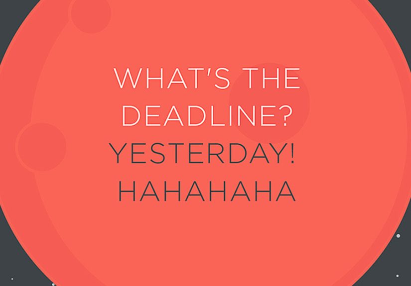
“We’re almost there.”
This one should be printed in elegant, optimistic type and sold next to candles. Every creative person knows it usually means the opposite.
What These Posters Actually Say About Creative Work
Under the jokes, this concept shines because it exposes the invisible labor behind creative projects. Great work is not just ideas. It is translation. It is diplomacy. It is turning fuzzy feelings into usable direction. It is protecting strategy from chaos while staying flexible enough to collaborate. And sometimes it is reading a sentence like “Can it be younger but more timeless?” and replying with grace instead of setting your laptop on a nearby hill.
That’s why this topic has strong appeal for agencies, freelancers, in-house teams, and even clients with a sense of humor. It gives everyone a better vocabulary for what good feedback should look like. Helpful feedback names the problem. It connects comments to audience, message, goals, and performance. Unhelpful feedback performs taste without context. One moves the work forward. The other creates poster material.
There’s also a branding lesson here. Humor is one of the best ways to make professional truth memorable. A dry article called “Common Communication Challenges in Client Review Cycles” may be accurate, but nobody is hanging it in the studio kitchen. A poster that says “Can You Make It Pop?” in glorious oversized type? That thing lives forever.
How Creative Teams Can Avoid Becoming Poster Quotes
The funny part is that the best way to honor this concept is not just to laugh at it. It’s to fix the process that creates it. Better briefs lead to better first drafts. Clear revision limits protect timelines and sanity. Fewer decision-makers create cleaner approvals. Strong presentation framing gets better critique than “What do you think?” ever will.
Creative teams can also reduce nonsense by asking smarter questions earlier. Who is the audience? What action should they take? What should they feel? What must remain unchanged? What references do we like, and more importantly, why? What does success look like beyond someone saying, “Yeah, that feels nice”?
Clients are not villains by default. Most are trying to solve a business problem, and many simply lack the vocabulary to articulate creative direction. That’s where experienced designers, strategists, and writers earn their keep. The job is not only to make the thing. The job is to guide the conversation so the thing can be made well.
Still, when the process fails and somebody drops “Can you make it more blue, but not look blue?” into the feedback doc, please know this: you are not alone. You are simply one deadpan layout away from a very strong poster series.
What It Feels Like in Real Life: Studio Experience, War Stories, and Why This Topic Never Dies
Anyone who has spent real time in a studio, agency, content team, or freelance business knows this topic sticks around because it’s painfully relatable. The worst client comments are rarely dramatic enough to become full disasters on their own. Instead, they arrive like paper cuts. One vague note. One surprise stakeholder. One “tiny tweak” that somehow requires a new concept, updated copy, reformatted files, and a team meeting that could have been prevented by a brief written like an adult document.
I’ve seen projects start with incredible optimism. Everyone is friendly. The kickoff call is smooth. The deck looks polished. Then the feedback begins. At first, it’s manageable: “Could we explore one more route?” Sure. Reasonable. Then a second voice joins in and wants a different direction. Then someone asks whether the thing feels “elevated enough.” Then someone else says it feels “too elevated.” Suddenly the work is no longer being judged against a strategy. It’s being judged against mood swings wearing business-casual language.
That is why a poster series like this feels so satisfying. It captures the emotional weather of the job. Not just the frustration, but the comedy of it. Because once the deadline passes and the blood pressure drops, many of these comments become genuinely funny. They reveal how strange professional communication can be when people want creative excellence without the time, trust, specificity, or process that excellence usually requires.
There’s also something comforting about seeing the worst comments turned into objects. A poster says: this happened, it was ridiculous, and we survived. Better yet, we made something cool out of it. That’s a deeply creative instincttaking friction, absurdity, and contradiction and reshaping it into form. It’s basically the whole job description, just with swearing and better kerning.
And let’s be honest: some of the funniest lines come from perfectly decent clients having one very bad feedback day. They are tired. Their boss is circling. Their sales team wants more. Their founder wants less. Their legal team wants safer language. Their audience wants excitement. Their brand wants consistency. Out of that blender comes a sentence like, “Can we make it stand out more while keeping it subtle?” That comment is annoying, yes. But it also tells a story about pressure, competing agendas, and the impossible dream of pleasing everyone at once.
So the enduring appeal of “Fuckilarious Bullshit: We Turned The Worst Client Comments Into Posters” is bigger than the joke. It reflects the modern creative economy. It speaks to revision fatigue, soft briefs, stakeholder clutter, and the weird heroism required to keep producing great work inside imperfect systems. Most of all, it reminds creative people that humor is not a distraction from the job. Sometimes it is the survival skill that makes the job possible.
Conclusion
“Fuckilarious Bullshit: We Turned The Worst Client Comments Into Posters” works because it’s funny, visually rich, and brutally recognizable. It turns vague feedback, revision chaos, and agency pain into something shareable and smart. More importantly, it reveals a useful truth: the worst client comments are often signs of broken process, not broken talent. When you understand that, the posters become more than jokes. They become a commentary on how creative work really happensand how it can happen better.
So frame the nonsense. Hang the absurdity. Laugh a little. Then go tighten the brief, limit the revisions, define the audience, and save your future self from hearing “Can you make it pop?” for the nineteenth time before lunch.