Table of Contents >> Show >> Hide
- What Is a “Hanging Instagram Wall Display,” Exactly?
- Plan Like a Designer (So You Don’t End Up with 17 Unnecessary Holes)
- Print and Prep: Make Digital Photos Look Great on a Wall
- Hanging 101: Height, Spacing, and Hardware (a.k.a. Preventing the 2 a.m. Crash)
- Step-by-Step: Build Your Hanging Instagram Wall Display in an Afternoon
- Style Upgrades That Make It Look “Intentional,” Not “Accidental”
- Common Mistakes (and How to Avoid Them Without Crying)
- Conclusion: Turn Your Feed Into a Space You Actually Live In
- Extra: of Real-World “Experience” Tips (What People Actually Run Into)
Your camera roll is basically a museum. Unfortunately, it currently lives inside a rectangle you drop on your face at 1 a.m. while whispering, “Just one more scroll.”
A Hanging Instagram Wall Display is how you rescue your favorite shots from phone purgatory and give them a real job: making your home look intentional, personal, and (ideally) not like a dorm room held together by hope and mystery tape.
This guide walks you through planning, printing, and hanging an Instagram-style photo wall that feels modern and curatedwithout turning your drywall into Swiss cheese. We’ll keep it practical, renter-friendly where possible, and just nerdy enough to get clean lines.
What Is a “Hanging Instagram Wall Display,” Exactly?
Think of it as an IRL version of your grid: a collection of photos (often square prints) arranged with consistent spacing and a cohesive vibe. It overlaps with a traditional gallery wall, but the “Instagram” flavor usually means at least one of these:
- Square photos (hello, classic feed shape).
- A defined color story (bright and airy, moody neutrals, bold pops, black-and-white, etc.).
- Repeatable structure (a clean grid, a tidy row, or a “controlled chaos” salon layout).
- Content that’s personal (travel, family, pets, food you were proud of, sunsets you swear looked even better in person).
The goal isn’t perfectionit’s cohesion. Your wall should read like a curated collection, not “I printed 40 photos and panicked.”
Plan Like a Designer (So You Don’t End Up with 17 Unnecessary Holes)
Start with a theme and a color mood
Before you measure anything, choose a simple through-line. Examples: all black-and-white, one trip, one year, all sunsets, or a “life greatest hits” mix with a consistent edit.
Quick trick: pick a “dominant” color family (warm neutrals, cool blues, rich greens) and make sure most photos share it. This makes even mismatched frames feel intentional.
Choose a layout that matches your personality
- The Grid: clean, modern, easiest to make Instagram-y. Best if you love symmetry and the idea of measuring doesn’t make you itchy.
- The Row or Column: great for hallways, stairs, or narrow walls. Feels minimal and polished.
- The “Salon” Gallery: mixed sizes and frames, art + photos together, more collected. Great if you’re into texture and layering.
- The Ledge Display: photos lean on picture ledges. Super swappable, very renter-friendly, low-commitment energy.
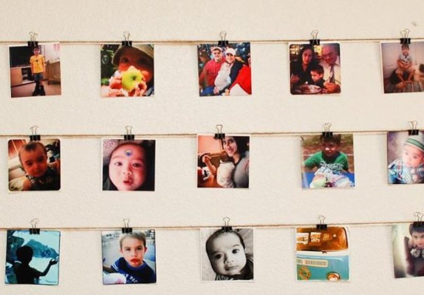
- The Clip/Line Hang: string + clips (or a rail system). Casual, playful, easy to refresh seasonally.
Mock it up before you commit
Professional-looking walls are rarely spontaneous. The easiest low-stress method is making templates: trace each frame on kraft paper (or printer paper taped together), cut them out, and tape the templates to the wall. Rearrange until it looks right from across the room.
If you’re doing a grid, lay the frames on the floor first, measure spacing, and take a photo of the layout as your “map.” Future-you will appreciate past-you’s organization skills.
Print and Prep: Make Digital Photos Look Great on a Wall
Pick print sizes that fit your space (and your patience)
Instagram-style displays often use square prints for a cohesive look. Common choices: 4×4 for dense grids, 5×5 for medium walls, and 8×8 when you want a bolder impact. Bigger prints typically feel more “designed” from across the roomtiny prints can get visually lost unless you use many of them.
Practical example: a 3×3 grid (9 photos) with 8×8 prints and 2-inch spacing creates a strong focal point above a console or sofa. A 4×4 grid (16 photos) with 5×5 prints makes a satisfying “feed wall” in an entryway or hallway.
Edit for consistency (your wall is not a phone screen)
Photos on a wall are viewed from farther away, in different lighting, and usually next to other photosso consistency matters more than “perfect.” Do a quick pass to:
- Normalize brightness (avoid one photo that’s dramatically darker than the rest).
- Keep skin tones consistent (if half your wall looks sunburned and half looks like a vampire documentary, adjust warmth).
- Crop thoughtfully (center subjects, avoid chopping heads, unless you’re going for “art.”)
- Choose one finish vibe (all matte, all glossy, or a planned mix).
Decide: framed, unframed, or “somehow both”
Framed prints look finished and protect photos, but cost more. Unframed prints (hung with clips, rails, or adhesive strips) are flexible and casual. For a modern “Instagram wall,” many people choose:
- Matching frames (same color/size) for a clean grid.
- Mixed frames in a limited palette (black + wood, white + brass) for a collected look.
- Mats (wide mats = airy, gallery feel; no mats = punchier, more graphic).
Hanging 101: Height, Spacing, and Hardware (a.k.a. Preventing the 2 a.m. Crash)
The height rule that saves almost everyone
A widely used standard is to place the center of the artwork around 57 inches from the floor (roughly average eye level). For a group of frames, treat the entire grouping like one pieceaim for the center of the whole arrangement at about that height.
Exception: if your display sits above furniture (sofa, credenza, bed headboard), the wall piece usually looks best when it visually “connects” to the furniture. A common guideline is placing the bottom of the lowest frame about 7–10 inches above the top of the furniture.
Spacing: pick a number and commit
Consistent spacing is what makes a wall look “designed.” Many decorators aim for about 2 inches between frames for a tight, cohesive look. Larger pieces can handle a little more breathing room, but if spacing gets too wide, the collection starts to look like separate items that happen to be near each other… which is not the same as a curated display.
Studs vs. drywall: what actually holds?
If you can hit a stud, do itespecially for heavy frames, glass-front pieces, or anything you would genuinely miss if it fell and exploded. If a stud isn’t where you need it, use appropriate drywall anchors or rated picture-hanging hardware.
Drywall anchors come in multiple styles (plastic expansion, self-drilling, molly/toggle styles). The right choice depends on wall type and weight. Always match the anchor’s rating to your frame weightthen give yourself a little safety margin (because frames don’t politely weigh exactly what the label says).
Damage-free hanging: Command strips (read this before you peel anything)
For rentersor commitment-phobesadhesive hanging systems can work well when used correctly. The biggest failures usually happen because of skipping instructions, not because “the strips are trash.”
- Wait after painting before applying (fresh paint and adhesive are not best friends).
- Clean the wall so the adhesive bonds properly.
- Don’t use on wallpaper unless the manufacturer explicitly says it’s safe.
- Mind temperature ranges (extreme heat/cold affects adhesive performance).
- Use the correct weight rating and the recommended number of strip pairs.
- Wait before hanging when instructed (adhesive bonds strengthen with time).
Bonus: if your frame has bumpers on the back corners, it sits flatter and is less likely to wobble. Wobble is the gateway drug to crooked grids.
Your “don’t regret this” tool list
- Measuring tape
- Painter’s tape
- Level (or a phone level app)
- Pencil (or removable wall marker)
- Stud finder (if using nails/screws into studs)
- Appropriate hooks/anchors/strips rated for your frame weight
Step-by-Step: Build Your Hanging Instagram Wall Display in an Afternoon
1) Measure your wall “canvas”
Decide where the display starts and ends. Use painter’s tape to mark an invisible rectangle that contains the whole layout. This helps you avoid the classic mistake: starting strong… and drifting into chaos.
2) Decide your grid math (if you’re doing a grid)
Here’s a simple way to plan:
- Pick print/frame size (example: 8×8).
- Pick spacing (example: 2 inches).
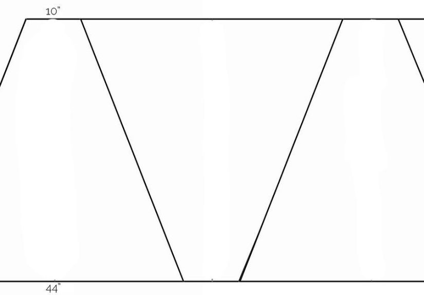
- Calculate total width: (frame width × columns) + (spacing × (columns − 1)).
- Do the same for height.
- Center that total shape on your wall at your chosen hanging height.
Example: a 3-column grid of 8-inch frames with 2-inch gaps = (8×3) + (2×2) = 28 inches wide. That’s a nice “statement” size without taking over the entire room.
3) Template the layout on the wall
Tape up paper templates (or even just outlines made with painter’s tape). Step back 6–10 feet and look at it like a guest would. If you have to tilt your head like a confused puppy, something’s offfix it now, before hardware enters the chat.
4) Hang your anchor pieces first
Start with the largest or most central piece at your target height, then build outward. For grids, start with the top row (or the center) and work systematically. For gallery walls, start with a focal frame and “orbit” around it with smaller pieces.
5) Level, then micro-adjust
Use a level constantly. Your eyes will lie to you when you’ve been staring at the same wall for 45 minutes. Once everything is up, make tiny spacing tweaks so gaps are consistent. Your future photos (yes, you will photograph your wall) will thank you.
6) Finish with lighting and little details
If you want the wall to feel extra polished, add a picture light above it or place it where it gets flattering ambient light. If you’re framing printed photos, consider UV-protective glazing if the wall gets a lot of sunprints can fade over time in direct light.
Style Upgrades That Make It Look “Intentional,” Not “Accidental”
Mix texture (without losing the Instagram vibe)
A modern “Instagram wall” doesn’t have to be only photos. You can sprinkle in a quote print, a small piece of textile art, or a minimal line drawing. The trick is keeping the color palette consistent so your wall reads as one collection.
Use a “frame rule” instead of matching everything
If all-matching frames feel too sterile, try a rule like: “Only black frames,” or “Only wood frames,” or “Mix frames, but all mats are white.” A rule gives you freedom without chaos.
Make it easy to refresh
If you like changing your feed, you’ll like changing your wall. Picture ledges, clip systems, and swappable frames let you rotate seasonal photos, travel highlights, or even a “best of the year” set every January (because nothing says growth like replacing last year’s blurry brunch photo).
Common Mistakes (and How to Avoid Them Without Crying)
- Hanging too high: If your neck tilts up, bring it down. Aim for that eye-level center point unless furniture requires adjusting.
- Inconsistent spacing: Choose a gap size and repeat it. Consistency is what makes it look expensive.
- No planning: Always mock it up. “I’ll eyeball it” is how holes multiply.
- Wrong hardware: Use hooks/anchors/strips rated for the weight and wall type. Don’t gamble with gravity.
- Too many competing colors: If everything screams, nothing is heard. Edit your selection and stick to a palette.
Conclusion: Turn Your Feed Into a Space You Actually Live In
A Hanging Instagram Wall Display is part design project, part memory-keeping, and part “I deserve to see my favorite moments without unlocking my phone.” Plan the layout, print with intention, hang at the right height, and use the right hardware for your wall. Do that, and your display will look curatedlike it was always meant to be there.
Extra: of Real-World “Experience” Tips (What People Actually Run Into)
Let’s talk about the unglamorous part of hanging an Instagram wall display: the part where confidence meets drywall and suddenly everyone becomes a philosopher about “imperfection.” These are the most common real-life moments people run intoand how to handle them without rage-googling “how to patch a wall” at midnight.
1) The Crooked Frame Conspiracy. You hang everything. You level everything. You step backand one frame looks like it’s smirking. This happens because walls and frames aren’t always perfectly square, and your eyes are extremely sensitive to misalignment in a grid. Fix: add small bumpers to the back corners so the frame sits steady, then re-level using the top edge of the frame (not the photo inside). If you’re using wire hangers, remember wire can shiftswitching to D-rings or a more stable hanger can reduce drift.
2) The “It Looked Smaller in My Head” Problem. A set of 4×4 prints seems adorable online… until it’s on a real wall and reads like a polite whisper. This is why designers love templates: you can “see” scale before printing and framing. Fix: either increase print size (5×5 or 8×8 often reads better), add more prints to build mass, or use mats to visually enlarge each piece. A wall display should feel proportional to the furniture and the roomnot like it’s hiding.
3) The Spacing Spiral. One tiny spacing error early in a grid grows into a full-blown geometry scandal by the last frame. Fix: don’t measure each new gap off the last frame. Instead, mark a baseline with painter’s tape, measure from a consistent reference point, and use a spacer (a piece of cardboard cut to your chosen gap works) to keep distances identical.
4) The Adhesive Strip Heartbreak. People love damage-free hanginguntil it fails because the wall wasn’t cleaned, the paint was fresh, the temperature was extreme, or the weight rating was ignored because “it’ll be fine.” (Gravity: “It will not be fine.”) Fix: follow the instructions carefully, use the correct number of strip pairs, and avoid hanging irreplaceable items with adhesive methods. If you’re nervous, reserve adhesives for lighter frames or unframed prints, and use proper anchors for heavier pieces.
5) The Lighting Reality Check. What looks perfect at noon can look dull at night. Fix: test the wall at different times of day before finalizing. If the display is in a dim hallway, consider a small picture light or nearby lamp so your photos don’t disappear after sunset.
6) The “Now I Want to Change Everything” Effect. Once you see your photos on the wall, you’ll want to swap in new favorites. That’s not a failurethat’s the point. Fix: plan for easy updates. Keep a small “rotation box” of prints, or use ledges/clips in part of the display so you can refresh without re-hanging the entire wall every time your camera roll gets ambitious.
Bottom line: a great Instagram wall display isn’t just the final lookit’s how smoothly it lives with you. A little planning makes it feel effortless. And if you do end up with one extra hole? Congratulations. You’re officially a person who decorates.