Table of Contents >> Show >> Hide
- Satellite Imagery 101: The Responsible Line (Curious vs. Creepy)
- Where Satellite Imagery Comes From (And Why It Matters)
- The Five Concepts That Make You 10× Better at Reading Images
- A Simple, Repeatable Workflow for Satellite Imagery Analysis
- Concrete Examples (All Legit, All Useful)
- Tools You Can Use Today (No Fancy Lab Required)
- Common Mistakes (AKA How People Accidentally Become Wrong on the Internet)
- Responsible Sharing: How to Publish Without Causing Harm
- FAQ: The Questions Everyone Asks (And the Honest Answers)
- Conclusion: Satellite Imagery Is PowerfulSo Use It Like a Professional
- Experience-Based Notes: Practitioner Lessons That Make You Better (and Keep You Out of Trouble)
Satellite imagery is basically Earth’s selfie stickexcept the stick is in space, and the “selfie” is a carefully calibrated grid of pixels
that can reveal everything from flood boundaries to new highways to crop stress. It’s fascinating, powerful, and (when used responsibly) an
incredible public-interest tool.
If you arrived here hoping for cloak-and-dagger tricks to “spy on military bases,” we’re going to disappoint the villain in your imagination.
This guide is about ethical, legal satellite imagery analysis: how to read images correctly, avoid common mistakes, use the right
tools, and apply satellite data to legitimate workresearch, journalism, humanitarian response, environmental monitoring, and
plain-old curiosity that doesn’t put people at risk.
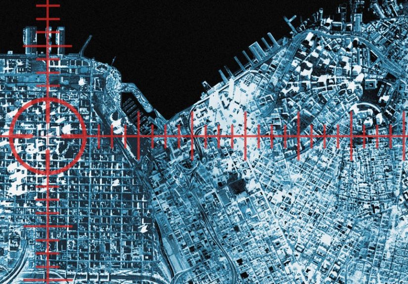
Satellite Imagery 101: The Responsible Line (Curious vs. Creepy)
Satellite imagery is widely available, but “available” doesn’t automatically mean “use it however you want.” A good rule: if your analysis could
help someone cause harm, invade privacy, or compromise safety, don’t publish itand reconsider doing it at all.
Ethical guardrails that keep you on the right side of history
- Do no harm: Avoid content that could enable violence, harassment, or operational targeting.
- Don’t publish sensitive specifics: Skip exact coordinates and granular details for vulnerable locations or people.
- Respect privacy: Most satellite imagery can’t identify individuals clearly, but don’t try to “triangulate” private life anyway.
- Follow terms and laws: Platforms and providers have rules; countries have regulations. When in doubt, treat it like a research project, not a game.
Translation: you can learn a lot from satellite imagery without turning it into a how-to manual for wrongdoing. And your work will be more credible
(and shareable) when you’re transparent about limitations and careful about what you publish.
Where Satellite Imagery Comes From (And Why It Matters)
Not all satellite imagery is created equal. The source determines resolution, update frequency, spectral bands, and what you can confidently conclude.
If you only remember one thing: the same place can look wildly different across sensors, dates, and processing methods.
Public satellite programs (great for learning and analysis)
Public Earth-observation missions provide free imagery that’s perfect for time-series analysis and science-backed workflows. You’ll often see:
multi-spectral data (multiple wavelengths), consistent revisit schedules, and strong documentation.
Commercial imagery (higher detail, different tradeoffs)
Commercial providers can offer higher-resolution imagery and frequent revisits, but licensing, costs, and usage terms vary. Also, “higher resolution”
isn’t magicclouds, shadows, viewing angle, and processing still affect interpretation.
Basemaps and aerial imagery (useful, but be careful)
Popular mapping platforms stitch together imagery from different dates and sensors. That’s great for browsing, but it can be tricky for serious analysis
because the “pretty” view may mix seasons or years. Always check dates when you can.
The Five Concepts That Make You 10× Better at Reading Images
1) Resolution: “Can I see it?” vs. “Can I prove it?”
Spatial resolution is how big each pixel is on the ground (think: meters per pixel). If one pixel covers a whole basketball court, you’re not
going to identify a traffic cone. Even with high-resolution imagery, you should phrase conclusions carefully: “likely,” “consistent with,”
“suggests,” rather than “definitely.”
2) Revisit rate: One photo is a snapshot; many photos are a story
A single image can be misleading. Time-series imagery lets you detect change: new construction, seasonal flooding, vegetation cycles, burn scars,
shoreline shifts. If you’re doing analysis, prioritize multiple dates over pixel-peeping one dramatic frame.
3) Spectral bands: The “invisible colors” that reveal real patterns
Multi-spectral sensors capture information beyond visible light, including near-infrared. That’s how analysts estimate vegetation health (like NDVI),
distinguish water from shadow, or detect heat anomalies. If you’re only using a pretty RGB view, you’re leaving data on the table.
4) Geometry and angle: Perspective can trick your brain
Satellites don’t always look straight down. Off-nadir angles can stretch objects, hide features behind taller structures, and exaggerate shadows.
If something looks “weird,” check another date or another view before writing your hot take.
5) Ground truth: Confirmation beats confidence
The best satellite imagery analysis uses supporting evidence: official reports, scientific datasets, trusted news coverage, or on-the-ground photos
(when safe and legal). “Looks like” is not “is.” Your credibility lives or dies on verification.
A Simple, Repeatable Workflow for Satellite Imagery Analysis
Here’s a practical workflow you can reuse for legitimate projectsenvironmental monitoring, disaster assessment, urban growth, infrastructure change,
and more.
Step 1: Start with a clear question
“Is a new road being built?” “How far did the flood spread?” “Did the wildfire perimeter expand?” Specific questions prevent you from seeing patterns
that aren’t there (your brain loves inventing stories from pixels).
Step 2: Choose the right imagery type
- Time-series change: medium resolution + consistent revisits
- Fine detail inspection: higher resolution (and careful licensing)
- Vegetation/water analysis: multi-spectral bands for indices
- Heat/smoke/fire context: thermal or specialized products when available
Step 3: Compare multiple dates (before/during/after)
Use at least 2–3 dates. If you can, match seasons (compare May-to-May, not May-to-December) to reduce false “change” caused by leaf-on/leaf-off
cycles, drought, or snow cover.
Step 4: Measure, don’t guess
Use tools that let you measure distance, area, and direction. “It’s huge” becomes “~1.8 km of new roadway” or “~230 hectares of inundation.”
Numbers improve clarity and reduce speculation.
Step 5: Sanity-check with context
Look for nearby landmarks, access routes, terrain constraints, and plausible explanations. If you’re analyzing flood extent, does it align with
rivers and elevation? If it’s urban growth, does it connect to existing streets and utilities?
Concrete Examples (All Legit, All Useful)
Example A: Flood mapping after a major storm
Satellites can help identify floodwater boundaries, especially when local reporting is limited. A responsible analysis might:
compare pre-storm imagery with post-storm imagery, map water extent, and highlight impacted roads or neighborhoodswhile avoiding publishing
details that could increase risk to individuals.
Example B: Wildfire burn scars and recovery
Time-series imagery can show fire spread and regrowth over months. Pairing visible imagery with vegetation indices helps distinguish burned areas
from shadows and seasonal browning. The result: clearer understanding of ecological impact and recovery.
Example C: Deforestation and land-use change
Repeated imagery can reveal incremental clearing that’s hard to notice day-to-day. Analysts often compare monthly or quarterly images, quantify
cleared area, and relate it to protected boundaries or watershed riskuseful for conservation and policy discussions.
Example D: Infrastructure progress tracking
Satellite imagery is often used to track construction of highways, ports, renewable energy projects, and urban expansion. The trick is to focus on
measurable changesnew foundations, grading, road cutsand confirm with public permitting, project announcements, or reputable reporting.
Tools You Can Use Today (No Fancy Lab Required)
GIS software: where “looking” becomes “analyzing”
A GIS tool lets you stack imagery, align layers, measure distances, create change maps, and export visuals for reports. If you’re serious about
satellite imagery analysis, learning basic GIS is the best skill investment you can make.
Browser-based explorers: fast and beginner-friendly
Many platforms let you browse public imagery, compare dates, and experiment with band combinations. They’re great for learning and quick checks.
Just remember: for publishable work, document dates, sensor sources, and limitations.
Pro tip: keep an “analysis notebook”
Track what you checked (dates, sensors, cloud cover, angle), what you measured, and what assumptions you made. The notebook is your defense against
your future self asking, “Wait… why did I think that blob was a building?”
Common Mistakes (AKA How People Accidentally Become Wrong on the Internet)
- Ignoring seasonality: Trees dropping leaves is not a “mysterious die-off.”
- Overreading shadows: Shadows can make small things look enormousor hide features completely.
- Confusing compression artifacts for real objects: Blocky patterns can be processing, not reality.
- Using one image as “proof”: Always seek additional dates or sources.
- Publishing sensitive details: Just because you can annotate it doesn’t mean you should.
Responsible Sharing: How to Publish Without Causing Harm
If you plan to publish satellite imagery analysis online, treat it like journalism: verify, contextualize, and minimize risk.
Good practice includes:
- State the date range and limitations (clouds, angle, resolution).
- Use cautious language (“appears consistent with…”) instead of absolute claims.
- Don’t share granular details that could enable targeting, trespassing, or harassment.
- When discussing sensitive topics, focus on high-level patterns rather than tactical specifics.
FAQ: The Questions Everyone Asks (And the Honest Answers)
Can I see things in real time?
Usually, no. Many public datasets have regular revisits, but “real time” is rare. Basemaps can be months or years old in some areas.
Always check timestamps where possible.
Can satellites see people’s faces or read license plates?
Typically, noespecially in widely available public imagery. Even when imagery is high-resolution, details like faces are generally not reliably
identifiable from standard satellite products. (And trying to do surveillance of individuals is unethical and can be illegal.)
Is it legal to analyze satellite imagery?
Analyzing publicly available imagery for legitimate purposes is generally lawful, but legality varies by jurisdiction and by what you do with the
results. Publishing sensitive information can create serious ethical and legal issues. When in doubt, follow platform terms and consult legal
guidance for your specific use case.
Conclusion: Satellite Imagery Is PowerfulSo Use It Like a Professional
Satellite imagery analysis is part science, part detective work, and part humility. The best analysts aren’t the loudestthey’re the most careful:
they compare multiple dates, measure instead of guessing, use the right bands, verify with context, and share responsibly.
If your goal is learning, research, journalism, environmental monitoring, or disaster response, satellite imagery can be a superpower. Just keep it
pointed toward public benefitnot toward “spying.”
Experience-Based Notes: Practitioner Lessons That Make You Better (and Keep You Out of Trouble)
I don’t have personal lived experiences, but I can share practitioner-style lessons that repeatedly show up in real-world satellite
imagery workespecially in research teams, newsrooms, NGOs, and civic groups. Think of these as “what people learn the hard way,” so you don’t have to.
1) The “Two-Date Trap” is real
A classic mistake: someone compares one “before” image and one “after” image, sees a difference, and posts a confident thread. Then a third date
shows the “change” existed for monthsor was a seasonal effect. Teams that do this work well build a habit of checking a timeline:
multiple dates across weeks or months, ideally matching the same season. It takes longer, but it prevents embarrassing reversals and improves accuracy.
2) Context beats zoom
New analysts often zoom in immediatelybecause zooming feels like progress. Experienced analysts zoom out first. They look for roads, waterways,
terrain, neighborhoods, and patterns of access. That context answers questions like: “Would construction here even make sense?” or “Is that dark area
water, shadow, or vegetation?” If you only zoom in, you risk turning a tiny clue into a big story that isn’t true.
3) “Pretty” imagery can be analytically dangerous
Basemap imagery is optimized for human viewing, not analysis. Color balancing, mosaicking across dates, and smoothing can create false impressions.
Many teams learn to treat basemaps as a starting point, then switch to documented datasets for actual conclusions. When credibility
matters, documented timestamps and sensor details are your best friends.
4) Measurement turns debate into clarity
One of the most satisfying moments in satellite imagery work is when a heated argument becomes boringbecause someone measures. Instead of “That looks
like a massive flood,” you map the boundary and compute area. Instead of “The burn scar is spreading,” you compare indices and quantify expansion.
Numbers aren’t perfect, but they create a transparent trail that other people can check.
5) The most responsible analysts publish less than they know
In ethical OSINT and Earth observation, restraint is a skill. Analysts sometimes discover details that could be misusedeven if they found them
legally. Responsible teams either avoid publishing those specifics or abstract the findings: trends over time, aggregated impacts, broader regional
patterns. The goal is public understanding, not enabling harm.
6) Collaboration is a cheat code
Many strong satellite imagery projects involve multiple perspectives: a GIS specialist to handle projections and measurements, a subject-matter
expert to interpret what’s plausible, and an editor or reviewer to challenge assumptions. Even if you’re solo, you can mimic this by writing down
alternative explanations and actively trying to disprove your own hypothesis.
7) The best “secret” skill is saying “I don’t know”
Experienced practitioners get comfortable with uncertainty. They use phrases like “consistent with,” “suggests,” and “cannot be confirmed from this
imagery alone.” That’s not weaknessit’s scientific honesty. Ironically, it makes your work more persuasive because it signals that you understand
limitations and aren’t trying to force the pixels to tell a story they don’t support.
If you take only one lesson from these experience-based notes, make it this: good satellite imagery analysis is less about seeing more and
more about claiming lesscarefully, transparently, and with verification.