Table of Contents >> Show >> Hide
- Color Wheel Basics for Real Rooms
- The Designer Method: Use the Wheel Without Overthinking
- 1) Start with the non-negotiables
- 2) Choose a hero color from a “jumping-off point”
- 3) Pick a harmony that matches the mood
- 4) Assign roles with the 60-30-10 rule
- 5) Let neutrals do the heavy lifting
- 6) Translate the wheel into “real” materials
- 7) Test in your actual lighting (because light changes the story)
- 8) Repeat your colors for a “designed” look
- Color Wheel Harmonies (With Examples You Can Actually Use)
- Room-by-Room Mini Playbook
- Common Mistakes (Quick Fix Edition)
- A 10-Minute Color Wheel Cheat Sheet
- Real-World Experiences: What People Notice When They Actually Try This
- The “it looked perfect at noon” plot twist
- Complementary colors are powerful… in small doses
- Analogous schemes need value contrast, not more colors
- Triadic doesn’t have to look like a toy store
- The open-concept “how do I make this all match?” breakthrough
- The sample-board habit that prevents repainting (and regrets)
- Conclusion: Aim for a Relationship, Not a “Perfect” Color
Choosing room colors can feel like a high-stakes game show where the wrong beige costs you a weekend of repainting, plus an emotional support latte. The fix is surprisingly unglamorous: a color wheel. It’s the designer’s quick-read map for building a room color scheme that looks deliberate, not “I impulse-bought these pillows at checkout.”
In this guide, you’ll learn the key color-wheel relationships (monochromatic, analogous, complementary, split-complementary, triadic, and tetradic), how to keep them balanced with the 60-30-10 rule, and how to dodge the two biggest villains in home color: lighting and undertones. You’ll also get room-by-room examples and real-world lessons so you can make decisions fasterand second-guess yourself less.
Color Wheel Basics for Real Rooms
The wheel shows how hues relate: neighbors blend easily, opposites create contrast, and evenly spaced colors feel balanced and energetic. In interiors, those relationships matter more than fancy paint names, because a room is basically a giant color experiment conducted under changing light.
Four things to watch besides “Do I like it?”
- Hue: the color family (blue, green, red, etc.).
- Value: how light or dark it reads; many paint brands publish light-reflectance info to help you predict brightness in a space.
- Saturation: how intense it is (dusty vs. electric).
- Temperature: whether it leans warm (yellow/red) or cool (blue/green).
Now the sneaky part: undertones. Undertones are a subtle warm/cool lean inside a color that becomes obvious once it’s on a wallespecially under different bulbs and daylight. That’s why two “grays” can behave like completely different species, and why “white” paint is rarely just white.
One more helpful translation: tints are colors mixed with white (lighter and often softer), while shades are colors mixed with black (deeper and moodier). You can keep the same hue relationship from the color wheel and make it feel calm or dramatic simply by shifting tints and shades.
The Designer Method: Use the Wheel Without Overthinking
1) Start with the non-negotiables
List the things you’re keeping: flooring, big furniture, counters, tile, wood tones. These fixed elements belong to your palette whether you invited them or not. A warm oak floor, for example, behaves like a warm neutral that will “vote” for warm colors around it.
2) Choose a hero color from a “jumping-off point”
Pick one item you genuinely lovea rug, artwork, fabric, or even a view outside your windowand pull a dominant hue from it. Designers often recommend starting with this single anchor because it prevents decision fatigue. Your hero color doesn’t have to be loud; it just needs to be consistent.
3) Pick a harmony that matches the mood
- Calm and cozy: monochromatic or analogous.
- Fresh and lively: complementary or split-complementary.
- Playful but balanced: triadic.
- Layered/maximal: tetradic (best with strong neutrals).
4) Assign roles with the 60-30-10 rule
The 60-30-10 rule keeps even bold color schemes from looking like a paint spill. Use 60% dominant color (walls/large pieces), 30% secondary color (big textiles/furniture), and 10% accent color (accessories/art). Contrast works best when one color leads and the others support.
If you’re nervous about color, make your 60% a neutral (warm white, soft greige, light taupe) and put your hero color in the 30% or 10%. You still get personalitywithout the commitment of a full-color room.
5) Let neutrals do the heavy lifting
Neutrals (warm whites, soft grays, tan, natural wood, black metal) act like punctuation. They give your eyes somewhere to rest so accent colors feel chic instead of frantic. Bonus: neutrals help connect spaces in open-concept homes where you don’t want every zone to shout its own theme.
6) Translate the wheel into “real” materials
The color wheel isn’t just for paint. It works for textiles, rugs, art, and even metals. Warm brass and golden wood read like warm accents; chrome and nickel read cooler. If your palette is cool (blues/greens), warm metals can be your complementary “spark” without introducing another bright color.
7) Test in your actual lighting (because light changes the story)
Paint brands repeatedly warn that natural and artificial light can shift a color’s undertones. Room direction matters, too: warm, sun-heavy rooms can wash out pale colors, while cooler light can make grays and blues feel extra crisp (or a bit gloomy). Sample paint on large swatches or sample boards, move them around, and check morning and night. This is the difference between “soft creamy white” and “why is my wall banana-flavored?”
8) Repeat your colors for a “designed” look
Once you choose your palette, repeat each key color at least three times around the room, in different materials. Example: if your accent is terracotta, echo it in a pillow, a framed print, and a small vase. Repetition creates rhythmyour eye feels guided instead of randomly surprised.
Color Wheel Harmonies (With Examples You Can Actually Use)
Monochromatic
One hue, multiple values. This is the calmest option and a favorite for bedrooms and minimalist living spaces. Example: pale blue walls, denim bedding, navy accents, plus creamy white trim. Add texture (linen, bouclé, wood grain, matte metals) so it feels layered, not flat.
Analogous
Colors next to each other on the wheelsmooth, stable, easy to live with. Example: blue + blue-green + green for a spa-like bath, or peach + coral + soft red for a warm, welcoming living room. Keep one color dominant and vary value (light/medium/dark) to create depth.
Complementary
Opposites on the wheel (blue/orange, red/green, yellow/purple). High contrast, high energy. The key is unequal proportions: choose a main color and use its complement as the accent.
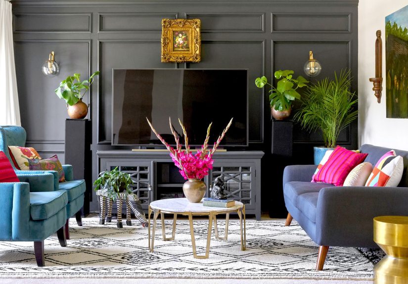
Example: Deep navy sofa and/or walls (dominant), warm neutral rug and curtains (secondary), then burnt orange pillows and art (accent). You get punch without chaos.
Split-Complementary
One color plus the two neighbors of its complement. You get pop with less “shout.” Example: pick blue as your hero, then use yellow-orange and red-orange accents. This works especially well if you like contrast but hate “matchy-matchy.”
Triadic
Three evenly spaced huesbalanced and lively. A classic triad example is turquoise, fuchsia, and yellow-orange. To keep it grown-up, let one hue dominate, mute another (use a softer tint), and save the brightest for small accents. If you want a calmer triad, choose slightly grayed versions of each hue.
Tetradic
Two complementary pairs (four colors). This scheme can look rich and collectedif you control it. Keep walls and large upholstery neutral, then distribute the four hues through pillows, art, and smaller furniture. Think of it like seasoning: you want complexity, not a mouthful of salt.
Room-by-Room Mini Playbook
Living room
Living rooms handle contrast well because they’re social spaces. Try complementary or split-complementary schemes, and use the 60-30-10 rule to keep them relaxed.
- Classic complementary: navy + warm neutrals + rust/orange accents.
- Soft split-complementary: sage green + blush + terracotta (warm, modern, inviting).
Repeat accents around the room (pillows + art + a small ceramic) and mix textures so the palette feels curated, not themed.
Bedroom
Analogous or monochromatic works best for rest. Example: soft blue-green walls, deeper teal textiles, creamy bedding, and warm wood furniture to keep the room grounded. Paint experts emphasize that lighting affects undertones, so test your “calm” color at nightbecause that’s when you’ll be living with it.
Kitchen
Start with cabinets and counters. If your materials run warm (woods), cool accents (blue-greens) can balance the warmth. If your stone is cool-toned, warm accents (brass, warm whites, terracotta accessories) keep the room inviting. A neutral base plus one confident accent color is often the most timeless kitchen formula.
Bathroom
Bathrooms love analogous palettes (blues/greens) because they read clean and spa-like. For drama, use a deeper shade on a vanity or lower half, then keep upper walls lighter. That contrast feels intentionaland still bright.
Home office
For focus spaces, a little contrast can help the room feel alert. Try a subtle complementary approach: green with small red/pink accents in art, or blue with warm wood and tiny orange touches. Keep the largest surfaces calmer and let the accent energize the details.
Common Mistakes (Quick Fix Edition)
- 50/50 complementary colors: Make one dominant and the other an accent.
- Ignoring undertones: Compare samples beside fixed materials in your room’s lighting.
- Too many intense colors: Add neutrals and softer tints to calm the palette.
- Trim/ceiling mismatch: Warm white vs. crisp white changes the whole roomchoose intentionally.
- “Everything is a statement” décor: Give the eye a break with solid textiles and a few quiet surfaces.
A 10-Minute Color Wheel Cheat Sheet
- Choose a hero color from something you love (rug/art/fabric).
- Pick a harmony (calm, bold, playful, or layered).
- Apply 60-30-10 so colors have clear jobs.
- Add a neutral “bridge” (warm white, soft gray, natural wood).
- Test samples in morning and night light before committing.
Real-World Experiences: What People Notice When They Actually Try This
Color theory sounds tidy until it meets real life: mixed bulbs, weird shadows, and the emotional attachment you have to your current couch. Here are a few common “aha” moments homeowners run into when they start using the color wheel on purpose.
The “it looked perfect at noon” plot twist
A paint chip can look dreamy in a store and totally different at night. This is undertones plus lighting doing their thing. People who win at this game test big samples in the room, then choose companion colors that match the paint’s true lean (warm-with-warm, cool-with-cool) so the palette stays harmonious all day.
Complementary colors are powerful… in small doses
Blue and orange (or green and red) can look sophisticated fastuntil both colors get equal airtime and the room turns into a loud conversation. The 60-30-10 rule usually fixes it immediately: one dominant color, one supporting color, and a small accent. Same palette, totally different vibe.
Analogous schemes need value contrast, not more colors
With analogous palettes, the “flat” feeling often comes from everything being the same intensity. The fix people love is varying value: light wall color, medium textiles, darker accentsplus texture (wood, linen, matte metals) to add depth without breaking harmony.
Triadic doesn’t have to look like a toy store
Many folks avoid triadic palettes because they sound too bright. The turning point is realizing you can use tints and shades: one muted main hue, one softer supporting hue, and one bright accent in tiny touches. It reads curated, not cartoonish.
The open-concept “how do I make this all match?” breakthrough
In open layouts, the color wheel becomes a sanity saver. A common strategy is picking one harmony for the whole space, then shifting the proportions by zone. Example: a blue-green analogous palette might show up as kitchen stools (accent), a living room rug (secondary), and hallway art (accent again), while walls stay neutral. The rooms feel distinct, but the colors speak the same language.
The sample-board habit that prevents repainting (and regrets)
One surprisingly common experience: people choose a paint color correctly, but place it next to the wrong neighbor. A cool gray can look crisp beside bright white trim, then suddenly look muddy next to a creamy cabinet finish. Using large sample boards makes this obvious fastyou can hold the sample against your trim, your flooring, and your upholstery and see whether the undertones agree. Once people start comparing colors side-by-side (instead of imagining them in their heads), decisions get calmer. The color wheel tells you which hues relate; sample boards confirm the relationship still works with your actual materials. Bonus: you can carry the board around the room and watch it change from corner to corner. It’s weirdly satisfying, too.
The big takeaway: the color wheel doesn’t restrict your tasteit connects it. Once you understand neighbors, opposites, and spacing, you make faster choices with fewer “why does this feel off?” moments.
Conclusion: Aim for a Relationship, Not a “Perfect” Color
Pick a hero color, choose a harmony, assign proportions with 60-30-10, and test under your real lighting. Do that, and your room will feel cohesive and intentionaleven if you keep that lovable, stubborn sofa.