Table of Contents >> Show >> Hide
- Why Salvaged Shop Signs Work So Well in Kitchens
- The Remodelista-Inspired Move: One Rough Element Against Clean Lines
- Choosing the Right Salvaged Sign
- Where to Source Salvaged Shop Signs (Without Getting Duped)
- How to Place a Salvaged Sign in a Kitchen
- Hanging It Safely: Because Gravity Has No Sense of Humor
- Kitchen Reality: Cleaning, Maintenance, and Safety
- 10 Style Ideas: Using a Salvaged Shop Sign as Kitchen Decor
- How to Make the Look Feel “Considered,” Not “Cluttered”
- Budget, Value, and the “Is This Real?” Question
- Common Mistakes (and Easy Fixes)
- Kitchen Sign Diaries: of Real-Life Experience (What People Learn After the Photo Shoot)
- Conclusion
Some kitchens have quartz. Some have hand-thrown zellige. And somequietly, confidentlyhave a battered old shop sign that looks like it once survived a rainstorm, a breakup, and at least three decades of cigarette smoke. That last one? That’s the kitchen with a story.
Using a salvaged shop sign as kitchen decor is one of those design moves that’s both low-effort and high-impact: a single piece can bring typography, history, patina, and personality into a room that often leans “clean and curated” (aka: slightly sterile). Remodelista has long championed this kind of imperfect perfectionwhere one rough-hewn element makes everything around it feel more intentional.
This guide breaks down how to pull off the look in a way that feels collectednot clutteredplus practical tips for sourcing, hanging, cleaning, and living with vintage signage in the one room where grease, steam, and tomato sauce exist solely to humble us.
Why Salvaged Shop Signs Work So Well in Kitchens
Kitchens are functional spaces, which means they’re full of hard-working materials: tile, stone, stainless steel, sealed wood, painted cabinets. A salvaged sign adds something most of those surfaces don’t: visual texture and human history. Even a simple signjust letters on a worn backgroundcan change the entire mood of the room.
They add “instant character” without adding chaos
Unlike open shelving packed with mugs (which, let’s be honest, becomes a dusty museum of good intentions), a sign is a single statement. It can be bold without being busy.
Typography is basically art that learned how to sell things
Old signs were designed to be read from across the street. That scale and clarity is perfect for kitchens, where you often want something that reads from the doorwayespecially in open-plan layouts.
They bridge styles instead of fighting them
A vintage sign can warm up a modern kitchen, sharpen up a farmhouse one, or give a traditional space a little wink. It’s a design “translator”: it helps stainless steel feel friendlier and helps reclaimed wood feel less like cosplay.
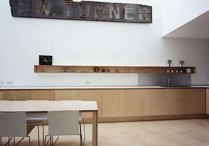
The Remodelista-Inspired Move: One Rough Element Against Clean Lines
Remodelista’s approach to decor often comes down to a simple principle: contrast creates energy. One of the most compelling versions of this is pairing a rough, aged shop sign with a kitchen that’s otherwise crisp and modern.
Think about what a salvaged sign brings to the table (sometimes literally): uneven edges, faded paint, industrial hardware, old-world lettering, or that perfectly imperfect patina you can’t buy in aisle seven. Place that against flat-front cabinetry, minimal hardware, clean plaster walls, and modern lightingand suddenly the whole room feels less like a showroom and more like a lived-in space with taste.
The key is restraint: the sign is the punctuation mark, not the entire sentence.
Choosing the Right Salvaged Sign
Not every old sign belongs in a kitchen. Some are too small, too loud, too “themed,” or too suspiciously perfect (which is usually your first clue it was made last Tuesday). Here’s how to choose a sign that looks right and lives well in a kitchen environment.
Size: go longer than you think
Kitchens have strong horizontal linescounters, shelves, backsplashes, uppers. A long, horizontal sign naturally echoes those lines, which is why it feels so “right” above a shelf, along a blank wall, or above a doorway. If you’re placing it above a run of cabinetry or open shelving, aim for a sign that spans at least half to two-thirds of that width.
Material: pick your patina
- Porcelain enamel (often on steel): glossy, durable, and color-rich; great for kitchens because it wipes clean easily.
- Painted wood: warm and rustic, but more sensitive to steam and splattersbest placed away from the cooktop.
- Metal or tin: can skew industrial; looks great with stainless or concrete, but may show dents (which is not a flawit’s a personality trait).
- Neon or lighted signs: dramatic, but require extra safety and electrical common sense. More on that below.
Color: either harmonize or deliberately clash
If your kitchen is neutral, a sign with aged reds, inky blacks, or vintage blues becomes a focal point. If your kitchen is already colorful, a monochrome sign can provide visual relief. Either way, let it feel like it belongsnot like it’s screaming for attention from the pantry.
Message: keep it subtle (or at least not cringe)
Vintage advertising is charming. “EAT” in distressed letters is… fine, but it can feel like decor that came prepackaged with a farm-to-table personality. Look for signage tied to real businesses, old trades, or authentic typography. Even partial words, numbers, or symbol-heavy signs can look more elevated than an overly on-the-nose slogan.
Where to Source Salvaged Shop Signs (Without Getting Duped)
Finding a great sign is part hunt, part patience, part knowing what you’re looking at. The best sources tend to be the places where old building materials and vintage commercial leftovers end up after remodels or closures.
Architectural salvage yards
These are gold mines for big, authentic piecesespecially if you want something with scale. Go in with measurements, be willing to visit more than once, and don’t expect the “perfect sign” to appear on command like a pizza delivery.
Antique malls and flea markets
Great for browsing and comparing. If you find a sign you love, check condition carefully: look for structural cracks, flaking paint, rust that’s actively spreading (not just surface patina), and any sharp edges that could be a problem in a high-traffic kitchen.
Estate sales and shop closings
Sometimes the best signs come from the least glamorous placesold hardware stores, closed diners, forgotten workshops. These can be the most authentic pieces because they weren’t collected for décor; they were collected for business.
Online marketplaces
Convenient, yesbut photos can be flattering liars. Ask for close-ups of edges, mounting points, paint wear, and the back of the sign. Authentic signs often show age on the reverse: mounting scars, old hardware marks, discoloration, or manufacturer stamps.
How to Place a Salvaged Sign in a Kitchen
The placement is what makes it feel designed instead of “I found this and now it lives here.” Think like a stylist, but with practical kitchen logic.
Above open shelving
This is a classic. The sign acts like a “header,” visually anchoring shelves and giving the wall a focal line. Keep shelf styling simple so the sign can do its job.
Over a doorway or cased opening
Perfect if your kitchen connects to a dining room, mudroom, or pantry hallway. A long sign above the opening reads like a found architectural detail.
On a blank wall near the breakfast nook
This works especially well if your table sits against a wall and needs something more interesting than another framed print. A sign adds scale and personality without feeling precious.
Leaning on a shelf or counter (renter-friendly)
If you rentor just don’t want to commitprop the sign on a sturdy shelf, a ledge, or on top of tall cabinetry. It can look intentionally casual, like it belongs to the building.
Hanging It Safely: Because Gravity Has No Sense of Humor
Old signs can be heavier than they look. And kitchens are busy placeskids, pets, guests, you carrying a pot like you’re auditioning for a cooking show. Hang it like it matters.
Use studs (when possible)
If the sign has real weight, secure it into studs. If you can’t hit studs, use heavy-duty anchors rated for the load and the specific wall type.
Consider a French cleat for large signs
A cleat distributes weight across a wider area and makes leveling easier. It also lets you remove the sign if you need to clean behind itwhich, in a kitchen, is not a hypothetical scenario.
Keep it away from heat and grease zones
Even if a sign looks amazing above the stove, that’s where grease vapor goes to turn into a sticky film. Choose a spot that’s more “admired” than “basted.”
Kitchen Reality: Cleaning, Maintenance, and Safety
Vintage pieces are charming because they’ve been through things. But kitchens will put them through new things: steam, splatter, and the occasional airborne spaghetti sauce. Here’s how to keep your sign looking great without damaging it (or your household).
Lead paint and vintage finishes: handle with care
Some older painted items may contain lead-based paint. In a kitchenespecially around kidsbe cautious. Avoid sanding, scraping, or wire-brushing old paint. If a sign is flaking, consider sealing it with an appropriate clear coat applied carefully (or have a professional advise) and place it out of reach.
Cleaning: gentle wins
For enamel or metal signs, start with a soft cloth and mild soap solution, then dry thoroughly. Avoid harsh chemicals or abrasive pads that can scratch enamel or lift old paint. For wooden signs, keep cleaning minimaldry dusting and very lightly damp wiping only if needed.
If it’s lighted (neon/LED retrofit), don’t DIY the scary parts
Vintage lighted signs can involve high voltage or outdated wiring. If you want a glowing sign in your kitchen, prioritize safety: get it inspected, rewired, or converted by someone qualified. “It still works” is not the same as “it’s safe above my coffee maker.”
10 Style Ideas: Using a Salvaged Shop Sign as Kitchen Decor
- Above a long shelf: Pair with a few practical items (cutting boards, a crock of utensils) and keep the rest calm.
- Centered over the sink: Works best if the wall is open and the faucet isn’t competing visually.
- Over a banquette: Gives diner energy without becoming a theme restaurant.
- In the pantry: A fun surpriseespecially if the pantry is otherwise utilitarian.
- Propped on top of tall cabinets: A stealthy way to use that awkward upper gap.
- As part of a minimal gallery wall: One sign + one framed print + one small object = curated, not chaotic.
- Near the coffee station: A vintage café sign can make your espresso corner feel intentional.
- Above a bar cart: Great in kitchens that double as entertaining zones.
- Next to a kitchen entry: Helps define the kitchen as a “place,” especially in open plans.
- On a brick or plaster wall: Patina-on-patina is a power move (when balanced with modern elements).
How to Make the Look Feel “Considered,” Not “Cluttered”
A salvaged sign is basically a design shortcutso don’t sabotage it by surrounding it with too many competing “vintage moments.” If everything is special, nothing is.
Pair it with clean, modern shapes
Flat-front cabinets, simple pulls, streamlined sconces, and clean-lined stools let the sign be the character actor who steals the scene.
Repeat one material to tie it in
If the sign has metal, repeat metal elsewhere (hardware, lighting, faucet). If it has warm wood, echo that warmth with a cutting board display or a wood shelf. Tiny repetitions make the whole room feel intentional.
Limit your “message count”
One sign with words is charming. Three signs with words is a motivational seminar. Keep the typography to one star piece, then let the rest of the kitchen breathe.
Budget, Value, and the “Is This Real?” Question
Authentic signage ranges from bargain-bin lucky finds to serious collector territory. If your goal is décor (not investment), you don’t have to chase the rarest piece on Earth. But you should know what affects price:
- Age and authenticity: Older and verified often costs more.
- Condition: Some wear is desirable; structural damage is not.
- Material: Porcelain enamel signs can command higher prices.
- Size: Big signs are harder to find and ship, so they often cost more.
Reproductions can still look greatespecially if you’re after the vibe, not a museum label. The trick is to avoid anything that looks artificially distressed in a way that feels costume-y. If it looks like it was aged with a cheese grater and a deadline, keep walking.
Common Mistakes (and Easy Fixes)
Mistake: the sign is too small
Fix: Move it to a smaller zone (pantry, coffee station) or mount it on a larger backing panel to give it presence.
Mistake: it’s hung too high
Fix: Bring it down closer to eye level, or align it with a strong horizontal line (top of backsplash, bottom of hood, shelf line).
Mistake: it fights the kitchen’s palette
Fix: Add one small echo of the sign’s color elsewhere (a towel, a bowl, a cookbook spine). Just one. Not a full matching outfit.
Mistake: it feels themed
Fix: Remove other “cute kitchen” text items. Let the sign be the only narrator in the room.
Kitchen Sign Diaries: of Real-Life Experience (What People Learn After the Photo Shoot)
The day a salvaged shop sign goes up, the kitchen instantly looks more finishedlike it’s been quietly collecting good taste for years. Then real life starts happening. Here are the kinds of experiences homeowners and renters commonly describe once the sign becomes part of daily kitchen traffic (and not just a pretty background for a weekend brunch photo).
Week 1: “It’s the first thing people mention.” A vintage sign is a conversation starter that doesn’t require you to be “a decor person.” Guests walk in, clock the sign, and ask where it came from. Even better: they often stop noticing minor kitchen flaws because their brain is busy enjoying the story the sign suggests. A scuffed floor? Old news. A mysterious sign that once advertised something charmingly obsolete? That’s the headline.
Week 3: “The kitchen feels warmer.” This is especially true in modern kitchens where everything is crisp, smooth, and new. People often report that the sign makes the room feel less like a catalog page and more like a place where someone actually cooks. The patina visually “softens” hard surfacesstone, metal, tilewithout needing more clutter on counters.
Month 2: “Grease is real, and it travels.” Kitchens create an invisible film over time. If the sign is too close to the cooktop, it may start to look dull or slightly sticky. The lesson most people learn: placement matters. Signs do best on walls that are near the action but not in the splash zone. When cleanup is needed, gentle wiping becomes part of the routinelike cleaning cabinet fronts or the hood.
Month 4: “Hanging hardware becomes a trust exercise.” If the sign wasn’t mounted properly, owners tend to notice tiny shifts: it tilts, it rattles, or it just makes them nervous every time someone slams a door. Many end up upgrading to sturdier anchors or a cleat system after realizing the sign is heavier than expected. The good news: once it’s truly secure, it feels permanent in a satisfying waylike a built-in feature rather than an accessory.
Long-term: “It changes how people decorate the rest.” A great salvaged sign often becomes the design “anchor,” and over time, people edit the space around it. They declutter shelves, simplify countertop décor, or choose more restrained accessories because the sign already brings visual interest. In other words, one strong vintage piece can encourage better design decisionsmainly by preventing the kitchen from turning into a collection of unrelated cute objects.
The best part: the sign keeps earning its place. It doesn’t wilt, it doesn’t go out of season, and it doesn’t demand trend updates. It just sits there, looking cool, quietly implying you have impeccable taste and a mysterious backstory involving flea markets and strong opinions about typography.
Conclusion
A salvaged shop sign in the kitchen is one of the simplest ways to add soul to a functional room. Done well, it’s not “decor for decor’s sake”it’s an object with history that brings contrast, warmth, and visual structure. Choose one sign with presence, place it thoughtfully, hang it safely, and let it do the heavy lifting (sometimes literally). Your kitchen gets character, your walls get a focal point, and your guests get something to talk about besides your cabinet hardware.