Table of Contents >> Show >> Hide
- What Is the Fingers Crossed Wall Light?
- Why This Benchmark Light Still Feels Relevant
- How the Fingers Crossed Wall Light Works in a Room
- Styling Tips for the Fingers Crossed Wall Light
- What Makes This Piece Different from Trendy Wall Sconces?
- Buying or Specifying a Light Like This: What to Consider
- The Experience of Living with a Light Like This
- Final Thoughts
Some wall lights are content to sit quietly on the wall and do their little glow-job like obedient background extras. The Fingers Crossed Wall Light at Benchmark is not one of them. This piece has presence. It is part sculpture, part practical sconce, and part conversation starter for people who pretend they are only stopping by for coffee but somehow end up asking, “Okay, where did you get that light?”
Originally spotlighted as a design worth noticing, the Fingers Crossed Wall Light stands out because it avoids the usual lighting clichés. It is not fussy. It is not trying to look futuristic like a spaceship that landed in your hallway. And it is definitely not another forgettable wall fixture in a sea of bland, builder-grade sameness. Instead, it balances handmade warmth with industrial restraint in a way that still feels fresh.
If you care about designer wall lighting, natural materials, and pieces that earn their keep both visually and functionally, this light deserves a closer look. It is the kind of fixture that makes a room feel more intentional without shouting for attention. In other words, it has excellent manners and very good bone structure.
What Is the Fingers Crossed Wall Light?
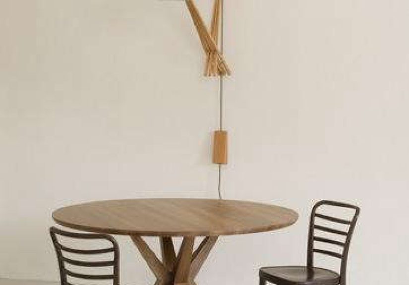
The Fingers Crossed Wall Light is a wall-mounted light designed by Jim Partridge and Liz Walmsley for Benchmark. Archival descriptions of the piece highlight its slatted oak support paired with an industrial aluminum shade, and historical references note that it was offered in two sizes. That simple material pairing tells you almost everything you need to know about its appeal: warm wood, cool metal, and a form that feels both handmade and sharp.
The name “Fingers Crossed” is not just clever branding. It points to the construction itself. Two oak elements appear to intersect or slot into one another, creating the visual effect of crossed fingers. That joinery-inspired idea gives the light its identity. Instead of hiding how it is made, the design turns construction into decoration. For design lovers, that is catnip. For everyone else, it just looks great.
There is also a wonderfully grounded honesty to the materials. Oak brings grain, texture, and quiet warmth. Aluminum adds a tougher, slightly industrial note. Together, they create the kind of contrast interior designers chase all the time: not too rustic, not too slick, not too precious, and not too cold. It lands in that sweet spot where craftsmanship and utility shake hands and decide to become roommates.
Why This Benchmark Light Still Feels Relevant
Good lighting ages well when it is built around proportion, material integrity, and useful light. The Fingers Crossed Wall Light checks all three boxes. Even now, when the market is packed with trendy sconces doing acrobatics for social media, this light feels current because it is based on principles that do not go out of style.
A sculptural wall sconce that earns its spotlight
Wall sconces work especially well because they sit at eye level, which means they are never just lighting tools. They are part of the room’s visual architecture. The Fingers Crossed design understands that perfectly. The oak support reads almost like a small piece of wall sculpture, while the aluminum shade gives the form direction and clarity. It feels composed, not chaotic.
That matters because today’s lighting trends continue to move away from flat, one-note illumination and toward layered lighting with more personality. People want fixtures that add depth, create mood, and help a room feel lived in rather than floodlit. This light fits that shift beautifully. It is decorative, yes, but it is also useful in the real-world sense of making corners, hallways, and reading zones feel warmer and more human.
Material contrast is the magic trick
One reason this Benchmark wall light has staying power is the way it mixes materials without becoming messy. Wood and metal can be a spectacular combination when handled with restraint. Here, the oak keeps the piece tactile and grounded, while the aluminum shade prevents it from drifting into country-cottage nostalgia. It is a clean balance of organic and industrial.
That balance also makes the light flexible. It can sit comfortably in an interior with white plaster walls, soft linen upholstery, and natural stone. But it can also work in a sharper setting with concrete, blackened steel, or darker woods. It does not force the room into one narrow style lane. It simply improves the route.
How the Fingers Crossed Wall Light Works in a Room
Let us be honest: a wall sconce is rarely the only light source a room needs. That is not a flaw. That is good lighting design. Sconces are most successful when they are part of a layered plan that includes ambient, task, and accent lighting. The Fingers Crossed Wall Light shines in precisely that role.
Entryways and hallways
In an entryway, this light can do what great entry lighting should do: create atmosphere before anyone has even taken off their shoes. A single sculptural sconce on a small wall near a console table can make a narrow entry feel more designed and less like a forgotten corridor between outside and inside. In a hallway, a pair of them can create rhythm and visual interest while softening the harshness of overhead lighting.
Bedrooms
In a bedroom, the Fingers Crossed Wall Light has obvious appeal. Wall lights save precious surface area on nightstands and help a room feel more polished. Because this design combines a strong silhouette with a warm material palette, it can bring just enough character to a bedroom without making the space feel busy. Pair it with warm bulbs and dimming capability, and suddenly your room says “boutique hotel” instead of “I bought this lamp during a midnight panic-scroll.”
Living rooms and reading corners
In a living room, wall sconces are excellent for creating softness. This piece would work beautifully beside shelving, near a fireplace, or in a reading nook where you want more intimacy than a ceiling fixture can provide. It can also help highlight architectural details or wall texture. That is one of the underrated joys of sconces: they do not just light objects, they light surfaces. And surfaces, when treated well, become mood.
Hospitality-inspired spaces
This light also has the kind of material honesty that works especially well in restaurants, boutique offices, studios, or hospitality-inspired residential interiors. Benchmark’s broader design language emphasizes solid timber, durability, repairability, and natural finishes, so a piece like this naturally feels at home in spaces where craft and longevity matter as much as appearances.
Styling Tips for the Fingers Crossed Wall Light
Because the light is already visually distinctive, styling it well is less about adding more and more things, and more about creating the right supporting cast.
1. Let the wall do some work
This kind of fixture looks best when the wall behind it is not fighting for attention. Limewash, plaster, warm white paint, muted greige, clay tones, or soft charcoal can all help the oak grain and aluminum shade stand out. A super-busy wallpaper might work, but it would need a careful hand. The light has enough character already. It does not need a roommate who plays drums at 2 a.m.
2. Use warm bulbs
If you want this fixture to feel welcoming instead of clinical, choose a warmer color temperature. Lighting experts increasingly favor warm, softer light in lived-in spaces, and for good reason. It flatters materials, makes wood glow more naturally, and helps a room feel calmer. With a piece like this, warm light enhances the oak and keeps the aluminum from feeling too stark.
3. Mix finishes thoughtfully
You do not need every metal in the room to match the aluminum shade. In fact, a curated mix of finishes often feels more collected and sophisticated than a perfectly matched set. The key is repetition and balance. If the room has black hardware, brushed nickel, or aged brass elsewhere, the light can still work as long as the overall palette feels intentional. Think harmony, not cloning.
4. Treat it like a statement, not filler
The biggest mistake with a fixture like this would be tucking it into a room as though it were just a practical afterthought. It is better used where people can actually notice it: beside a bed, above a console, near a favorite chair, or on a wall that benefits from a little sculptural punctuation. Good design deserves a decent seat at the table.
What Makes This Piece Different from Trendy Wall Sconces?
Many modern wall sconces lean heavily into novelty. Some are all curve and no substance. Others look fantastic in a product shot but feel flimsy or anonymous in person. The Fingers Crossed Wall Light avoids that trap because it is rooted in craftsmanship and a clear material story.
First, it is memorable without being gimmicky. The crossed oak construction is distinctive, but not strange for the sake of being strange. Second, it uses real material contrast instead of fake drama. Oak and aluminum are allowed to be what they are. Third, it feels tactile. That matters more than ever now that interiors are moving toward sensory richness, organic texture, and artisan pieces that feel personal rather than mass-produced.
In other words, this is not a wall light that depends on trend momentum. It depends on design quality. That is a much safer long-term relationship.
Buying or Specifying a Light Like This: What to Consider
If you are drawn to the Fingers Crossed Wall Light specifically, or you are shopping for something with a similar look, a few practical considerations matter.
Placement height
Sconce height depends on the room, but proportion is everything. Around beds, lower placements can feel cozy and intimate. In hallways or as accent lighting, a slightly higher mount often works better. The goal is to place the light where it supports the room’s function and feels visually balanced with surrounding furniture or architecture.
Role in the lighting plan
Do not expect one sconce to light an entire room unless the room is roughly the size of a large closet and emotionally prepared for that level of ambition. A light like this is strongest when paired with ambient lighting and perhaps another accent source. Think layers, not miracles.
Scale and spacing
Because archival references indicate the fixture was available in two sizes, scale was clearly part of the design logic. That is smart. A compact version may be perfect beside a bed or in a narrow entry, while a larger one can hold its own in a living room or commercial setting. When using a pair, symmetry can be elegant, but an asymmetrical arrangement can feel more modern if the room supports it.
Material palette
This light plays well with oak furniture, pale woods, blackened metals, stone, leather, linen, and plaster. It is not limited to one decorating style, but it does want a room that appreciates texture. If your space is all glossy surfaces and high-shine finishes, this piece may feel like the one guest who arrived in hiking boots to a black-tie dinner.
The Experience of Living with a Light Like This
There is a difference between admiring a fixture online and living with it every day. The first is visual. The second is emotional. A light like the Fingers Crossed Wall Light earns its value in the daily moments that never show up in a catalog photo.
Imagine coming home in the evening and switching on a wall light that does not blast the room with harsh brightness, but instead gives you a soft, directional glow. The oak catches a little warmth. The aluminum shade gives the beam some focus. The wall behind it picks up a gentle wash of light. Suddenly the room feels less like a container and more like a place. That is the thing great sconces do: they change the atmosphere faster than almost any other fixture.
In a bedroom, the experience is even better. A wall light with this kind of sculptural presence can make bedtime routines feel calmer and more designed. You read a few pages, set down your book, and the light does not feel sterile or bossy. It feels companionable. It is there to support the moment, not dominate it. That sounds dramatic for a lamp, but anyone who has suffered under one terrible blue-white bulb knows exactly what I mean.
In a hallway or entry, the experience becomes more architectural. During the day, the piece reads almost like an object on the wall. At night, it changes character and becomes part sculpture, part guide. Guests notice it. Kids brush past it and look up. You catch it out of the corner of your eye while carrying groceries and think, yes, that was a very good decision. Small household victories count.
There is also a tactile satisfaction in living with something that feels materially honest. So many contemporary fixtures aim for effect without substance. A light built around oak and aluminum feels grounded. You notice the grain. You notice the contrast. You notice that it still feels relevant months or years later because it was never trying too hard in the first place.
And perhaps that is the best experience of all. The Fingers Crossed Wall Light does not depend on novelty. It grows into the room. It becomes part of the visual rhythm of your home, not a flashy stunt piece that starts strong and ends up feeling dated. Over time, that kind of quiet confidence is exactly what makes a design memorable.
So yes, on paper it is a wall light. In practice, it is a mood setter, a sculptural accent, a space saver, and a small daily reminder that functional objects can still have personality. Not bad for something bolted to a wall.
Final Thoughts
The Fingers Crossed Wall Light at Benchmark is a smart example of what great lighting can do when design and utility are treated as equals. With its slatted oak structure, aluminum shade, and quietly inventive crossed form, it offers more than illumination. It offers texture, warmth, shape, and a sense of intention.
That is why the piece remains so compelling. It embodies several qualities homeowners and designers continue to value: artisan craftsmanship, mixed materials, layered lighting, and a look that feels collected rather than cookie-cutter. Whether you are studying it as a design reference or searching for a wall sconce with the same spirit, it is an excellent reminder that the best lighting does not just help you see. It helps you feel the room differently.