Table of Contents >> Show >> Hide
- What Is Color Capping, Exactly?
- Why Color Capping Will Dominate 2026 Interiors
- Color Capping vs. Color Drenching
- Best Rooms to Try Color Capping
- How to Pull Off Color Capping Successfully
- Color Ideas That Will Feel Fresh in 2026
- Mistakes to Avoid
- The Real Reason This Trend Has Staying Power
- Personal Experiences and Real-World Design Takeaways
- Conclusion
For the last couple of years, color drenching has been the reigning drama queen of interior design. You know the look: walls, trim, ceiling, built-ins, maybe even the dog bowl if no one stops you, all wrapped in one deliciously moody shade. It is bold. It is immersive. It is not exactly subtle. And while it still has plenty of fans, 2026 interiors are starting to flirt with a clever new idea: color capping.
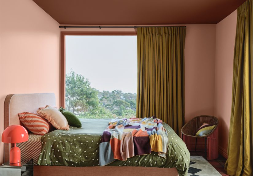
If color drenching is a cannonball into the deep end, color capping is the confident, stylish dive that makes everybody else at the pool feel underdressed. Instead of coating every surface in one uniform color, color capping focuses attention on the upper section of the roomtypically the ceiling and sometimes the top portion of the wallsusing tonal shifts, complementary paint choices, or a stronger hue overhead. The result is layered, architectural, and far more flexible than a full monochrome soak.
In other words, 2026 is not saying goodbye to color. It is just getting smarter about where color goes, how it shapes a room, and why ceilings deserve better than being painted default builder white for the thousandth time.
What Is Color Capping, Exactly?
Color capping is a paint technique that uses the ceiling, crown area, or upper wall zone as a distinct visual layer. Rather than treating the ceiling like an afterthought, it becomes an intentional design feature. Sometimes the ceiling is painted in a darker or richer version of the wall color. Sometimes a band of paint extends down from the ceiling to create a “cap” around the room. In other spaces, trim, cornices, and upper walls shift tones while the lower wall area stays softer and calmer.
The beauty of the trend is that it sits in the sweet spot between restraint and personality. It offers more depth than a standard accent wall and more breathing room than full-on color drenching. It also feels tailor-made for a time when homeowners want spaces that are expressive, warm, and memorable without making every room feel like a velvet stage curtain.
That balance is a big reason 2026 interior color trends are leaning this way. Design is moving toward layered palettes, cozy character, and architectural detail. Color capping checks all three boxes with a smug little wink.
Why Color Capping Will Dominate 2026 Interiors
1. It makes ceilings part of the design conversation
Designers have been calling the ceiling the “fifth wall” for years, but homeowners are finally listening. A white ceiling can still work, of course, but it often creates a hard stop in rooms that are otherwise warm and carefully considered. Color capping solves that by drawing the eye upward and making the ceiling feel integrated instead of forgotten.
That matters because rooms look more polished when every plane feels intentional. A painted ceiling can soften harsh contrast, highlight molding, and give even a simple boxy room a more custom look.
2. It adds drama without overwhelming the room
Color drenching can be stunning, but it is a commitment. A rich tone on every surface can feel cocooning in the best wayor just a touch “I live inside a jewel box and now I cannot find my socks.” Color capping offers the same mood-forward energy with more visual relief.
By keeping some surfaces lighter and reserving the bolder move for the ceiling or upper wall area, the room stays dynamic without feeling heavy. It is especially effective for people who love color but are not ready to marry it in every square inch of the room.
3. It works with the warmer, softer palettes trending in 2026
One of the biggest shifts in 2026 home decor trends is the move away from stark black-and-white contrast and chilly minimalism. Warmer neutrals, earthy greens, clay tones, dusty mauves, aubergines, mushroom shades, and softened blues are taking over. Color capping thrives in these palettes because tonal variation is the whole point.
A pale mushroom wall with a cocoa ceiling. A muted sage room capped with olive. A soft blush wall with a terracotta crown zone. These combinations feel layered, welcoming, and grown-up. They whisper sophistication instead of shouting at your guests from across the room.
4. It emphasizes architecture in older and newer homes alike
Color capping is a gift to rooms with crown molding, beams, picture rails, alcoves, or sloped ceilings. It can trace those details beautifully and turn them into assets. But it also helps plain newer homes by adding a sense of structure where there was not much personality to begin with.
Even a basic bedroom or builder-grade hallway can look more tailored when the upper portion of the room is treated as its own design moment. It is one of those rare trends that works equally well in a historic home and a modern condo that came preloaded with exactly three interesting features: a thermostat, a smoke detector, and disappointment.
Color Capping vs. Color Drenching
Let’s settle the paint-room gossip. Color drenching and color capping are cousins, not twins.
Color drenching uses one color across most or all surfaces in a room: walls, trim, ceiling, doors, and sometimes furnishings. It creates an enveloping, immersive effect. It is dramatic, cohesive, and often moody.
Color capping, on the other hand, uses tonal contrast within the same family or a coordinated palette, with special emphasis on the upper section of the room. It is more architectural and more layered. You still get cohesion, but the eye has more places to rest and more details to enjoy.
If color drenching is a full orchestra, color capping is a brilliant string section with excellent cheekbones.
Best Rooms to Try Color Capping
Living Rooms
Living rooms are perfect for color capping because they often need a balance of comfort and style. A warm neutral or soft earthy tone on the walls paired with a deeper ceiling color can make the room feel intimate without shrinking it. If you have crown molding, even better. Use it as the visual transition between the lighter and darker tones.
Bedrooms
Bedrooms benefit from the cocoon effect of a darker ceiling, but not everyone wants full-on drenching where the whole room feels like a midnight cave. Color capping lets you create a restful, enveloping look while keeping the lower walls airy. Dusty blue, muted mauve, olive, and warm taupe are especially strong here.
Dining Rooms
Dining rooms can handle more drama, which makes them ideal for deeper capping shades. A rich ceiling draws attention to lighting fixtures and gives the room a tailored, intimate quality. Add dim lighting and a table with candles, and suddenly even takeout pasta looks like an event.
Powder Rooms
If there were ever a place to experiment, it is the powder room. These small spaces are made for bold choices. Try a deep plum ceiling over softer lavender walls, or a mossy green cap over warm ivory walls. Powder rooms do not ask for much, but they do appreciate a little glamour.
Hallways and Entryways
These transition spaces are often ignored, which is rude because they work hard. A color-capped entryway instantly feels more intentional and welcoming. It can also help visually connect adjacent rooms if you echo tones used elsewhere in the home.
How to Pull Off Color Capping Successfully
Stick to tonal families
The easiest way to make this trend work is to stay within one color family. Use a lighter wall shade and a darker ceiling, or reverse it if the room has lots of natural light. Tonal layering keeps the look cohesive and prevents the cap from feeling random.
Consider the room’s light
Natural light changes everything. North-facing rooms can make colors look cooler, while south-facing spaces often warm them up. Always test paint at different times of day before committing. The perfect moody green at noon can turn into “haunted zucchini” after sunset.
Mind your finish
Matte and flat finishes usually work best for ceilings because they hide imperfections and reduce glare. On trim or moldings, a slight sheen can help define details. The exact finish depends on the effect you want, but consistency matters. Random shifts in sheen can make a sophisticated paint concept look like a hardware-store panic buy.
Use architecture as your guide
If the room has molding, beams, or picture rails, let them tell you where the cap should begin and end. If the room is simpler, a painted band that drops several inches from the ceiling can still create the effect. The trick is to make the placement look intentional rather than accidental.
Do not forget furnishings
Paint is only part of the story. A capped room looks best when textiles, wood tones, and decor support the palette. Warm woods, brushed metals, textured upholstery, and layered lighting help the room feel complete rather than like you simply ran out of paint halfway down the wall.
Color Ideas That Will Feel Fresh in 2026
Earthy Greens
Sage, olive, eucalyptus, and moss continue to dominate because they feel grounded and versatile. A pale sage wall with an olive ceiling is subtle but stylish, especially in bedrooms, kitchens, and reading nooks.
Dusty Mauves and Soft Plums
These shades bring warmth and sophistication without tipping into sugary sweetness. They look beautiful in dining rooms, guest rooms, and even cozy home offices.
Clay and Terracotta
Clay-based tones add instant warmth and pair beautifully with cream, sand, walnut, and blackened bronze finishes. A terracotta cap can make a neutral room feel sun-baked and luxurious.
Stormy Blues
Blue is still a favorite, but in 2026 it is leaning moodier and more nuanced. Think slate, denim, inky marine, and smoky teal. These shades work especially well in living rooms and bedrooms where you want calm with a side of character.
Warm Neutrals
Not every capped room needs obvious color. Mushroom, greige, putty, and oat tones can create a gorgeous tonal effect that feels subtle from a distance and rich up close. For the color-shy crowd, this is your gateway trend. Nobody panic.
Mistakes to Avoid
Choosing colors with clashing undertones: A warm beige wall and a cool gray ceiling will fight like siblings in the back seat. Keep undertones aligned.
Ignoring ceiling height: Very dark ceilings can feel cozy, but in low-light, low-ceiling rooms they may feel heavy. Test first.
Treating trim as an afterthought: Trim can help blend or separate the cap. Decide whether you want it highlighted or softened.
Using trendy color without context: A beautiful paint chip means nothing if it does not work with your flooring, upholstery, and light. The room is the boss.
The Real Reason This Trend Has Staying Power
Color capping is not just another pretty social media moment. It taps into something deeper happening in design right now: people want homes with personality, warmth, and architectural interest. They want rooms that feel curated but livable. Stylish but not exhausting. Layered but not chaotic.
That is exactly why color capping in interiors feels so timely. It respects the boldness people loved in color drenching but refines it. It encourages creativity while leaving room for comfort. Most importantly, it proves that ceilings are not dead space. They are prime real estate.
So yes, color drenching had a fabulous run. It swept into rooms, stole the spotlight, and made white ceilings look painfully underdressed. But 2026 is ready for a fresh headliner. And this one is looking up.
Personal Experiences and Real-World Design Takeaways
One of the most interesting things about color capping is how people respond to it in real life. In photos, it looks polished and editorial. In person, it often feels even better because the effect is emotional as much as visual. A room with a thoughtful cap can feel taller, softer, warmer, and more intentional the second you walk in. That reaction is a huge part of why the trend has momentum.
Homeowners who have experimented with saturated paint trends often describe a similar journey. First comes curiosity. Then comes the terrifying moment of actually opening the paint can. Then, after a few hours of questioning every life choice, the room starts coming together and suddenly the ceiling becomes the star. That shift is what makes the experience memorable. It is not just about adding color. It is about changing how the room behaves.
In spaces where full color drenching felt too intense, color capping tends to land as the happy medium. People still get the drama they wanted, but with more flexibility for furniture, art, and everyday living. A dining room capped in a richer shade can feel special at night under soft lighting, yet still open and elegant during the day. A bedroom with a slightly deeper ceiling can feel wrapped and restful without turning into a cave. That balance is often what wins people over.
There is also a practical side to the experience. Many people discover that once the ceiling is painted intentionally, the whole room suddenly makes more sense. Window trim looks sharper. Lighting feels more integrated. Artwork pops differently. Even bland, builder-grade spaces seem more finished. It is one of those rare design moves that can make a room look more expensive without requiring custom millwork or a second mortgage.
Another common experience is surprise at how much light matters. A capped ceiling in the morning can read calm and airy, while the same color in lamplight becomes cozy and dramatic. That changing personality is part of the charm. It gives the room depth throughout the day. Instead of the ceiling disappearing, it participates.
Design-wise, the most successful spaces usually share a few habits. The paint choices are tonal rather than random. The cap relates to the furnishings. Wood, fabric, metal, and lighting all support the scheme instead of arguing with it. When people skip that step, the room can feel trendy in a forced way. But when they treat the ceiling as part of the full composition, the result feels thoughtful and lasting.
There is also something psychologically satisfying about drawing attention upward. It changes how you move through a room. Your eye travels, the walls feel more sculpted, and the space gains rhythm. In an era when many homes are multifunctional and visually busy, that kind of structure feels comforting. It gives the room a clear point of view.
Perhaps the most telling experience is that once people try color capping in one room, they start spotting missed opportunities everywhere else. The entryway ceiling suddenly looks neglected. The guest room starts begging for a tonal upgrade. The powder room begins whispering dangerous ideas. This is usually how a design trend turns from experiment to obsession.
And honestly, that is the real magic of it. Color capping feels approachable enough for cautious decorators, but exciting enough for people who are bored with safe paint rules. It invites play without demanding chaos. It looks fresh, but it also feels livable. In a design world full of extremes, that may be its strongest advantage of all.
Conclusion
Move over, color drenching. The next big thing is not less color. It is smarter color. Color capping gives 2026 interiors a layered, architectural, highly intentional look that turns ceilings into assets and makes rooms feel richer without overwhelming them. Whether you love earthy greens, stormy blues, clay tones, or elegant warm neutrals, this trend offers a stylish new way to shape mood and elevate everyday spaces. For homeowners who want character, comfort, and a little design swagger, color capping may be the paint move that changes everything.