Table of Contents >> Show >> Hide
- What Is Polvere 01, Exactly?
- The Design Vibe: Quiet Gray, Big Range
- Performance: The Stuff You Care About After the Honeymoon
- Best Places to Use Polvere 01 Porcelain Tile
- Installation: Where Good Projects Become Great (or Go Off the Rails)
- Care and Maintenance: Keep It Looking Expensive
- Buying Tips: How to Shop Polvere 01 Without Regret
- Common Pairings and Example Scenarios
- Field Notes and Real-World Experiences With Polvere 01
- It hides “life dust” better than you think
- Grout choice can make it feel brand new… or forever stressful
- Matte finishes feel modernand they have opinions about residue
- Rectified tile is gorgeous, but the prep has to match the ambition
- Offset patterns: the one-third rule saves feelings
- Temperature and comfort: plan like a grown-up
- Long-term durability: the quiet flex
- The best tip people share: buy extra now, not later
- Conclusion
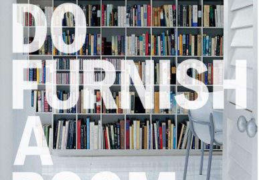
Some tiles scream for attention. Polvere 01 porcelain tile is not one of those tiles. It’s the quiet, confident friend who shows up on time, dresses well, and somehow makes the whole room look more expensive without ever mentioning where they shop.
If you’re hunting for a modern gray porcelain tile that feels clean, architectural, and “designer but not dramatic,” Polvere 01 deserves a spot on your shortlist. It lives in the Cromie collectiona color-driven series designed around the Natural Color System (NCS), which is a fancy way of saying: these shades were picked with a serious eye for how humans actually see color.
What Is Polvere 01, Exactly?
Polvere 01 is a colorway in the Cromie lineupthink gray with a calm, powdery personality. It’s part of a family of tones that runs from lighter to deeper neutrals, built to mix, match, and stay timeless without turning your floor into a trend headline.
Through-body (aka “color body”) porcelain: why that matters
Cromie is often described as through-body (also called color-body) porcelain. Translation: the color isn’t just a surface “makeup layer.” If the tile chips (life happenshello, cast iron pan), it’s less likely to reveal a wildly different color underneath. That’s one reason designers like through-body porcelain in busy areas.
Rectified edges: the crisp-shirt look of tile
Many Cromie options are rectified, meaning the edges are mechanically finished for tight, consistent sizing. Done right, rectified tile gives you those neat lines and smaller grout joints that read “high-end” from across the room. Done wrong… well, let’s just say tile doesn’t forgive a wavy subfloor.
The Design Vibe: Quiet Gray, Big Range
Polvere 01 tends to shine in spaces where you want a neutral foundation that still has intentionminimal kitchens, spa-like bathrooms, gallery-style entries, and commercial interiors that need to look polished without looking precious. It’s also a great teammate for:
- Warm woods (oak, walnut, even that “I swear this is real” wood-look cabinet finish)
- Matte black fixtures for contrast
- Brushed brass for warmth without turning into a disco ball
- Soft whites and creamy paints to keep gray from feeling cold
- Concrete, plaster, or microcement aestheticswithout the maintenance drama
Lighting tip: gray is a shapeshifter
Gray tile can look warmer in afternoon sun and cooler under bright LEDs. If you can, grab a sample and view it in the actual room at a few times of day. This is not overthinkingthis is avoiding the “why does my floor look blue?” surprise.
Performance: The Stuff You Care About After the Honeymoon
Porcelain tile is popular because it’s dense, tough, and not easily impressed by water. Industry standards define porcelain as having very low water absorption (that’s one reason it’s commonly used in wet areas and many exterior settingswhen rated for it).
Slip resistance: what the numbers mean (and what they don’t)
You’ll see slip-resistance referenced as DCOF (dynamic coefficient of friction). Here’s the practical takeaway: for level interior areas that may be walked on while wet, a commonly referenced guideline is a minimum wet DCOF around 0.42. Higher can be better for traction, but no tile is magically “slip-proof,” especially when water, soap, oil, or chaos enter the chat.
Cromie has been listed with a DCOF around 0.61 in some distributor materials, which is generally a reassuring place to be for many residential floors. Still: always confirm the exact tile finish you’re buying and match it to your use case (shower floor, commercial entry, pool deck, etc. are their own worlds).
Wear rating and durability
A tile’s wear performance is often discussed using PEI ratings (especially for glazed surfaces) and broader technical testing for strength. Cromie has been listed with a PEI 5 in some distributor specstypically associated with heavy traffic suitability. If you’re planning a busy household with kids, pets, or that one friend who drags chairs like it’s an Olympic sport, the “durable” category matters.
Best Places to Use Polvere 01 Porcelain Tile
1) Kitchens
Polvere 01 works beautifully as a kitchen floor tile because it’s neutral, hides everyday dust better than pure white, and plays well with both modern and transitional cabinetry. Pair it with a slightly darker grout for a low-maintenance “always tidy” look, or a closer-match grout if you want a calmer, more seamless surface.
2) Bathrooms
For bathroom floors and walls, Polvere 01 gives spa energy without forcing you into an all-beige lifestyle. If you’re using it on the shower floor, consider mosaics or smaller formats for extra grout lines (more traction + easier slope to the drain). For shower walls, larger formats can look stunning and reduce grout maintenance.
3) Entryways and mudrooms
This is where porcelain earns its keep. An entry floor sees grit, water, salt (in many parts of the U.S.), and heavy traffic. A calm gray tile is forgiving and looks intentional even when life is… not.
4) Commercial and light industrial interiors
Cromie is often positioned as a modern, color-system-driven porcelain suitable for floors and walls. If you’re specifying for commercial use, confirm slip rating, maintenance plan, and the exact technical sheet for your selected format and finish.
Installation: Where Good Projects Become Great (or Go Off the Rails)
Subfloor flatness: the unglamorous hero
Large-format and rectified tiles demand flatter substrates. If your floor is wavy and you install tight-joint rectified tile anyway, you’ll likely get lippage (edges you feel underfoot) and grout lines that look like they were drawn during turbulence. A quality installer will check flatness and recommend leveling where needed.
Grout joint size: smaller isn’t always “more premium”
Rectified tile can use tighter grout joints, but “tight” still has rules. Practical guidance commonly starts around 1/8 inch minimum for many rectified tiles, and joint size should account for any warpage and tile variation. Choosing a joint that’s too small can make alignment issues more obvious, not less.
Offset patterns: don’t fight physics
For rectangular tiles (like 12" x 24"), a 50% brick pattern is often not recommended because it can exaggerate warpage and lippage. A one-third offset is commonly suggested instead. It still looks classicjust with fewer “toe-stub surprises.”
Grout color strategy (a.k.a. the final boss)
- Match grout to tile for a seamless, minimal look.
- Go slightly darker for easier maintenance and softer visual framing.
- Avoid ultra-white grout on floors unless you enjoy constant cleaning as a hobby.
Care and Maintenance: Keep It Looking Expensive
Porcelain tile is relatively low-maintenance, but it’s not “no-maintenance.” The biggest wins are simple: remove grit (it’s basically sandpaper), clean with appropriate products, and avoid turning your floor into a chemistry experiment.
Everyday cleaning
- Sweep or vacuum regularly to remove grit.
- Use a neutral pH cleaner and warm water for routine mopping.
- Rinse if needed and dry to prevent haze or residueespecially on matte surfaces.
What not to do (your grout will thank you)
- Don’t use harsh acidic cleaners (like vinegar) routinelyespecially on grout.
- Don’t rely on heavy bleach use as your “weekly reset.”
- Don’t use abrasive pads that can dull finishes over time.
Buying Tips: How to Shop Polvere 01 Without Regret
1) Confirm current availability
Some distributors have noted the Cromie series as discontinued by the factory, which can mean limited remaining stock. That doesn’t automatically make it a “no”it just means you should confirm lead times, dye lots, and whether you can get extra for attic stock.
2) Ask for the technical sheet for your exact SKU
“Polvere 01” names the color, but performance details depend on format, finish, and sometimes texture. Request the latest documentation so you can confirm water absorption, slip rating, recommended uses, and installation notes.
3) Order extra (because matching later can be painful)
A common best practice is to order extra tile for cuts, waste, and future repairs. If a series is limited or discontinued, that extra becomes even more valuable.
Common Pairings and Example Scenarios
Modern kitchen renovation
Picture Polvere 01 on the floor, white or warm off-white cabinets, a walnut island, and matte black hardware. The tile becomes the calm foundation that lets your other choices look intentional instead of “stuff I liked online.”
Bathroom refresh with a spa feel
Use Polvere 01 on the floor, a slightly lighter wall tile, and warm metals. Add soft lighting and a simple vanity. The effect is clean and serenelike a boutique hotel bathroom, minus the awkward “where do I put my toothbrush?” confusion.
Commercial lobby or office
A neutral gray tile with strong performance characteristics can handle traffic while keeping the look architectural. Pair with acoustic wood panels, clean signage, and lighting that doesn’t turn everyone into a tired ghost.
Field Notes and Real-World Experiences With Polvere 01
Let’s talk about what happens after the photos are taken and the compliments roll inwhen you’re actually living on the tile. These are common experiences homeowners and installers report with calm-gray, through-body porcelain like Polvere 01:
It hides “life dust” better than you think
Dark charcoal floors can show every crumb like it’s on a billboard. Bright white floors can reveal every footprint like a crime scene. Polvere 01-style gray tends to land in the sweet spot: it’s light enough to feel open and clean, but grounded enough that yesterday’s toast crumbs don’t immediately demand a press conference.
Grout choice can make it feel brand new… or forever stressful
People who go with a slightly deeper gray grout often report the most “low-maintenance happiness.” It disguises normal discoloration in high-traffic areas and keeps the floor looking consistent. On the other hand, ultra-light grout on a kitchen floor can be beautifulbut it’s a lifestyle choice, like owning a white couch with a golden retriever. Possible? Yes. Peaceful? Depends on your personality.
Matte finishes feel modernand they have opinions about residue
Matte tile is great at looking soft and sophisticated, but it can show cleaning residue if you use the wrong products or don’t rinse well. The folks who are happiest long-term typically stick to neutral cleaners, avoid waxy products, and do the occasional “reset mop” (clean water rinse, then dry) when the floor starts looking a little hazy under certain light.
Rectified tile is gorgeous, but the prep has to match the ambition
Homeowners who invest in flattening the substrate (and use the right mortar and leveling systems when needed) tend to love the result: crisp grout lines, clean geometry, that high-end “sheet of stone” feel. The frustration stories almost always trace back to skipping prep. Tile will happily expose the truth about your floor. It’s basically a lie detector you can walk on.
Offset patterns: the one-third rule saves feelings
On 12" x 24" formats, installers often steer clients away from a 50% offset because it can create lippage. People who follow the one-third offset guidance usually end up with the look they wanted (classic running bond) without the “why does it feel bumpy?” follow-up conversation.
Temperature and comfort: plan like a grown-up
Porcelain can feel cool underfootgreat in warm climates, less charming on winter mornings. Many homeowners pair it with area rugs in living zones or add radiant heat in bathrooms. The tile itself isn’t the problem; cold feet are simply very persuasive.
Long-term durability: the quiet flex
The most satisfying “experience” with a durable porcelain tile is that you stop thinking about it. It doesn’t dent, it doesn’t warp, it doesn’t demand sealing rituals every few months. People who’ve lived with softer surfaces often describe porcelain as a reliefespecially in entryways, kitchens, and pet zones. It’s not flashy. It’s dependable. Like the friend who brings a phone charger and snacks.
The best tip people share: buy extra now, not later
Even if you never need it, having extra tile from the same production batch feels like insurance. If you ever have to replace a damaged tile, you’ll be thrilled you planned ahead. If the collection is limited or discontinued, that extra becomes the MVP of your renovation story.
Conclusion
Polvere 01 porcelain tile is the kind of design decision that keeps paying you back: it’s calm, versatile, and rooted in a color system that’s meant to work with real spaces and real light. If you want a modern gray floor or wall tile that doesn’t chase trendsand you’re willing to respect installation fundamentals Polvere 01 can deliver a clean, architectural look with the durability porcelain is famous for.