Table of Contents >> Show >> Hide
- Start With the “Job” of the Room (Because Chairs Don’t Have Feelings, But People Do)
- The Science Behind Why Seating Works (Or Doesn’t)
- Research-Based Tips That Transfer Across Classrooms, Meetings, and Events
- Tip 1: Use assigned seating strategically (yes, even for adults)
- Tip 2: Build a “distraction map” and seat accordingly
- Tip 3: Match the layout to the activitythen switch when the activity changes
- Tip 4: Optimize sightlines (because “I can’t see” becomes “I don’t care” fast)
- Tip 5: Pick the right “meeting geometry”
- Tip 6: In offices, rotate seating only when it has a purpose (and explain that purpose)
- Tip 7: Don’t forget the body: ergonomic seating is performance seating
- Tip 8: Design for access and dignity (accessibility is not optional décor)
- Tip 9: Use “social mixing” intentionally at events
- Tip 10: Measure it like you mean it
- Common Seating Mistakes (A Short Comedy of Errors)
- of “Experience” (Composite, Real-World Lessons People Commonly Report)
- Conclusion: The Best Seating Arrangement Is the One That Makes the Right Behavior Easy
Seating seems harmlessuntil you’ve watched a “quick meeting” turn into a two-hour debate because the loudest voice
got the power seat, or until you’ve tried to teach a room where half the group is staring at the back of someone’s hoodie.
The truth is: seating is a silent system. It shapes who talks to whom, who pays attention, who feels included, and who
quietly checks out.
The good news? You don’t need a PhD or a furniture budget the size of a small nation. Research from classrooms, offices,
ergonomics, accessibility standards, and social psychology points to practical moves that work across contextsfrom
training rooms and conferences to dining events and collaborative workspaces.
Start With the “Job” of the Room (Because Chairs Don’t Have Feelings, But People Do)
Before you slide a single chair, answer one question: What should participants be doing most of the time?
The “best” seating arrangement depends on whether the priority is focus, discussion, collaboration, or presentation.
- Focus + information transfer: layouts that face forward (rows/theater/classroom style)
- Discussion + visibility: U-shape/horseshoe/roundtable formats
- Collaboration + making stuff together: pods/clusters/team tables
- Mixing + networking: rounds/cabaret/banquet-style tables
The most reliable rule is function-first: match the geometry of the room to the behavior you want, then tweak for sightlines,
noise, and access.
The Science Behind Why Seating Works (Or Doesn’t)
1) Proximity changes behaviorwhether you want it to or not
People react to distance. Social psychology describes “zones” of interpersonal space that affect comfort and interaction.
Put strangers too close and you may get tension or avoidance; put collaborators too far and you may get radio silence.
Your goal is to keep distance aligned with the task: closer for teamwork, more space for individual focus.
2) Neighbors matter more than you think
Research summarized for educators finds that attention and effort can be strongly influenced by who is seated next to whom.
In other words, seating isn’t just about where someone sitsit’s also about who sits within their “gravity field.”
3) Visibility and traffic flow quietly control engagement
If people can’t see the speaker, the screen, or each other, participation drops. If high-traffic areas (doors, windows, supply
stations) are next to easily distracted participants, off-task behavior rises. This is one reason “perfect” layouts still fail
when they ignore the room’s real-life movement patterns.
Research-Based Tips That Transfer Across Classrooms, Meetings, and Events
Tip 1: Use assigned seating strategically (yes, even for adults)
In school settings, research syntheses emphasize that teacher-assigned seating can reduce disruptive behavior compared with
student-chosen seatingand it can also broaden social connections by preventing the “everyone sits with their friends forever”
effect. In professional settings, the same principle applies: a thoughtful seating plan can prevent cliques, balance participation,
and reduce side conversations.
How to apply it: Assign seats when the cost of distraction is high (training, testing, high-stakes decisions),
and allow choice when autonomy is the point (brainstorm sessions, informal work blocks). If you hate being the “seating villain,”
rotate: assign by activity (discussion vs. independent work) or by week.
Tip 2: Build a “distraction map” and seat accordingly
Identify your distraction hotspots: doors, windows, hallways, refreshments, equipment tables, and the one chair that squeaks like
a startled duck. Research on classroom distractions highlights that busy environments increase cognitive loadmeaning people burn
mental energy just trying to ignore the noise.
How to apply it: Place participants who need the most focus away from traffic and visual clutter. Put strong
contributors where they can be seen and heard easily. Keep late arrivals from doing the “awkward walk of shame” across the
front row by leaving accessible, low-disruption entry seating near the door.
Tip 3: Match the layout to the activitythen switch when the activity changes
Universities that advise instructors on classroom design emphasize that different activities call for different seating:
rows can support individual attention, while pods or semicircles support discussion and collaboration. Research also shows that
seating changes can affect cognitive tasks differently. For example, an experimental study with primary school students found that
single-desk seating improved logical reasoning overall compared with clusters, while effects on creativity and social cognition
varied depending on individual factors (like loneliness).
How to apply it: Treat seating like a tool, not a monument. Use forward-facing layouts for direct instruction,
then shift into pods for practice and problem-solving. Even small shiftslike turning pairs to face each othercan unlock more
interaction without chaos.
Tip 4: Optimize sightlines (because “I can’t see” becomes “I don’t care” fast)
Good sightlines reduce cognitive friction. In discussion-based sessions, horseshoe/U-shape layouts improve visibility among participants.
In presentation-heavy sessions, theater or classroom style maximizes attention toward the front.
Fast checks:
- Can every seat see the main screen/board without leaning?
- Can the facilitator make eye contact with every section of the room?
- Do tall participants block shorter participants? (Be kind. This is not a basketball tryout.)
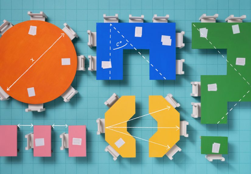
Tip 5: Pick the right “meeting geometry”
Many organizations publish practical setup guides because different meeting formats predictably produce different behaviors.
Here’s a research-aligned way to choose:
-
Boardroom/conference table: Best for decision-making and negotiation. Watch-outs: side conversations and
“power positions” at the ends. - U-shape: Great for training + discussion. The facilitator can move inside the U and maintain visibility.
- Classroom style (tables in rows): Best for note-taking, workshops with materials, or laptop use.
- Theater style: Maximum capacity for listening. Minimum collaboration unless you add structured turn-and-talk.
- Cabaret/rounds: Best for mixed presentation + table discussion (people face the front but still have groups).
- Team tables/clusters: Best for problem-solving, project work, and interactive learning.
Pro tip: If you expect debate, avoid placing opponents directly facing each other across a narrow table.
That’s not collaborationthat’s a courtroom drama with worse snacks.
Tip 6: In offices, rotate seating only when it has a purpose (and explain that purpose)
Workplace research and management writing warns that seat changes can feel disruptive if they’re done “because we can.”
But rotation can help create new connections and reduce silos when it’s aligned to real collaboration needs.
How to apply it: Rotate to support project-based work (seat cross-functional partners near each other),
not as a random ritual. Provide norms: quiet zones, collaboration zones, and predictable anchors (so people aren’t perpetually
hunting for a power outlet like it’s hidden treasure).
Tip 7: Don’t forget the body: ergonomic seating is performance seating
People can’t contribute if they’re in pain. Government and university ergonomics guidance consistently emphasizes neutral posture:
feet supported, knees and hips comfortable, wrists neutral, and monitor placement that reduces neck strain. For computer work,
practical checklists commonly recommend keeping the monitor at a comfortable distance (often roughly an arm’s length) and positioning
the screen so the top portion is at or slightly below eye level.
How to apply it: In training rooms and conferences, provide a mix of seating types when possible (standard chairs,
some higher-top options, and space for standing breaks). In offices, encourage microbreaks and simple adjustments. In classrooms,
consider flexible seating cautiouslymovement options can help attention for some learners, but structure still matters.
Tip 8: Design for access and dignity (accessibility is not optional décor)
Accessibility standards provide concrete minimums that should shape layoutsespecially in assembly spaces. For example, ADA guidance
specifies minimum dimensions for wheelchair spaces and requires that they connect to accessible routes without forcing someone to
“park in the aisle.” It also emphasizes dispersing accessible seating so people can choose different locations and viewing angles,
not just “the one lonely spot.”
How to apply it:
- Keep clear routes wide and unobstructeddon’t store extra chairs in the accessible path.
- Disperse accessible seating across the room (front/middle/back options when feasible).
- Include companion seating next to accessible spaces.
- Ensure presenters can be seen from accessible locations (not blocked by podiums or table legs).
Tip 9: Use “social mixing” intentionally at events
For banquets, receptions, and networking events, seating controls conversation patterns. If you want fresh connections,
avoid grouping all friends together at one table and all strangers at another (that’s how you get one loud table and one table
quietly auditioning for a library job).
How to apply it: Mix by shared interests, roles, or project needs. Use rounds to encourage table conversation,
but keep a clear focal path to speakers or screens. If the event includes both a talk and table discussion, choose cabaret-style
placement so people can pivot between listening and collaborating without rearranging the entire universe.
Tip 10: Measure it like you mean it
Seating is easy to change, which makes it perfect for small experiments. Instead of arguing about layouts by vibes alone,
collect quick evidence:
- Observation: Who speaks? Who withdraws? Where do side conversations start?
- Pulse surveys: “Could you see/hear well?” “Did you feel comfortable participating?”
- Outcome markers: Quiz scores, task completion time, decision quality, or post-session recall.
- Equity check: Are the same people always in the back corner? Are accessible options truly comparable?
Common Seating Mistakes (A Short Comedy of Errors)
- One layout all day, every day: It signals “one mode of learning/work,” even when tasks change.
- Ignoring sightlines: If half the room can’t see, half the room will disengage.
- Underestimating noise: Clusters boost collaboration but also raise chatterplan for it.
- Creating accidental “VIP zones”: The best seats shouldn’t belong to the same people forever.
- Blocking access: Aisles aren’t storage. Accessible routes aren’t negotiable.
of “Experience” (Composite, Real-World Lessons People Commonly Report)
Let’s talk about what tends to happen in the wildbased on common experiences reported by teachers, facilitators, event planners,
and office managers (not magical mind-reading, and not personal lived experience). The patterns are surprisingly consistent.
In classrooms, one of the most repeated “aha” moments is how fast behavior changes when you separate a chatty duo.
Teachers often describe it like turning down the volume on the entire room. It’s rarely about punishment; it’s about reducing the
number of easy distractions within arm’s reach. Another frequently reported win: keeping easily distracted students away from the
doorway and windows. The door is basically a live-action notification feedevery late arrival, hallway sound, and passerby becomes
a pop-up ad for attention. When seating plans account for that, engagement usually feels less like herding cats and more like
teaching humans.
In meetings, people often underestimate how much a table shape determines who “owns” the conversation.
In a classic boardroom setup, the person at the end can accidentally become the default authorityeven if they’re just sitting
there because it was closest to the coffee. Facilitators commonly report better balanced participation in a U-shape, where the
leader can move, make eye contact, and invite quieter voices without feeling like they’re moderating a courtroom showdown.
In theater style, the opposite happens: it’s excellent for listening, but if you ask for discussion without a structure (pairs,
small groups, guided prompts), you’ll usually get the same two brave souls speaking while everyone else becomes an audience member
in their own meeting.
At events, the most common “seating regret” is accidentally isolating someonelike placing a single attendee at a
table of tightly bonded friends or mixing people with nothing in common and no prompts to connect. Event organizers often report
better outcomes when they mix by shared interests (industry, hobbies, project roles) and add small conversation cues (table cards
with a question, a quick intro prompt, or a short activity). Even tiny structure can prevent the awkward “so… how do you know the host?”
loop from repeating until dessert.
In offices, seating changes can be either a collaboration superpower or a morale pothole. People tend to respond well
when there’s a clear reasonlike co-locating a cross-functional project team for a sprintplus a basic plan for focus (quiet zones)
and tools (whiteboards, shared screens, enough outlets). What people tend to dislike is “surprise musical chairs” with no explanation,
especially if it breaks helpful routines or creates new noise conflicts. A small but frequent lesson: if you want more collaboration,
don’t just move people closeralso create norms for interruptions and signals for “do not disturb,” or you’ll get a room full of
friendly productivity derailments.
Across all these settings, the most practical lesson is simple: seating is a system you can test. Try a layout for
two weeks. Watch what changes. Keep what works. Adjust what doesn’t. The best seating plan isn’t “perfect”it’s responsive.
Conclusion: The Best Seating Arrangement Is the One That Makes the Right Behavior Easy
Optimal seating arrangements aren’t about aesthetics or traditionthey’re about outcomes. Research points to the same core moves:
match layout to task, protect attention by managing distractions and neighbors, improve visibility, support comfort with ergonomic
basics, and design for accessibility and dignity. Then measure, tweak, and repeat. If that sounds like a lot, start small:
change one thing (neighbors, sightlines, or traffic flow) and watch what happens. Seating is one of the rare decisions that’s
both low-cost and high-impactlike finding an extra hour in the day, except it’s made of chairs.