Table of Contents >> Show >> Hide
- Why This Clock Still Feels So Distinctly IBM
- The Design Language Behind the Clock
- What Makes the 1970s Association So Strong?
- Materials, Construction, and the Industrial Feel
- Collector Appeal: Why People Hunt for Them Today
- How It Fits Into American Design History
- How to Style One Without Turning Your Room Into a Fake Office Museum
- Why the Clock Still Matters
- Experiences Related to the 1970’s IBM Standard Issue Wall Clock
- Conclusion
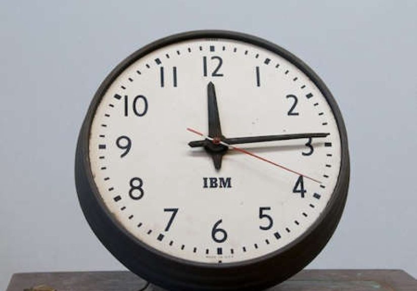
Some objects tell time. Others tell a story. The 1970’s IBM Standard Issue Wall Clock does both, and it does it with the kind of no-nonsense confidence that makes you want to stand a little straighter and maybe finish that memo before lunch. At first glance, it is just a round industrial clock: clean numerals, practical hands, metal case, glass lens, zero glitter, zero drama. But that understatement is exactly the point. This is the sort of design that made old offices, schools, labs, and workrooms feel organized, competent, and quietly futuristic.
Strictly speaking, the look collectors now associate with a “1970s IBM wall clock” did not appear out of thin air on New Year’s Day of 1970. Its visual DNA reaches back to earlier IBM design decisions, especially the company’s postwar push toward a modern identity and the broader design discipline that shaped everything from buildings to graphics to office machines. By the 1970s, however, that restrained IBM aesthetic had matured beautifully. The clock looked perfectly at home in the decade of systems furniture, humming equipment rooms, muted wall colors, and the famous striped IBM logo. In other words, the 1970s did not invent the IBM wall clock mystique, but they certainly gave it a very comfortable place to hang.
Why This Clock Still Feels So Distinctly IBM
IBM’s history has an unusual twist that makes the company’s clocks more than random corporate merchandise. Long before IBM became shorthand for computing, the business descended in part from time-recording equipment. That heritage matters because it turns the wall clock from a cute vintage accessory into something closer to a family heirloom from the company’s earlier life. Even when IBM evolved into a giant of data processing and computing, the relationship between work, timing, accuracy, and systems never really disappeared. A clock on the wall was not decorative fluff. It was part of the operating logic of the place.
That practical streak is what gives the IBM Standard Issue Wall Clock its lasting appeal. It does not try to seduce you with ornate trim, hand-painted flowers, or enough brass to blind a small village. Instead, it leans hard into clarity. The face is easy to scan from across a room. The proportions are balanced. The case feels sturdy rather than precious. It is industrial design behaving exactly as it should: useful first, handsome as a result.
The Design Language Behind the Clock
To understand the charm of a 1970’s IBM wall clock, you have to understand IBM’s larger design culture. Mid-century IBM became famous for treating design as an integrated system, not as frosting slapped onto products at the end. That philosophy shaped architecture, logos, machines, interiors, and workplace tools. The result was an aesthetic that valued order, modernity, coherence, and calm authority. A clock made for that environment was never going to look fussy. It had a job to do, and it was going to do it without needing applause.
That is why the best IBM clocks feel almost architectural. The round face reads like a precise graphic sign. The case has the quiet solidity of industrial hardware. The restrained palette, typically neutral and workmanlike, helps the clock disappear and stand out at the same time. It disappears as clutter, but it stands out as a form. That is not easy to pull off. Plenty of clocks either scream for attention or melt into the wall like a forgotten paper plate. The IBM style manages to be memorable precisely because it refuses to show off.
Form That Rewards Distance
One of the smartest things about the IBM wall clock is that it looks better the farther away you are. Up close, you notice the metal, the dial, the hands, the lens. Step back, and the object becomes almost graphic. It starts behaving like signage. That quality made it ideal for busy rooms where people needed to check the time quickly. A wall clock in a workplace is not a wristwatch; it is shared information. IBM’s design culture understood that difference.
Function Wears the Suit Here
There is a certain honesty to the clock’s industrial look. It is not pretending to be hand-carved French furniture. It is also not pretending to be futuristic space jewelry. It looks like what it is: a durable, readable timepiece built for real environments. In the 1970s, when American offices were full of practical equipment and streamlined visual systems, that approach made perfect sense. The IBM clock fit into rooms with filing cabinets, typewriters, terminals, task chairs, and fluorescent lights without ever feeling out of place.
What Makes the 1970s Association So Strong?
The 1970s connection is partly visual and partly emotional. Visually, the decade loved disciplined modernism. You see it in corporate interiors, public institutions, schools, and workspaces that valued efficiency over ornament. IBM’s 1972 striped logo pushed the company’s identity even further into that polished, modern territory, and the wall clock’s clean face naturally belongs in that world. Even if some original design cues go back earlier, the clock feels deeply at home in the IBM universe of the 1970s.
Emotionally, the 1970s were a peak era of shared workplace objects. Before everyone carried a phone, time lived on the wall, on the desk, in the office machine, and in the rhythm of the building. That gave a standard issue wall clock real presence. It was part of the daily choreography: the glance before a meeting, the hopeful stare before lunch, the dramatic look upward during a long training session, and the tiny thrill of watching the second hand drag you toward five o’clock like a loyal but underpaid mule.
Materials, Construction, and the Industrial Feel
Surviving IBM clocks and later reproductions point to the features that define the type: a metal case, a prominent glass lens, strong legible graphics, and a scale large enough to read across a room. Some examples on the vintage market appear in compact diameters, while others are larger and more commanding, reinforcing the idea that these were built for institutional use rather than bedside-table cuteness. That range only adds to the collector appeal. The smaller ones feel nimble and graphic; the bigger ones have the presence of factory equipment with better manners.
The lens matters more than people think. A domed glass lens gives the clock a little depth and a little dignity. It also softens the strict geometry just enough to keep the object from feeling cold. The steel or iron case does the opposite: it adds weight, discipline, and a sense of permanence. Together, those materials create a balance that feels very mid-century American industrial design: simple, sturdy, and somehow more elegant because nobody was trying too hard.
Collector Appeal: Why People Hunt for Them Today
Vintage enthusiasts love the IBM Standard Issue Wall Clock for several reasons, and nostalgia is only one of them. First, it fits beautifully into modern interiors. If your home office has walnut shelving, neutral walls, old books, and one mildly intimidating desk lamp, this clock looks like it has been there since the Kennedy administration and still pays rent on time. Second, it carries corporate and design history without feeling like a novelty sign. You are not hanging a giant advertisement on your wall. You are hanging a piece of industrial culture.
Third, it bridges multiple collecting worlds at once. Clock collectors like it for the movement and build. Industrial design fans like it for the form. IBM and technology enthusiasts like it for the brand history. Mid-century decorators like it because it makes almost everything around it look sharper. That is a rare trick. Most collectible objects are either too niche, too fragile, or too loud. The IBM wall clock slips into conversation with almost any room and almost any collection.
Originals Versus Reproductions
Reproductions helped keep the design alive, especially when American design retailers recognized that the old IBM clock had become more than office leftovers. Faithful modern versions preserved signature details like the spun metal case, domed lens, and bold face treatment while switching to more convenient contemporary movements. Originals, on the other hand, offer age, patina, period mechanisms, and the occasional “this thing probably watched a hundred deadlines pass” aura. Neither route is wrong. One is cleaner and easier. The other comes with history, dust, and the possibility of acquiring a new hobby called “clock troubleshooting at 11:47 p.m.”
How It Fits Into American Design History
What makes the 1970’s IBM Standard Issue Wall Clock especially interesting is that it sits at the intersection of corporate identity, industrial design, and workplace memory. It is easy to talk about glamorous icons like the Eames lounge chair or the IBM Selectric typewriter because they get museum treatment and magazine spreads. A wall clock is humbler. But humble objects often tell the truth better. They reveal what a company thought everyday life should look like.
In IBM’s case, the answer was clear: everyday life should look organized, readable, modern, and sane. That philosophy extended from major products down to ordinary objects. A clock in that ecosystem was not meant to be whimsical. It was meant to be dependable, legible, and visually consistent with the rest of the environment. That consistency is exactly why the clock feels so satisfying today. It carries the confidence of a company that believed design was not separate from work but part of how work should happen.
How to Style One Without Turning Your Room Into a Fake Office Museum
Here is the good news: you do not need to recreate an IBM training center from 1974 to make this clock look fantastic. In fact, a little restraint goes a long way. The best styling move is usually contrast. Hang the clock on a quiet wall and let its graphic face do the talking. Pair it with natural wood, black metal, paper files, ceramics, or simple textiles. It also works beautifully in kitchens, studios, entryways, and home offices because it brings order without feeling sterile.
If you want the full vintage-industrial effect, combine it with a steel task lamp, a wood desk, and one or two older office objects like a stapler, file box, or typewriter. If you want a softer look, pair it with warmer woods, muted paint, and art that gives the room some life. The clock is surprisingly adaptable. It can lean factory, academic, mid-century, or even quietly Scandinavian if the rest of the room plays nice.
Why the Clock Still Matters
We live in an age when time is everywhere and somehow nowhere. It glows on phones, laptops, ovens, dashboards, earbuds, microwaves, watches, smart speakers, and probably on at least one appliance that has no business telling time at all. That overload makes a great wall clock feel almost radical. It gives time a place again. It puts the information back into the room instead of burying it inside a screen.
The 1970’s IBM Standard Issue Wall Clock matters because it reminds us that utility can be beautiful and that corporate design, at its best, can produce objects that outlast the systems that spawned them. It is a timepiece, yes, but it is also a tiny monument to discipline, clarity, and the odd comfort of shared routines. It does not beg for attention. It earns it. That may be the most IBM thing about it.
Experiences Related to the 1970’s IBM Standard Issue Wall Clock
The experience of living with a clock like this is surprisingly emotional for such a practical object. People often expect a vintage IBM wall clock to feel cold or corporate, but the opposite tends to happen. Once it is on the wall, it starts creating atmosphere. In a kitchen, it gives the room a quiet sense of order, like breakfast might somehow become more efficient just because the numerals look serious. In a home office, it can make the space feel more deliberate, as if the room has stopped pretending to be a temporary work corner and finally accepted a promotion.
There is also the visual experience of it. Many decorative clocks ask for a compliment every time you walk by. The IBM clock does not. It just sits there being competent, which ends up being oddly charming. The clean dial is easy to read from across the room, and the larger case gives it a presence that feels architectural rather than fussy. If the clock has a glass lens with a bit of age or a slightly softened finish on the case, that patina adds warmth. You stop seeing it as an old office object and start seeing it as a piece of daily scenery that improves the room simply by being calm.
Then there is the nostalgia factor, even for people who never worked in a classic IBM office. The design taps into a broader American memory of schools, labs, government buildings, libraries, and workplaces where objects were built to last. The clock can trigger a strange sense of familiarity: maybe it reminds someone of a hallway outside a science classroom, a parent’s office, a hospital waiting area, or a municipal building where every object looked like it had been approved by a committee determined to avoid nonsense. That sounds dull on paper, but in real life it feels comforting. The clock represents a world where time was public, visible, and shared.
Collectors and vintage shoppers also describe a particular thrill in finding one. Spotting an IBM wall clock at a flea market, salvage shop, antique mall, or online listing feels like discovering a useful artifact rather than a decorative trinket. You are not just buying a clock; you are rescuing a piece of American work culture. Even the minor imperfections become part of the experience. A scratch on the case, an old label on the back, or a slightly aged dial can make the piece feel more authentic, not less.
And finally, there is the everyday experience of checking the time on it. That might sound too obvious to mention, but it is the heart of the whole thing. A good wall clock changes how a room works. Instead of fishing your phone out of your pocket every twenty minutes and getting distracted by messages, you just look up. The clock gives you the answer and sends you back to your life. No notifications. No algorithms. No accidental detour into the internet. Just the time, offered plainly and without drama. For a design born from a company obsessed with systems, that may be the most elegant feature of all.
Conclusion
The 1970’s IBM Standard Issue Wall Clock is more than a vintage office accessory with good posture. It is a compact lesson in American industrial design, corporate identity, and the beauty of purposeful objects. Rooted in IBM’s long relationship with timekeeping and shaped by a design culture that prized clarity over clutter, the clock remains relevant because it still solves the same problem in the same smart way. It tells time clearly, looks right almost anywhere, and carries just enough history to make a room feel deeper.
For collectors, it is a crossover object with real design credibility. For decorators, it is a graphic anchor with utility. For nostalgia lovers, it is a portal to the age of shared walls, shared schedules, and shared glances at the clock before the meeting began. And for everyone else, it is proof that even a standard issue object can become an icon when the design is honest, durable, and just a little bit cooler than it needs to be.