Table of Contents >> Show >> Hide
- What Is a Tone-on-Tone Wall Stencil?
- Best Rooms for a Tone-on-Tone Stencil
- Choose the Right Tone-on-Tone Color Strategy
- Supplies You’ll Need
- How To Prepare the Wall
- How To Lay Out the Pattern
- How To Apply the Stencil Without Making a Mess
- How To Get the Tone-on-Tone Effect Just Right
- Common Mistakes and How To Avoid Them
- Design Ideas for a Sophisticated Finish
- How Long Does the Project Take?
- Is It Worth It?
- Experiences and Lessons From Real-Life Tone-on-Tone Stencil Projects
- Conclusion
If wallpaper and a plain painted wall had a very stylish, very budget-conscious baby, it would probably be a tone-on-tone wall stencil. This finish gives you pattern without chaos, drama without shouting, and personality without turning your living room into a circus tent. In other words, it is the kind of design move that whispers, “I know what I’m doing,” even if you are standing on a ladder in old sweatpants eating pretzels between coats.
A tone-on-tone wall stencil uses colors from the same family, often the exact same paint color in a different sheen or a slightly lighter or darker variation. The result is subtle, elegant, and surprisingly rich. It catches light during the day, creates a soft layered effect at night, and makes people ask, “Wait, is that wallpaper?” which is one of the highest compliments a painted wall can receive.
This guide walks you through exactly how to add a tone-on-tone wall stencil, from choosing the right wall and paint finish to lining up the pattern and avoiding the dreaded paint bleed. Because yes, stencil bleed is real, and no, pretending it is “artistic texture” does not always work.
What Is a Tone-on-Tone Wall Stencil?
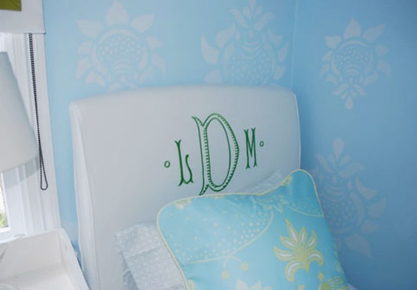
A tone-on-tone wall stencil is a decorative paint technique where you apply a stenciled pattern over a base wall color using a closely related shade or the same hue in a different finish. Instead of creating a bold contrast, the design appears subtle and dimensional. Think soft damask over warm greige, glossy geometric shapes over matte navy, or pearl-finish trellis over eggshell sage.
This look works because the pattern reveals itself through light, shadow, and texture rather than loud color contrast. It feels custom, polished, and expensive, even when the supply list says otherwise.
Why homeowners love this look
- It adds depth without overwhelming the room.
- It gives walls a wallpaper-like effect for less money.
- It works with traditional, modern, farmhouse, and transitional styles.
- It is easier to live with long term than a super-bold accent pattern.
- It can make a room feel layered and finished, not just painted and abandoned.
Best Rooms for a Tone-on-Tone Stencil
You can stencil nearly any interior wall, but some spaces are especially well suited to this technique. Bedrooms, dining rooms, powder rooms, entryways, and home offices tend to get the best payoff. These rooms often benefit from a little visual interest, and because the pattern is subtle, it does not make the space feel busy.
A full-room stencil can look beautiful, but a single accent wall is often the smartest place to start. Behind a bed, around a fireplace, in a breakfast nook, or on the wall behind a desk, a tone-on-tone pattern creates a focal point without stealing the whole show.
Choose the Right Tone-on-Tone Color Strategy
This is where the magic happens. Tone-on-tone does not mean boring. It means controlled. You want enough difference to reveal the pattern, but not so much that the wall starts yelling from across the room.
Option 1: Same color, different sheen
This is the most refined version. Paint the wall in a flat, matte, or eggshell finish, then stencil with the same color in pearl, satin, or semigloss. From straight on, the wall may look nearly solid. As light moves across it, the pattern appears like a secret with good manners.
Option 2: Same hue, slightly lighter or darker
If you want the pattern to show a bit more, use a stencil color that is one or two steps lighter or darker than the base. For example, pair a soft mushroom wall with a slightly deeper taupe stencil, or a dusty blue wall with a muted slate blue overlay.
Option 3: Paint plus glaze
For a softer, old-world finish, some DIYers prefer a glaze mixture over the base coat. This can create a more translucent design that feels layered rather than sharply painted. It is especially pretty in formal dining rooms, powder rooms, or spaces where you want that subtle faux-finish charm.
Supplies You’ll Need
- Wall stencil
- Base coat paint
- Stencil paint or same color in a different sheen
- Stencil brush, dense foam roller, or small foam roller
- Painter’s tape
- Low-tack spray adhesive
- Level
- Measuring tape
- Pencil or chalk
- Paper towels or lint-free rags
- Drop cloth
- Paint tray
- Ladder
- Sample board or poster board for practice
Do not skip the practice board. It is the difference between “I’ve got this” and “Why does my wall look like a haunted tablecloth?”
How To Prepare the Wall
Preparation is the least glamorous part of the project, which is exactly why it matters so much. A stencil highlights surface problems. Tiny dents, crumbs of old paint, greasy spots, and rough patches that looked harmless before can suddenly become very noticeable once pattern enters the chat.
Step 1: Clean the surface
Wipe away dust, grease, and grime. In kitchens, hallways, and kids’ rooms, this matters even more because paint does not bond beautifully to old fingerprints and mystery smudges.
Step 2: Patch and sand
Fill nail holes, patch imperfections, and sand rough areas smooth. If the wall is glossy, lightly scuff it so the new finish grips properly.
Step 3: Prime if needed
If you are painting over a dark color, patched areas, stains, or a tricky existing finish, primer is worth the extra effort. It helps the base coat look even, which matters because uneven color underneath a stencil will show.
Step 4: Apply the base coat
Paint the wall with your chosen base color and let it cure fully. Not “feels dry enough if I squint.” Fully dry. Rushing this step can cause the stencil to stick, lift paint, or smear the pattern.
How To Lay Out the Pattern
Good layout is what makes a stencil wall look intentional instead of accidentally enthusiastic. Start by deciding whether you want the pattern centered on the wall, aligned with a major architectural feature, or begun in a less noticeable corner.
Center-first method
This is best for accent walls, walls behind beds, and spaces where symmetry matters. Measure the center of the wall vertically and horizontally, then use a level to draw light guide lines. Position the stencil around this center point so the pattern feels balanced from side to side.
Corner-first method
This works well for all-over patterns in less formal spaces. Starting in an upper corner is simpler, but it can leave you with cut-off motifs in highly visible areas. If you are okay with a more casual finish, this method is perfectly reasonable.
Before you commit, tape the stencil to the wall and step back. Then step back farther. Then farther still. A pattern can look fabulous at ladder distance and weirdly tiny from the doorway.
How To Apply the Stencil Without Making a Mess
This is the make-or-break section. The biggest secret to beautiful stencil work is not fancy talent. It is restraint. Specifically, restraint with paint.
Step 1: Secure the stencil
Use painter’s tape and, if needed, a light coat of low-tack spray adhesive on the back of the stencil. The adhesive helps the stencil sit tighter to the wall, especially around delicate details. Let the adhesive settle briefly before placing the stencil so it stays tacky, not gooey.
Step 2: Load your roller or brush lightly
If using a foam roller, load it with paint and then offload most of that paint onto the tray or a scrap surface. The roller should feel almost dry. If using a stencil brush, dip only the tips and blot thoroughly on paper towels. This part feels wrong the first time because your brain says, “That cannot possibly be enough paint.” Your brain is being dramatic.
Step 3: Apply in thin layers
Use a pouncing, stippling, or light swirling motion with a brush, or use a nearly dry roller in light passes. Build the pattern gradually with two or three thin layers rather than one thick coat. Thick paint seeps under stencil edges and ruins clean lines fast.
Step 4: Lift carefully
Peel the stencil away gently, usually while the paint is still slightly wet, and check the result. Clean the stencil regularly as paint builds up. A dirty stencil is a sneaky saboteur.
Step 5: Repeat with patience
Line up the registration marks or pattern edges carefully for the next repeat. Use a level often. The human eye forgives many things, but a drifting pattern is not one of them.
How To Get the Tone-on-Tone Effect Just Right
The goal is subtle contrast, not invisibility and not full-on graphic wallpaper. To land in that sweet spot, test your combo on a board first and move it around the room at different times of day. Morning light, lamplight, and side light can all change how much the stencil shows.
If the pattern disappears completely, increase contrast by using a higher sheen or slightly darker stencil color. If it jumps out too much, scale back with a closer color match or softer finish. Often, the prettiest result is one that looks understated from across the room and richer up close.
Common Mistakes and How To Avoid Them
Using too much paint
This is the number-one stencil mistake. More paint does not equal better coverage. It equals fuzzy edges and regret.
Skipping the practice run
Practice teaches you how dry your roller should feel, how much pressure to use, and how visible the sheen difference will be.
Ignoring wall texture
Heavily textured walls can be stenciled, but the effect is usually softer and less crisp. Choose a larger, more forgiving pattern if your wall texture is prominent.
Forgetting to step back
Check alignment every few repeats. A small shift becomes a giant visual wobble by the time you reach the far end of the wall.
Choosing the wrong pattern scale
A tiny pattern on a huge wall can look busy and fussy. An oversized pattern in a tiny powder room can feel like it is wearing shoulder pads. Match the scale to the room.
Design Ideas for a Sophisticated Finish
- Soft greige + satin greige stencil: timeless and easy to live with.
- Dusty blue + pearl-finish same-color stencil: calm, coastal, and quietly dramatic.
- Warm white + slightly deeper ivory stencil: subtle texture in low-light rooms.
- Charcoal matte + charcoal satin stencil: moody and upscale without looking flashy.
- Sage eggshell + muted olive stencil: earthy, elegant, and very current.
If you want a high-end look, pair a classic pattern like trellis, damask, or a clean geometric repeat with restrained color. Tone-on-tone is not about showing off every square inch. It is about making the room feel better dressed.
How Long Does the Project Take?
For one accent wall, plan on a weekend. Day one is prep and base coat. Day two is layout and stenciling. A small powder room or nook may move faster, while a large feature wall with lots of repeat pattern takes longer than expected. Not because the project is difficult, but because precision has a way of eating the clock.
Is It Worth It?
Absolutely, especially if you want the charm of wallpaper without the higher material cost, paste drama, or long-term commitment. A tone-on-tone wall stencil delivers visual texture, custom character, and a designer touch with paint, patience, and a little planning. It is affordable, personal, and much easier to touch up later than a torn wallpaper seam.
Most of all, it creates a room that feels layered and thoughtful. And in decorating, thoughtful beats expensive more often than people admit.
Experiences and Lessons From Real-Life Tone-on-Tone Stencil Projects
The first thing many people notice after finishing a tone-on-tone wall stencil is that the room feels different before they can explain why. It does not scream “new feature wall.” Instead, it feels softer, richer, and more complete. A bedroom can suddenly feel cocooning. An entryway can feel less like a hallway and more like part of the home’s actual personality. A bland home office can stop looking like a temporary setup and start looking like a room where good ideas might actually clock in on time.
One common experience is that the stencil seems almost invisible right after application, especially if you used the same color in a different sheen. Then the sun shifts, a lamp turns on, or you walk past the wall from an angle, and there it is. That delayed reveal is part of the charm. It is subtle in the best way. Guests tend to move closer, tilt their heads, and ask if the wall is wallpaper, plaster, or some expensive boutique finish. That moment alone can make the whole project worth the ladder time.
Another lesson people learn quickly is that rhythm matters. Stenciling is not a race. The best sessions feel almost meditative: tape, level, dab, lift, slide, repeat. Once you settle into the pattern, the project becomes oddly satisfying. It is detailed work, yes, but not necessarily stressful. In fact, many DIYers find it more forgiving than freehand painting because the stencil gives structure. You do not have to invent the design. You just have to respect it.
There is also the reality that the wall rarely looks perfect from six inches away, and that is okay. Tiny soft edges, the occasional variation in paint density, and slight hand-done inconsistency are part of the appeal. From normal viewing distance, those “imperfections” disappear into texture and character. The finished wall looks handmade, not machine printed, and that is exactly why it feels warm instead of sterile.
Some of the happiest results come from modest spaces. Powder rooms, laundry rooms, small dining corners, and reading nooks often become favorites because a stencil gives them an identity. These spaces do not need a massive budget or dramatic renovation to feel special. A quiet pattern in a closely matched color can do a surprising amount of emotional heavy lifting.
Perhaps the biggest takeaway is this: a tone-on-tone wall stencil rewards patience more than expertise. You do not need magician-level painting skills. You need a good plan, a light hand, and the willingness to do one more careful repeat instead of one rushed one. And once the wall is done, the room tends to look as though you hired someone who uses phrases like “bespoke surface treatment” with a straight face. Not bad for a project built on paint, tape, and a slightly overworked foam roller.
Conclusion
If you want a wall treatment that feels custom, elegant, and surprisingly achievable, a tone-on-tone wall stencil is hard to beat. The secret is simple: prep the wall well, choose a subtle color strategy, use very little paint, and build the pattern slowly. Done right, the result is soft but memorable, decorative but livable, and stylish without trying too hard. In short, it is the decorating equivalent of wearing a tailored blazer with sneakers: polished, comfortable, and cooler than it has any right to be.