Table of Contents >> Show >> Hide
- How to Build a Living Room Color Scheme That Works
- 33 Beautiful Living Room Color Schemes You Can Use Right Now
- 1) Warm White + Greige + Matte Black
- 2) Cream + Taupe + Olive Green
- 3) Soft White + Camel + Walnut Brown
- 4) Ivory + Dusty Blue + Brass
- 5) Cloud Gray + Charcoal + Cognac Leather
- 6) Stone Beige + Sage + Natural Oak
- 7) Mushroom + Mocha + Linen White
- 8) Sand + Terracotta + Clay Pink
- 9) Oatmeal + Rust + Espresso
- 10) Greige + Navy + Antique Gold
- 11) Pale Gray + Ink Blue + Crisp White
- 12) Denim Blue + Warm White + Light Maple
- 13) Mist Blue + Charcoal + Soft Black
- 14) Seafoam + Sand + Driftwood Gray
- 15) Slate Blue + Mauve + Bronze
- 16) Soft Sage + Cream + Black Frames
- 17) Olive + Bone + Tobacco Brown
- 18) Eucalyptus + Off-White + Warm Brass
- 19) Forest Green + Beige + Tan Leather
- 20) Mint Gray + White + Honey Wood
- 21) Blush + Mushroom + Taupe
- 22) Dusty Rose + Warm White + Walnut
- 23) Peach Beige + Clay + Cocoa
- 24) Lavender Gray + Ivory + Pewter
- 25) Lilac + Charcoal + Oak
- 26) Soft Black + Warm White + Camel
- 27) Espresso + Alabaster + Olive
- 28) Chocolate Brown + Taupe + Brass
- 29) Charcoal + Fog Gray + Walnut
- 30) Mustard + Cream + Ink Blue
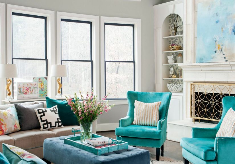
- 31) Teal + Warm Gray + Walnut
- 32) Cobalt + White + Honey Wood
- 33) Burgundy + Blush Beige + Black Accents
- Quick Styling Rules That Prevent Color Regret
- Real-Home Experiences: What These Color Schemes Felt Like in Daily Life (About )
- Conclusion
A living room color scheme does more than make a space look “nice.” It sets emotional temperature.
It can make your room feel calm, energized, cozy, dramatic, or quietly luxurious without moving a single wall.
The right palette also helps furniture, art, rugs, and lighting feel intentional instead of accidental.
This guide gives you 33 beautiful living room color schemes you can actually use in real homes, from tiny apartments to open-plan family spaces.
You’ll get practical styling tips, simple balance rules, and examples that make the process easier than staring at paint swatches until your soul leaves your body.
How to Build a Living Room Color Scheme That Works
Start with mood, not paint chips
Ask one question first: How do I want this room to feel? Cozy? Airy? Sophisticated? Playful?
Your emotional goal should lead color choices, not trend panic.
Use the 60-30-10 rule
A reliable formula: 60% dominant color (usually walls), 30% secondary color (upholstery, curtains, rug), and 10% accent (pillows, art, decor).
This keeps your palette dynamic without chaos.
Respect undertones
White, gray, beige, and even black have undertones. Warm undertones pair best with warm woods and brass.
Cool undertones are happier with chrome, crisp whites, and cooler woods. If the undertones fight, the room feels “off” even if you can’t explain why.
Test paint in real light
Morning light, afternoon light, lamp light, rainy-day lightyour color shifts in all of them.
Paint large sample areas and watch for two days before committing.
33 Beautiful Living Room Color Schemes You Can Use Right Now
-
1) Warm White + Greige + Matte Black
A forever combination for modern homes. Warm white walls keep things bright, greige upholstery adds softness, and matte black accents create clean structure.
Use for minimalist, transitional, or Scandinavian-inspired rooms. -
2) Cream + Taupe + Olive Green
Think quiet, earthy elegance. Cream opens the room, taupe grounds it, olive adds organic depth.
Layer linen curtains and a jute rug for a relaxed, high-end look. -
3) Soft White + Camel + Walnut Brown
This palette feels warm and collected. Camel adds richness without being loud.
Walnut furniture gives architectural weight and makes even a rental feel custom. -
4) Ivory + Dusty Blue + Brass
Dusty blue brings a calm, coastal-adjacent mood without going “beach theme.”
Ivory keeps it fresh; brass lighting adds polish and warmth. -
5) Cloud Gray + Charcoal + Cognac Leather
Sleek but inviting. Cloud gray softens walls, charcoal introduces contrast, and cognac leather breaks up cool tones with warmth.
Great for urban or loft-style spaces. -
6) Stone Beige + Sage + Natural Oak
A soft biophilic scheme. Stone walls calm visual noise, sage accents echo nature, and oak furniture keeps it light and lived-in.
Perfect for family rooms. -
7) Mushroom + Mocha + Linen White
Subtle and sophisticated. This is your palette if you want depth without bold color.
Mix boucle, wool, and linen textures to avoid a flat look. -
8) Sand + Terracotta + Clay Pink
Warm desert energy. Sand keeps it approachable, terracotta adds personality, clay pink softens transitions.
Works beautifully with curved furniture and ceramic decor. -
9) Oatmeal + Rust + Espresso
Cozy and mature. Oatmeal walls provide a gentle background, rust textiles inject warmth, espresso accents sharpen the composition.
Ideal for rooms with fireplaces. -
10) Greige + Navy + Antique Gold
A refined classic. Greige makes navy feel intentional, not heavy.
Antique gold frames, sconces, or table lamps deliver a designer-level finish. -
11) Pale Gray + Ink Blue + Crisp White
Clean and tailored. Pale gray prevents starkness, ink blue adds confidence, and white trim creates definition.
Great for rooms with strong moldings. -
12) Denim Blue + Warm White + Light Maple
Casual, approachable, and family-friendly. Denim blue hides life’s little surprises (hello, snack hands).
Maple keeps the palette youthful and bright. -
13) Mist Blue + Charcoal + Soft Black
Moody without becoming cave-like. Mist blue lifts the space while charcoal and soft black deliver modern contrast.
Best in rooms with good natural light. -
14) Seafoam + Sand + Driftwood Gray
Breezy and serene. Seafoam works as an accent when you want color that whispers rather than shouts.
Pair with woven textures for an easy coastal-modern vibe. -
15) Slate Blue + Mauve + Bronze
An underrated combo with artistic charm. Slate blue stabilizes, mauve softens, bronze warms.
Perfect for vintage-inspired or eclectic living rooms. -
16) Soft Sage + Cream + Black Frames
Fresh but grounded. Soft sage on walls or millwork gives a gentle color wash.
Black picture frames and hardware keep the room from floating away into pastel land. -
17) Olive + Bone + Tobacco Brown
Rich and timeless. Olive creates intimacy, bone keeps contrast elegant, tobacco leather adds depth.
This scheme looks better as it ageslike a good jacket. -
18) Eucalyptus + Off-White + Warm Brass
A modern wellness palette. Eucalyptus feels soft and clean, off-white brightens, brass adds warmth.
Great for homeowners who want calm without plain beige. -
19) Forest Green + Beige + Tan Leather
Dramatic and inviting. Forest green on walls or built-ins creates depth fast.
Beige upholstery and tan leather prevent it from feeling too formal. -
20) Mint Gray + White + Honey Wood
Light, optimistic, and slightly retro in the best way. Mint gray feels airy, white keeps it crisp, honey wood adds warmth.
Excellent for smaller living rooms. -
21) Blush + Mushroom + Taupe
Soft sophistication without looking sugary. Blush works best dusty, not bubblegum.
Mushroom and taupe stabilize the palette and make it very adult-friendly. -
22) Dusty Rose + Warm White + Walnut
Warm and elevated. Dusty rose pairs surprisingly well with walnut tones and cream textiles.
Add black accents for sharper contrast. -
23) Peach Beige + Clay + Cocoa
Sunlit and cozy. Peach beige flatters skin tones and warms north-facing rooms.
Clay and cocoa deepen the look so it feels intentional, not pastel. -
24) Lavender Gray + Ivory + Pewter
Quietly elegant and a little unexpected. Lavender gray reads neutral from a distance but gives subtle personality.
Pewter hardware keeps things refined. -
25) Lilac + Charcoal + Oak
For people who want a gentle statement. Lilac works beautifully with charcoal accents and natural oak furniture.
Keep fabrics textured and mostly neutral. -
26) Soft Black + Warm White + Camel
High contrast done right. Soft black walls look cocooning, not harsh, when paired with warm whites and camel leather.
Add mirrors to bounce light. -
27) Espresso + Alabaster + Olive
Deep, cozy, and dramatic. Espresso delivers mood, alabaster lifts, olive accents connect everything to natural tones.
Excellent for large rooms that feel too empty. -
28) Chocolate Brown + Taupe + Brass
A luxurious, old-money-adjacent palette. Chocolate walls or trim create rich contrast.
Taupe upholstery keeps it welcoming; brass adds glow. -
29) Charcoal + Fog Gray + Walnut
Contemporary and architectural. Charcoal outlines the room, fog gray softens transitions, walnut introduces organic warmth.
Best with layered lighting and large artwork. -
30) Mustard + Cream + Ink Blue
Energetic and personality-packed. Mustard is best used in accentschairs, pillows, art.
Ink blue anchors the palette while cream keeps it from feeling heavy. -
31) Teal + Warm Gray + Walnut
Bold but balanced. Teal adds depth and style, warm gray prevents visual overload, walnut adds natural character.
A strong choice for eclectic or mid-century rooms. -
32) Cobalt + White + Honey Wood
Bright and cheerful with gallery-like clarity. Cobalt accents energize the room fast.
White walls and honey woods keep the look livable and fresh. -
33) Burgundy + Blush Beige + Black Accents
Dramatic, romantic, and sophisticated. Burgundy shines in velvet, art, or a feature wall.
Blush beige softens intensity; black details sharpen the silhouette.
Quick Styling Rules That Prevent Color Regret
- Pick one hero color: Let one shade lead and keep others supporting.
- Repeat color 3 times: If blue appears in art, echo it in pillows and decor for cohesion.
- Mix warm and cool thoughtfully: Contrast adds depth, but keep undertones compatible.
- Use texture as a “color amplifier”: Velvet, boucle, wood grain, and metal make palettes richer.
- Don’t forget the ceiling: Even a subtle ceiling tint can make a scheme feel custom.
- Sample before painting: Small chips lie. Large swatches tell the truth.
Real-Home Experiences: What These Color Schemes Felt Like in Daily Life (About )
In one small city apartment, a couple replaced stark builder-gray walls with a warm white + greige + matte black palette.
The room didn’t get bigger in square feet, but it felt less visually cramped within hours. Their previous cool gray absorbed light in the afternoon,
so the space looked tired by 4 p.m. Warm white bounced light around better, and greige upholstery softened everything without feeling bland.
The black accentsfloor lamp, frames, a slim coffee tableadded rhythm. Their biggest surprise: art they almost donated suddenly looked intentional.
A family with two kids tried stone beige + sage + natural oak after years of “safe white everything.”
They were worried green would look too trendy, but sage turned out to be the calmest color in the house.
It masked scuffs better than bright white and made weekend clutter feel less chaotic.
They also learned a practical lesson: when wall color has gentle depth, you can buy fewer decorative accessories and still get a layered look.
Translation: less shopping, less visual noise, fewer “Where did this basket come from?” moments.
In a north-facing townhouse with limited sunlight, a homeowner tested three palettes and chose sand + terracotta + clay pink.
She expected terracotta to feel heavy, but in that cool light it read warm and welcoming, especially at sunset.
The mistake she avoided was painting all four walls dark at once. She started with textiles and art, then painted one focal area,
then expanded. That staged approach helped her calibrate saturation and saved both money and repaint stress.
One open-concept living room needed to connect with a kitchen full of medium-toned wood cabinets.
The winning palette was ivory + dusty blue + brass. Dusty blue appeared in the rug and accent chairs first,
then moved onto a built-in bookshelf backing. Because the color was muted, it linked to the kitchen without competing.
Brass hardware repeated from the kitchen pendants into the living room lamp bases, creating a subtle visual bridge.
The homeowner described the result as “quietly polished”not flashy, but clearly designed.
A renter who loved bold color but feared losing a security deposit used teal + warm gray + walnut in a reversible way.
She kept walls neutral and put teal into a large area rug, drapes, and oversized art. Warm gray sofa, walnut sideboard, black-and-brass table lamp.
The lesson was empowering: you can build a strong living room color scheme without painting a single wall.
Her friends assumed she had hired a designer. She had not. She had just repeated colors intentionally and edited aggressively.
A final case involved a long, rectangular room that always felt like a hallway.
The owners used charcoal + fog gray + walnut, but only painted the short far wall charcoal to visually “pull it closer.”
They kept adjacent walls fog gray and added walnut shelving for warmth. Instantly, proportions felt better.
They also switched to warmer bulbs (2700K), which made the palette richer at night.
Their takeaway was simple and useful: color is architecture’s best low-cost sidekick.
You can correct mood, perceived proportions, and visual flow with paint and a few repeated tonesno demolition, no drama, no living in a construction zone for six months.
Conclusion
The best living room color schemes are the ones that match your light, your furniture, and your real lifenot just your saved inspiration photos.
Start with mood, test for undertones, balance with the 60-30-10 rule, and repeat colors with intention.
Whether you lean neutral, earthy, moody, or bold, a thoughtful palette can make your living room look more expensive, feel more comfortable,
and function better for everyday living.
If you’re undecided, begin with one anchor neutral plus one accent family, then build in layers.
A beautiful room is rarely created in one weekendit’s edited into greatness.