Table of Contents >> Show >> Hide
- Why Certain Home Features Look “Dated” (Even If They’re Still Functional)
- 9 Outdated Home Features Designers Never Want to See Again
- 1) Popcorn Ceilings
- 2) Carpeted Bathrooms
- 3) Tiled Countertops (a.k.a. Grout Lines That Collect Crumbs Like It’s Their Job)
- 4) Sponge-Painted Walls and Heavy Faux Finishes
- 5) Glass-Block Windows and Walls
- 6) Shiny Yellow Brass Everywhere
- 7) Orange-Toned Oak Floors and Honey-Oak Wood Finishes
- 8) Builder-Grade Lighting (Including the Infamous Dome Light)
- 9) Overly Coordinated Furniture Sets and Matchy-Matchy Rooms
- How to Update a Dated Home Without Over-Renovating
- FAQ: Quick Answers About Outdated Home Features
- of Real-World Experiences: What These “Outdated” Features Feel Like in Daily Life
Trends come and go. Unfortunately, some of them don’t just “go”they cling to your house like that one
mystery smell in the guest bathroom. If you’re trying to modernize your home (or protect resale value),
spotting outdated home features is step one.
Below are nine details interior designers routinely side-eye during walk-throughs. The goal here isn’t to shame
anyone’s 1998 “Italian villa” era. It’s to help you swap the dated stuff for upgrades that feel fresh, livable,
and timelesswithout turning your renovation into a full-contact sport.
Why Certain Home Features Look “Dated” (Even If They’re Still Functional)
Most dated interior design choices share the same problem: they announce the decade they were installed.
Sometimes that decade is charming. Sometimes it’s… aggressively beige. Designers tend to flag features as
outdated when they:
- Fight light: heavy textures and shiny surfaces can flatten or bounce light in weird ways.
- Complicate cleaning: grout grooves, dust traps, and impossible-to-wipe finishes add daily friction.
- Look mass-produced: matchy sets and builder-grade choices can make a home feel generic.
- Limit flexibility: ultra-specific themes (hello, Tuscan kitchen) can box future owners into a vibe.
The good news: you don’t need a TV-reno demolition montage to fix most of these. Many updates are more
“weekend plan + hardware store run” than “move out for four months.”
9 Outdated Home Features Designers Never Want to See Again
1) Popcorn Ceilings
Popcorn ceilings had a moment because they hid imperfections and helped with sound. Today, they read as
instantly dated, trap dust, and make ceilings feel lower. They also turn simple taskslike touching up a water
staininto a crumbly, snow-globe situation.
Modern swap: If you want a clean, current look, aim for a smooth ceiling (skim coat) or a subtle, modern
texture that’s easier to patch. If your home is older, test before disturbing the materialsome older ceilings may
contain asbestos, and that’s a “call a pro” situation, not a “hold my ladder” situation.
- Budget-friendly: fresh paint + upgraded lighting draws attention away temporarily.
- Mid-range: professional scraping/skim coating for a smooth finish.
- Design-forward: add ceiling details like simple beams or tasteful trim once the surface is clean.
2) Carpeted Bathrooms
There are few statements louder than carpet… next to a toilet. It absorbs moisture, holds odor, and makes guests
wonder if they should keep their shoes on for emotional support. Designers avoid it because it’s hard to keep truly
clean and can read as a hygiene hazard.
Modern swap: porcelain tile, stone, or waterproof luxury vinyl (in appropriate areas) with a washable rug
for warmth. You get the cozy underfoot feeling without the “soggy sponge” energy.
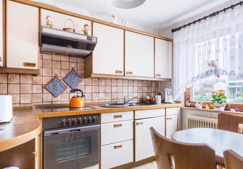
3) Tiled Countertops (a.k.a. Grout Lines That Collect Crumbs Like It’s Their Job)
Tile can be beautifulon backsplashes, shower walls, and floors. On countertops, the grout becomes the main
character, and not in a good way. Food, makeup, and everyday mess settle into the lines, turning routine cleanup
into a tiny archaeology project.
Modern swap: quartz, solid-surface, or stone slabs (even budget-friendly options) offer a cleaner look and
a wipeable surface. If you love tile, consider it for vertical surfaces where it can shine without constant wear.
- Tip: If replacement isn’t immediate, deep-clean and seal grout regularly to buy time.
- Design note: a simple slab counter instantly elevates even older cabinets.
4) Sponge-Painted Walls and Heavy Faux Finishes
Sponge paint, rag-rolling, and other “faux texture” wall treatments were once meant to look artistic and upscale.
In practice, they often read like a fast-food muralbusy, shiny, and oddly uneven. Designers dislike them because
they fight modern furnishings and make a room feel visually noisy.
Modern swap: if you want depth, go for limewash, plaster looks, or subtle mineral finishes that feel more
artisanal. If you want calm, a clean coat of paint in a warm neutral (or a confident color) does more than a dozen
sponged layers ever could.
5) Glass-Block Windows and Walls
Glass blocks were the privacy solution of the 1980s and 1990s: let light in, keep neighbors out. The downside is
they can look chunky and cloudy, and they often collect grimeespecially in showers. Designers also note that
newer materials give you privacy without turning your bathroom into a retro bank lobby.
Modern swap: frosted or textured glass, slim-profile windows, and well-placed window treatments. In
bathrooms, consider a larger window with obscured glass for brighter light and a more open feel.
6) Shiny Yellow Brass Everywhere
Brass itself isn’t the villain. The issue is the super-lacquered, bright yellow brass that screams “builder upgrade,
circa 1994.” Designers tend to prefer metals with depthfinishes that look intentional, not like they came in a
matching 47-piece set.
Modern swap: unlacquered brass (patina-friendly), brushed brass, matte black, polished nickel, or mixed
metals used with restraint. The trick is cohesion: repeat finishes thoughtfully rather than matching every single
hinge like you’re trying to win a showroom contest.
7) Orange-Toned Oak Floors and Honey-Oak Wood Finishes
Warm wood is backbut not the orange-red polyurethane glow that can make a room feel like it’s permanently
trapped in late-90s lighting. Honey-oak cabinets and similarly toned trim can also dominate a space, especially
when paired with beige walls and busy granite.
Modern swap: matte or satin finishes, more natural stains (think balanced oak, walnut, or softer warm
tones), or refinishing to reduce the orange cast. For cabinets, painting, re-staining, or simply updating hardware can
dramatically shift the vibe.
- Fast update: swap cabinet pulls and add warmer, layered lighting to soften the “orange effect.”
- Bigger update: refinish floors to a calmer tone with a modern topcoat sheen.
8) Builder-Grade Lighting (Including the Infamous Dome Light)
Lighting is the easiest way to time-traveland not always in the fun way. Builder-grade fixtures (especially the
dreaded dome light) can make a home feel instantly dated, no matter how nice the furniture is. Designers love to
change lighting early because it improves both function and mood, fast.
Modern swap: simple semi-flush fixtures, recessed lighting used strategically (not everywhere), warm LEDs,
and layered light sources (table lamps, sconces, under-cabinet lighting). A single upgraded fixture can make a room
feel “designed,” not just “occupied.”
9) Overly Coordinated Furniture Sets and Matchy-Matchy Rooms
If your bedroom looks like it came as one giant “Buy Now” buttonbed, nightstands, dresser, mirror, all in the same
finishdesigners tend to cringe. Perfectly matching sets can make a room feel visually heavy and less personal.
The same goes for rooms built around a strict theme (like “Tuscan kitchen” or “coastal everything, including the
bathroom anchor”).
Modern swap: mix materials and silhouettes. Keep one anchor piece (like a great wood dresser) and pair it
with lighter, simpler companions. Think “collected over time,” not “assembled in aisle nine.”
- Easy win: break up sets by changing hardware, adding varied textiles, or swapping one major piece.
- Style tip: repeat a color or metal finish to keep the mix feeling intentional.
How to Update a Dated Home Without Over-Renovating
Not every outdated interior design element needs a full replacement. Prioritize based on impact:
- Lighting: high impact, relatively affordable, instantly modernizes.
- Paint: the fastest way to calm busy surfaces and unify mismatched rooms.
- Floors & ceilings: big visual surfaces that change the entire “era” of a home.
- Kitchens & baths: focus on touch points firsthardware, faucets, mirrors, countersbefore gut jobs.
If resale value is part of your plan, aim for updates that feel widely appealing: cleaner lines, easy maintenance,
and finishes that age well. If resale isn’t your concern, your best rule is simpler: choose what you’d still like five
years from now, when the internet moves on to something else.
FAQ: Quick Answers About Outdated Home Features
Are popcorn ceilings always unsafe?
Not automatically. The bigger concern is older ceilings that may contain asbestos. If your home is older and you
plan to scrape or disturb the texture, testing and proper safety steps are important.
Can I modernize honey-oak cabinets without replacing them?
Yes. Paint, re-stain (to reduce orange), add new hardware, and improve lighting. Even swapping to a modern faucet
and simple backsplash can shift the whole kitchen.
What’s the cheapest way to make a house feel less dated?
Lighting + paint + updated hardware. Those three changes can make an older home feel intentionally styled rather
than stuck in a specific decade.
of Real-World Experiences: What These “Outdated” Features Feel Like in Daily Life
Imagine you’re touring a house that looks great online. The listing photos are bright. The rooms seem spacious.
You’re already mentally placing your couch. Then you walk in andbampopcorn ceiling. Not a subtle one, either.
The kind that looks like the ceiling has a crunchy topping. Suddenly you notice everything: the lighting seems dimmer,
the ceiling feels lower, and you’re thinking, “So… how do I dust that without wearing a helmet?” That’s the sneaky
power of outdated home features: they change how a home feels before you’ve even seen the bedrooms.
Next comes the bathroom surprise. You open the door and the floor is carpeted. Your brain pauses, as if it just hit a
buffering screen. You don’t even have to touch anything to know it’s going to be a maintenance nightmare. It’s not
just about aestheticsit’s about trust. If the bathroom has carpet, what else was considered a good idea here?
Suddenly you’re inspecting the corners like a detective in a crime drama, except the crime is “moisture management.”
Then there’s the tiled countertop experience: beautiful from five feet away, stressful from five inches away. You wipe
the surface and crumbs migrate into grout lines like they’re escaping the law. Cooking becomes a two-step process:
make food, then clean grout. And the grout doesn’t want to be cleaned. It wants to hold memories. Forever.
Many homeowners also describe the “orange wood effect” as a slow realization. At first, honey-oak cabinets seem fine.
Then you paint the walls a fresh neutral…and the cabinets suddenly look even more orange. You replace a light bulb with
a brighter LED…and the cabinets look more orange. You bring home a sleek black toaster…and the cabinets look like they
just got a spray tan. That’s why designers often recommend tackling lighting and paint in tandem with wood tonesbecause
the room’s undertones will tell on you the moment you change anything else.
Lighting upgrades are the most satisfying, though. Swapping a builder-grade dome light for a simple semi-flush fixture
can feel like your house took a deep breath. The room looks taller. Shadows soften. Colors feel more accurate. It’s the
kind of change that makes you want to walk from room to room flipping switches like you’re hosting a tiny, private
grand opening.
Finally, there’s the “matchy set” phase. Lots of people inherit furniture or buy sets because it’s easy. But living with
a perfectly matched bedroom can feel oddly… flat. When you break it updifferent nightstands, a new lamp, varied
texturesthe room starts to feel like a person lives there, not a catalog. And that’s the real point: the best updates
don’t just remove dated design. They make your home feel more like you, and less like a timestamp.