Table of Contents >> Show >> Hide
- Why the Vitruvian Man Is Still a Puzzle After 500+ Years
- The Dentist’s Discovery: A Third Shape “Hiding in Plain Sight”
- So What’s the “Code,” Exactly?
- Is This Real Discovery or Fancy Pattern-Finding?
- Why This Story Still Matters (Even If You’re Not Fully Convinced)
- Try It Yourself: A Low-Stakes Way to “Decode” the Drawing
- FAQ: The Questions Everyone Asks After Seeing the Headline
- Conclusion: The Real “Da Vinci Code” Is Method + Curiosity
- Real-World Experiences Related to the “Hidden Code” (A 500-Word Add-On)
Every few months, the internet collectively rediscovers that somebody has “solved” a famous artwork.
Sometimes it’s a curator with a newly digitized archive. Sometimes it’s a physicist with a fresh graph.
And sometimesbecause the universe loves a plot twistit’s a dentist with a protractor.
The latest buzz centers on Leonardo da Vinci’s Vitruvian Man, arguably the most recognizable drawing in Western art:
a figure simultaneously posed to fit inside a circle and a square. The claim? A London-based dentist, Dr. Rory Mac Sweeney,
spotted a “hidden” geometric element that functions like a blueprintwhat headlines call a “code.”
Before we grab our magnifying glasses and start narrating ourselves like a prestige documentary, let’s set expectations:
this “code” isn’t a secret message, a cipher, or a treasure map to a Renaissance snack stash. It’s a proposed geometric framework
a way to explain how Leonardo constructed relationships between the circle, the square, and the human figure with unusual precision.
Whether it’s the one true solution is still a matter of debate, but it’s a fascinating story because it sits at the crossroads of art,
anatomy, math, and (unexpectedly) dentistry.
Why the Vitruvian Man Is Still a Puzzle After 500+ Years
Vitruvius posed the challenge; Leonardo made it iconic
The Vitruvian Man was inspired by ideas from the Roman architect Vitruvius, who wrote about ideal proportions
and described how a human body could relate to both a circle and a square. That sounds tidy until you try drawing it.
“A man fits in a circle and a square” is the geometric equivalent of “make it pop”: easy to say, strangely hard to execute.
Artists before Leonardo tried their own versions, and many ran into the same problem:
if you force the circle and square to share the same center, something has to giveusually the anatomy.
Arms stretch, legs distort, proportions wobble. The drawing starts feeling less like “ideal harmony”
and more like “human pretzel, architectural edition.”
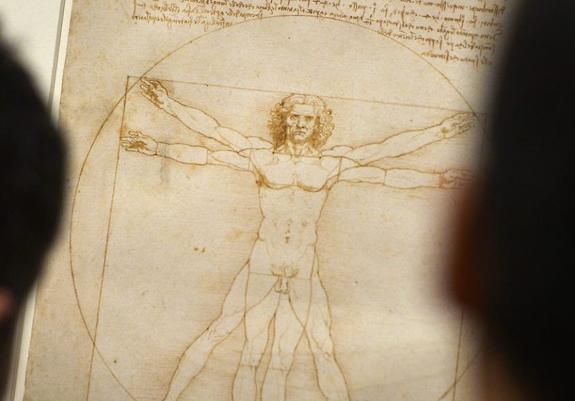
Leonardo’s clever adjustment: the circle and square don’t share a center
One of Leonardo’s most important moves was not insisting the circle and square are centered at the same point.
In many descriptions, the circle’s center aligns with the navel (belly button), while the square’s center shifts lower.
This offset allows two different poses to coexist: one that “fits” the circle and another that “fits” the square.
That alone explains why the Vitruvian Man looks like it’s doing a small, controlled dance while being inspected by geometry.
Two stances. Two shapes. One drawing. The result is both elegant and maddeningbecause Leonardo’s exact method for
coordinating these shapes has been argued over for centuries.
The Dentist’s Discovery: A Third Shape “Hiding in Plain Sight”
The equilateral triangle between the legs
Dr. Rory Mac Sweeney’s headline-making observation is simple to describe:
look at the wide-legged stance and trace an equilateral triangle suggested by the angles and spacing
a triangle positioned between the legs, with its top pointing toward the navel.
“Equilateral” means all three sides are the same lengthgeometry’s version of perfectly even teeth after braces.
The triangle itself isn’t drawn as a bold outline (Leonardo didn’t label it “TRIANGLE, DO NOT IGNORE”).
It’s inferred from the arrangement of the figure. And that’s where the story gets interesting:
Mac Sweeney argues this triangle is not accidental decoration-by-anatomy but a deliberate construction clue.
Why a dentist would see it: Bonwill’s triangle
Here’s the dental curveball: the triangle resembles a concept in dentistry called Bonwill’s triangle.
In simplified terms, Bonwill’s triangle is an “idealized” equilateral triangle used to describe relationships in the lower jaw
connecting two jaw-joint points (condyles) and the midpoint near the lower front teeth.
The dental takeaway is not “your jaw is secretly Renaissance art,” but that equilateral-triangle geometry appears in models
of efficient jaw mechanics and dental occlusion. Mac Sweeney’s argument is that Leonardo’s triangle mirrors this same
efficiency-based geometrysuggesting the artist may have embedded a structural principle that modern anatomy and biomechanics
also recognize.
So What’s the “Code,” Exactly?
In Mac Sweeney’s interpretation, the triangle is more than a neat overlayit’s a geometric key.
The claim is that if you use that equilateral triangle as a building block and replicate it around the navel point,
you can create a hexagonal arrangement (think honeycomb-like symmetry).
From that construction, he proposes a specific proportional relationship between the square and the circle emerges:
a ratio reported around 1.64–1.65 (often discussed alongside the value √(8/3) ≈ 1.633),
sometimes described as a “tetrahedral ratio” because similar numbers appear in efficient 3D packing and tetrahedral geometry contexts.
If your brain just said, “That’s cool, but also… huh?” you’re normal.
The important point is not that everyone must immediately tattoo 1.633 on their forearm.
It’s that the theory tries to connect Leonardo’s drawing to a broader idea:
nature and human anatomy often reflect efficient geometric relationships,
and Leonardo may have been deliberately encoding an efficiency-driven geometry in the figure’s proportions.
Some summaries of the theory go furtherlinking the geometric relationships to modern frameworks of structural balance and
spatial organization. At that point, the idea becomes less “Leonardo drew a triangle” and more “Leonardo intuited a universal
architecture of reality,” which is… ambitious. Fun! But ambitious.
Is This Real Discovery or Fancy Pattern-Finding?
This is the part where we keep one foot in wonder and the other foot firmly on the groundlike the Vitruvian Man, but with fewer
overlapping limbs.
Why it feels convincing
-
Leonardo actually thought like this. He was obsessed with measured observation, anatomy, mechanics,
and how geometry maps onto the physical world. -
The triangle is structurally meaningful. Equilateral triangles aren’t random doodles; they’re stable, efficient shapes
used in engineering and modeling for a reason. -
The claim connects to known anatomical modeling. Bonwill’s triangle is a real idea in dental anatomy and prosthodontic modeling,
so the comparison isn’t pulled from thin air.
Why skepticism is reasonable
-
Humans are professional pattern-finders. Given enough lines, we will “discover” triangles, spirals, and hidden
messages in a bowl of cereal. -
Reproduction issues matter. The Vitruvian Man is often seen through scans, prints, crops, and perspective distortions.
Small measurement changes can produce big ratio changesespecially when people round numbers to make them look magical. -
Intent is hard to prove. Even if the triangle can be overlaid cleanly, proving Leonardo intentionally encoded
a specific ratio is tougher than simply showing it can be found.
A fair middle position is this: the triangle-based interpretation is a compelling way to read the drawing’s geometry,
and it may align with Leonardo’s habits of thinking. But “plausible” is not the same as “proven,” and viral headlines tend to sprint
past nuance like they’re late for a trend.
Why This Story Still Matters (Even If You’re Not Fully Convinced)
Whether Mac Sweeney’s triangle is the solution or a solution, the story highlights something genuinely valuable:
the Vitruvian Man is not just “a cool sketch.” It’s a visual research notea diagram where art is doing the job of engineering.
It also reminds us that innovation often comes from cross-pollination. A dentist looking at jaw mechanics may notice
geometric relationships that an art historian, focused on iconography and provenance, might not prioritize.
That’s not a diss on art historyit’s an argument for interdisciplinary curiosity.
And if nothing else, it’s refreshing to see a modern “discovery” in a Leonardo work that doesn’t involve conspiracy theories,
aliens, or a previously unknown painting found behind a couch.
Try It Yourself: A Low-Stakes Way to “Decode” the Drawing
Want to explore the claim without turning your living room into a Renaissance crime lab?
Here’s a practical approach that’s more “curious experiment” than “definitive proof.”
Step 1: Use a high-quality, undistorted image
Start with a reputable reproduction. Avoid images that are skewed, stretched, or heavily cropped.
Small distortions can create fake precision.
Step 2: Identify the two poses and their shapes
Notice the two stances: one with limbs extended diagonally (often tied to the circle) and one with arms out horizontally and legs together
(often tied to the square). Understanding the overlay is half the battle.
Step 3: Look for the equilateral triangle in the wide-stance legs
In the wide-stance position, examine whether the leg angles and spacing can reasonably support an equilateral triangle.
Don’t force it. If you have to “help” the triangle by moving points around, you’re no longer measuringyou’re improvising.
Step 4: Measure carefully (and accept imperfection)
If you measure ratios, record your method: where you placed points, what tools you used, and how you handled thickness of lines.
If a result “only works” when you round aggressively, that’s a clue in itself.
Step 5: Compare interpretations
Read multiple explanations: art history context, Vitruvius’s original description, and modern analyses.
Strong ideas get clearer under multiple lenses, not weaker.
FAQ: The Questions Everyone Asks After Seeing the Headline
Is the Vitruvian Man really Leonardo’s most famous drawing?
It’s certainly a top contender. Even people who can’t name the drawing often recognize the image instantly,
which is a special kind of fame.
Did Leonardo intentionally hide a “code”?
The safest answer is: Leonardo intentionally used geometry and proportion. Whether he intentionally embedded the specific triangle framework
and ratio described in the modern claim is still debated.
Does this change how we should understand the drawing?
It canat minimumencourage people to treat the drawing as a working diagram, not just a symbol slapped on posters.
That’s a win for serious curiosity.
Conclusion: The Real “Da Vinci Code” Is Method + Curiosity
A dentist noticing a triangle in Leonardo’s most famous drawing sounds like the start of a joke.
But it’s also a reminder that big ideas don’t respect job titles.
If Mac Sweeney’s interpretation holds up, it could offer a satisfying geometric explanation for a long-discussed proportional puzzle.
If it doesn’t fully hold up, it still pushes the conversation forwardforcing clearer questions about what we mean by “hidden geometry,”
what counts as evidence of intent, and how Leonardo blended observation with design.
Either way, the Vitruvian Man stays what it has always been:
a drawing that dares you to measure the worldand then measure your assumptions.
Real-World Experiences Related to the “Hidden Code” (A 500-Word Add-On)
One of the most interesting side effects of this story is what happens when real people try to engage with itespecially people who
don’t normally spend their free time arguing with a 15th-century sketch (no judgment; hobbies are hobbies).
Across classrooms, studios, and even dental offices, the “hidden triangle” idea has become a gateway into the kind of hands-on thinking
that Leonardo would probably approve of: observe, measure, compare, repeat.
Art students often describe a strange emotional whiplash when they first attempt overlays and measurements.
The Vitruvian Man is so familiarprinted on notebooks, mugs, and museum tote bagsthat it can feel more like a logo than a drawing.
But when students start tracing the circle and square and mapping the limbs, it stops being “an icon” and turns into “a construction.”
That shift changes the vibe in the room: suddenly the sketch feels alive, like a workbench rather than a shrine.
Even students who don’t care about ratios end up caring about processhow a line was chosen, why a point matters,
what “precision” looks like in ink on paper.
Dental professionals and anatomy-minded readers tend to have a different reaction:
they recognize that models like Bonwill’s triangle aren’t meant to be mysticalthey’re meant to be useful.
In dentistry, a clean geometric model is valuable because it helps explain how forces distribute and how alignment affects function.
When they see a claim that Leonardo may have embedded a triangle resembling a jaw-geometry principle, they don’t necessarily jump to
“Leonardo predicted modern dentistry.” Instead, they think, “It’s plausible he noticed stable relationships and used them as design anchors.”
The experience becomes less about “hidden secrets” and more about “shared geometry” across disciplines.
STEM teachers love this story for a simple reason: it’s sticky.
Students who would normally groan at the word “ratio” will suddenly argue passionately about whether a triangle is truly equilateral.
That’s educational gold. Teachers report that the Vitruvian Man becomes a bridge topican excuse to practice measurement error,
discuss rounding, compare sources, and talk about how models simplify reality. The best part is that there’s no single
easy answer to memorize, so students are forced to defend methods, not just conclusions.
Everyday museum-goers and casual readers often experience something even simpler: permission to look slowly.
The headline draws them in, but the activity of testing the claimzooming in, tracing lines, noticing offsetsturns passive viewing
into active seeing. People frequently describe that moment as surprisingly calming. The drawing becomes a puzzle you can hold in your mind,
one line at a time, without needing to “solve” it perfectly.
In the end, the biggest “experience” tied to this story is a mindset shift:
great works don’t have to be untouchable. You can examine them, question them, measure them,
and still be amazedmaybe even more amazedbecause you’re engaging with the work the way it was made: thoughtfully.