Table of Contents >> Show >> Hide
- What Counts as a Background in Adobe InDesign?
- Why Backgrounds Matter More Than People Think
- How to Create a Background in Adobe InDesign: Step by Step
- Step 1: Set Up Your Document Properly
- Step 2: Create a Dedicated Background Layer
- Step 3: Draw a Rectangle That Covers the Page
- Step 4: Add a Solid Color Background
- Step 5: Place an Image Background
- Step 6: Use a Gradient for More Depth
- Step 7: Add Transparency or an Overlay When Text Needs Help
- Step 8: Send the Background Behind Everything
- Step 9: Reuse It with Parent Pages
- Best Background Methods for Different Projects
- Common Mistakes to Avoid
- Pro Tips for Cleaner Background Design
- Final Thoughts
- Experience and Practical Lessons from Real-World Background Design
- SEO Tags
If you are new to Adobe InDesign, creating a background can feel strangely dramatic. You open a fresh document, stare at a beautiful blank page, and suddenly realize the page is judging you. The good news is that making a background in InDesign is not complicated once you understand one core idea: a background is usually just a shape, frame, color, gradient, or image placed behind everything else.
That means you do not need a secret menu, a magic plugin, or a design wand blessed by typography monks. You just need the right tools, the right order, and a couple of smart habits that prevent your headline from vanishing into a dark photo like a shy raccoon in the woods.
In this guide, you will learn how to create a background in Adobe InDesign using solid colors, full-page images, and gradients. You will also learn how to make that background reusable across multiple pages, how to keep it from getting in your way while designing, and how to avoid the classic beginner mistakes that turn a sleek layout into a mild emergency.
What Counts as a Background in Adobe InDesign?
In InDesign, a background is not a special built-in page property in the way some beginners expect. Instead, it is usually one of these:
- a colored rectangle filling the page
- an image placed inside a frame that covers the page
- a gradient-filled object
- a tinted or transparent overlay behind text
- a reusable background placed on a parent page for consistency
That is why the basic workflow is so reliable. You create a rectangle, size it to the page or bleed, apply a fill color or place an image, send it to the back, and lock it. In other words, you build the background as an object, not as a mystical page aura.
Why Backgrounds Matter More Than People Think
A good background does more than make the page look less lonely. It helps set the mood, supports branding, improves visual hierarchy, and gives your layout a finished, intentional look. A soft gray background can make a white product photo feel cleaner. A deep navy photo overlay can make white text pop. A warm gradient can guide the eye toward a callout or headline.
A bad background, on the other hand, is a serial troublemaker. It can crush readability, create printing issues, make photos look muddy, or overpower the content. The best backgrounds support the layout without yelling, “Look at me, I’m the wallpaper!” every three seconds.
How to Create a Background in Adobe InDesign: Step by Step
Step 1: Set Up Your Document Properly
Before creating any background, make sure your document size is correct. If the project is for print and your background color or image should run all the way to the edge of the page, add bleed in your document setup. Many U.S. print workflows commonly use a bleed of 0.125 inch on all sides, although you should always confirm with your printer.
This matters because if your background stops exactly at the trim edge, a tiny shift during trimming can leave an unwanted white sliver. And nothing ruins a polished brochure faster than an accidental white haircut.
Step 2: Create a Dedicated Background Layer
Open the Layers panel and create a layer named Background. Put it below your text and image layers. This is one of those tiny habits that makes a huge difference later. When everything sits on one layer, editing becomes an archaeological dig. With a dedicated background layer, you can show, hide, lock, and manage your page foundation without disturbing the rest of the design.
If you are working on a multipage document, this step becomes even more important. Organized layers make future-you much happier, and future-you deserves that kind of kindness.
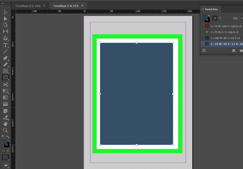
Step 3: Draw a Rectangle That Covers the Page
Select the Rectangle Tool if you want a color or gradient shape, or the Rectangle Frame Tool if you plan to place an image. Then drag out a rectangle that covers the entire page. If the project is going to print edge to edge, extend the rectangle all the way to the bleed guides, not just the page edge.
This single rectangle is the workhorse of background design in InDesign. Most backgrounds begin here, whether you are building a magazine cover, flyer, brochure, poster, annual report, or social graphic.
Step 4: Add a Solid Color Background
For a simple color background, select the rectangle and apply a fill color from the Swatches panel, the Color panel, or the Properties panel. You can use a default swatch, create a custom CMYK or RGB color, or save brand colors as swatches for consistency across the project.
Solid backgrounds are ideal when you want a clean, modern look or need strong contrast for text. They also print more predictably than complicated image backgrounds and are often easier to manage in corporate layouts.
If your text will sit on top of the color, test readability right away. Dark background plus dark text equals design tragedy. Light background plus low-contrast pastel text is only slightly less tragic.
Step 5: Place an Image Background
If you want a photo background, select the frame and go to File > Place. Choose your image and insert it into the frame. If only part of the image appears, that is normal. InDesign places images inside frames, which means the frame and the content work together but can be adjusted independently.
After placing the image, use fitting options such as Fill Frame Proportionally, Fit Frame Proportionally, or Content-Aware Fit depending on the look you want. Then reposition the image inside the frame using the content grabber or direct selection tools until the crop looks intentional.
This is where many beginners panic. They drag the image, the frame moves, the crop changes, and suddenly everyone is clicking things with the energy of a game show contestant. Slow down. InDesign is just asking whether you want to move the frame, the image inside the frame, or both.
Step 6: Use a Gradient for More Depth
If a flat color feels too plain and a full photo feels too busy, gradients are the elegant middle ground. Create a gradient swatch in the Swatches panel or use the Gradient panel to build one on the fly. Linear gradients are great for soft top-to-bottom or left-to-right transitions, while radial gradients can create spotlight-style emphasis.
Gradients work especially well for hero sections, title pages, event programs, and digital layouts where you want more visual energy without introducing a full image. They are also useful for creating readable overlays behind text. A dark-to-transparent gradient over a photo can make headlines much easier to read without making the design look heavy-handed.
Step 7: Add Transparency or an Overlay When Text Needs Help
Sometimes the background looks great, but your text looks like it is fighting for survival. That is where overlays save the day. Create another rectangle above the photo but below the text, fill it with a color, and lower the opacity. You can also experiment with blending modes for more nuanced results.
This trick is useful for cover pages, pull quotes, section dividers, and callout boxes. It lets you keep the texture and mood of the image while giving your words an actual chance to be read by a human person.
Step 8: Send the Background Behind Everything
Once your background object is ready, make sure it sits behind the rest of the content. Use Object > Arrange > Send to Back if needed. Then lock the background frame so you do not accidentally move it while editing text or adding other design elements.
This locking step is wildly underrated. Without it, you will eventually nudge the background by mistake, fail to notice, and spend ten minutes wondering why the whole page feels “slightly cursed.”
Step 9: Reuse It with Parent Pages
If you want the same background on multiple pages, place it on a parent page. That way, every page using that parent updates automatically when you make a change. This is perfect for newsletters, catalogs, magazines, proposals, and branded reports.
Parent pages are one of the most efficient ways to keep multipage layouts consistent. Instead of copying and pasting the same background over and over, you set it once and let InDesign do the repetitive work. Finally, software earning its keep.
Best Background Methods for Different Projects
For Flyers and Posters
Use a bold solid color or one strong full-page image. Keep contrast high. Posters need impact at a glance, so your background should support the headline instantly.
For Brochures and Reports
Use subtle tinted backgrounds, section dividers, or parent-page elements for consistency. Heavy backgrounds on every page can make long documents feel cluttered.
For Magazine Covers
Use a dominant photo background with careful text placement. Add a tinted overlay if the masthead or feature lines are getting lost.
For Digital PDFs
Gradients and large photos can look terrific on screen, but keep file size in mind. High-resolution image backgrounds can make a PDF heavier than expected.
Common Mistakes to Avoid
- Not extending backgrounds to bleed: This can leave white edges after trimming.
- Using low-contrast text: Pretty is nice, readable is better.
- Forgetting to lock the background: One accidental drag can throw off the whole layout.
- Using images without checking crop and focus: Important faces or objects can end up sliced awkwardly.
- Overdesigning: A background should support content, not start a fight with it.
- Skipping layers: Disorganization turns simple edits into scavenger hunts.
Pro Tips for Cleaner Background Design
Start with the background before styling detailed typography. It is easier to choose text color, stroke, and spacing once the backdrop is in place.
Use saved swatches for brand consistency. If your design has multiple pages or versions, swatches make color changes much faster.
Preview often. Pressing preview mode helps you see the page more like a final reader would, without the clutter of guides and frame edges.
If you are placing Photoshop files, consider preparing them carefully before import. InDesign can handle transparency and placed graphics very well, but the cleaner the original asset, the smoother your layout work will be.
And one more practical rule: if you keep adding effects because the background still feels “meh,” the problem may not be the effects. It may be the image choice. A stronger photo usually beats five extra tricks.
Final Thoughts
Learning how to create a background in Adobe InDesign is really about learning how InDesign thinks. It thinks in frames, layers, fills, placed graphics, and reusable layout structure. Once that clicks, backgrounds become easy. You stop hunting for a nonexistent “set page background” button and start building exactly the look you want.
The simplest method is often the best: create a rectangle, size it correctly, apply color or place an image, fit it well, send it back, and lock it. From there, you can level up with gradients, transparency, overlays, and parent pages. That gives you a background that is not only attractive, but also practical, editable, and production-friendly.
In short, InDesign backgrounds are less about flashy tricks and more about smart structure. Get the structure right, and the design gets a whole lot easier.
Experience and Practical Lessons from Real-World Background Design
One of the most useful lessons designers learn with InDesign backgrounds is that the “best” background is usually the one readers barely notice. Early on, many people try to prove they have imagination by throwing giant photos, dramatic gradients, textured overlays, and enough transparency effects to frighten a printer. Then they step back and realize the page looks like three different ideas applied at once. With experience, you begin to value restraint. A simple dark rectangle behind a headline can outperform a complicated photo treatment every single time.
Another real-world lesson is that backgrounds behave differently depending on the job. A background that looks rich and cinematic on a laptop screen may print darker than expected. A pastel fill that feels soft and elegant in a brochure mockup may look washed out when paired with weak typography. Designers often discover that a background is not just decoration; it is part of the communication system. It affects mood, readability, printability, file weight, and even how “expensive” or polished the final piece feels.
Beginners also tend to think the background should come last, as if it were frosting. In practice, backgrounds often come early because they influence everything else. Once you choose a photo with deep shadows, your text color, box styles, icon treatment, and even margin decisions may change. Once you commit to a bold brand color background, your white space becomes more important because the page feels visually heavier. Experience teaches you that the background is part of the layout skeleton, not just a decorative coat of paint.
A very common workflow improvement comes from using parent pages and layers intelligently. Designers who skip those features at first usually regret it when they hit page 18 of a report and suddenly need to adjust every section opener. The moment you realize one background element can be updated globally is the moment InDesign starts feeling less like software and more like a reliable production partner.
Perhaps the biggest practical lesson is that background problems are often content problems in disguise. If a headline is unreadable, the fix is not always more opacity. Sometimes the image crop is wrong. Sometimes the photo is too busy. Sometimes the color choice is simply fighting the brand palette. Good designers do not just “decorate harder.” They simplify, test, and adjust until the page feels calm and intentional.
That is why creating backgrounds in Adobe InDesign becomes easier with repetition. The more layouts you build, the more quickly you see what belongs behind the content, what should be toned down, and what should be cut entirely. Over time, your backgrounds stop being random visual filler and start becoming one of the strongest tools in your design kit.