Table of Contents >> Show >> Hide
- What “Full-Size” Actually Means on Instagram (And Why It’s Tricky)
- The Instagram Features That Help You Post Full-Size Photos
- 1) The “Expand” / Pinch-to-Zoom-Out Trick (a.k.a. the No-Crop Lifesaver)
- 2) Native Support for Taller Photos (Hello, 3:4)
- 3) Carousel Cropping Control (Tap Each Slide, Don’t Let It Auto-Butcher)
- 4) “Adjust Preview” for Your Profile Grid (Because the Grid Is a Different Universe)
- 5) Choosing the Right Format: Feed vs. Story vs. Reel
- The Aspect Ratio Cheat Sheet (So You Don’t Guess and Stress)
- How to Post Full-Size Photos in the Feed (Without Cropping the Good Stuff)
- When Your Photo Doesn’t Fit: Three Smart Fixes That Keep It Full-Size
- Carousels: How to Keep Every Slide Full-Size (and Not Randomly Cropped)
- Fix Your Grid Without Reposting: How “Adjust Preview” Saves Your Aesthetic
- Quality Tips So Your “Full-Size” Photo Doesn’t Look Like It Was Faxed
- Common “Full-Size” Problems (and Fast Fixes)
- Conclusion: Full-Size Posting Isn’t LuckIt’s a Workflow
- Creator Experiences: What Usually Works in the Real World (500+ Words)
Instagram has a long, complicated relationship with your camera roll. You take a gorgeous full-frame shot, open Instagram, and suddenly it’s like, “Nice photo. Would be a shame if… I cropped the best part.”
The good news: Instagram has quietly rolled out (and steadily improved) several features that make it much easier to post “full-size” photosmeaning your image shows the whole composition with minimal cropping, looks sharp, and fits the feed or grid the way you intended. Some of these tools are built right into Instagram. Others are simple prep steps that keep your photo intact without turning your post into a tiny postage stamp surrounded by sad white space.
What “Full-Size” Actually Means on Instagram (And Why It’s Tricky)
“Full-size” doesn’t mean Instagram will display every photo exactly as-shot in every place it appears. It means you’re working with Instagram’s format rules instead of getting ambushed by them.
Instagram feed posts accept a range of aspect ratios (the relationship between width and height). If your image falls outside that range, Instagram forces you to cropunless you add padding (borders) to “fit” the whole image inside an allowed ratio.
Also important: your photo can appear in multiple placesfeed, profile grid, Explore, and shares in Stories/DMseach with its own preview behavior. So the goal is to create a post that looks great everywhere, not just in the edit screen where everything is briefly under your control.
The Instagram Features That Help You Post Full-Size Photos
1) The “Expand” / Pinch-to-Zoom-Out Trick (a.k.a. the No-Crop Lifesaver)
When you’re creating a new feed post, Instagram lets you zoom out on the preview to show the full image within an allowed frame. This usually adds a border around the photo instead of cropping off the edges. It’s fast, built-in, and works great when your photo is only slightly outside the ideal ratios.
- When to use it: You want the full image visible and don’t mind a subtle border (often white or black depending on theme).
- When not to: Your photo is extremely wide/tall and the border would make the image too small to enjoy.
2) Native Support for Taller Photos (Hello, 3:4)
For years, the tallest comfortable feed ratio was the portrait format everyone knows: 4:5. Instagram has increasingly supported taller, phone-native photography, including 3:4which matches what many phone cameras shoot by default.
Translation: if your photo is already 3:4, you can often post it so it appears “as shot,” with less cropping drama than older limits allowed.
3) Carousel Cropping Control (Tap Each Slide, Don’t Let It Auto-Butcher)
Carousels (multiple photos in one post) are amazing for storytelling… and also for unexpected cropping if you mix formats. Instagram lets you adjust how each slide fits in the frame while editing. The catch: your first slide typically sets the vibe, so plan your carousel with consistent dimensions to avoid surprise crops.
4) “Adjust Preview” for Your Profile Grid (Because the Grid Is a Different Universe)
Even if your feed post looks perfect, the grid preview can cut off heads, text, or the one detail you actually wanted people to notice. Instagram’s Adjust Preview feature lets you reposition how a post thumbnail appears on your profilewithout deleting and reposting like it’s 2017.
5) Choosing the Right Format: Feed vs. Story vs. Reel
If your photo is tall, cinematic, or packed with detail, the feed isn’t always the best stage. Sometimes the most “full-size” way to share a photo is to post it in a full-screen environment like Stories (9:16) or use it as a Reel cover and highlight it there.
The Aspect Ratio Cheat Sheet (So You Don’t Guess and Stress)
Here are the common Instagram-friendly formats that keep your image as intact as possible. Think of these as “safe lanes” for full-size posting.
| Placement | Recommended Aspect Ratios | Common Pixel Sizes | Best For |
|---|---|---|---|
| Feed (Portrait) | 4:5, 3:4 | 1080×1350 (4:5), 1080×1440 (3:4) | People, outfits, food, product shots, “stop-the-scroll” images |
| Feed (Square) | 1:1 | 1080×1080 | Logos, minimal designs, consistent grid aesthetics |
| Feed (Landscape) | 1.91:1 | 1080×566 | Landscapes, wide shots, banners (with careful text placement) |
| Stories | 9:16 | 1080×1920 | Full-screen photo moments, announcements, behind-the-scenes |
| Reels | 9:16 (recommended; accepts a range) | 1080×1920 | Vertical-first content, photo montages, motion graphics |
How to Post Full-Size Photos in the Feed (Without Cropping the Good Stuff)
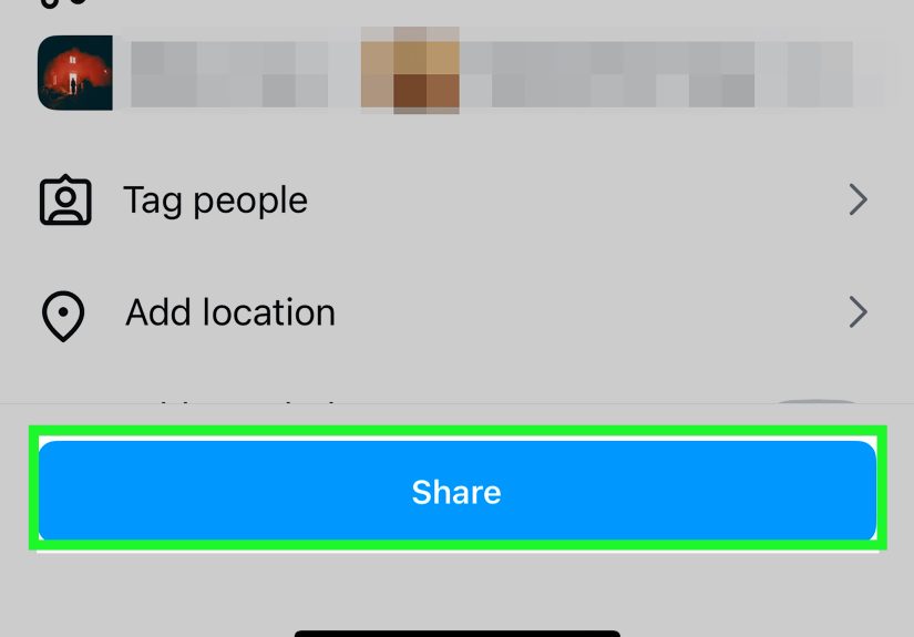
Step 1: Start a New Post Like Normal
Tap the + button, choose Post, and select your photo.
Step 2: Use the “Expand” Icon or Pinch to Zoom Out
On the preview screen, look for the expand/full-screen style icon (or just pinch inward). Instagram will “fit” the whole photo inside its allowed frame, usually adding a border rather than cropping the image.
Step 3: Choose the Best Feed Ratio for Your Photo
If your photo is portrait, aim for 4:5 or 3:4 for maximum screen space. If it’s landscape, try 1.91:1 to avoid top/bottom cropping.
Quick rule: taller = bigger in the feed. If your goal is impact, portrait formats win. If your goal is preserving a wide composition, plan for a clean landscape-friendly frame (or consider a carousel with a wide first slide).
Step 4: Check the “Thumbnail Moment” Before You Hit Share
Ask yourself: “If someone sees only the preview in the feed, will they understand what this is?” If the answer is “maybe,” choose a stronger crop (still within allowed ratios) or use a carousel with a compelling first slide.
When Your Photo Doesn’t Fit: Three Smart Fixes That Keep It Full-Size
Fix #1: Add a Soft Border That Looks Intentional (Not Like You Gave Up)
If the expand/pinch method makes your photo too small, create a background canvas in the target ratio (like 4:5 or 3:4) and place your original photo on top. The background can be:
- Blurred version of the photo (clean and modern)
- Solid color pulled from the image (brand-friendly)
- Gradient that matches your feed aesthetic
This keeps your full composition visible while still filling the screen in a way that doesn’t scream “I fought Instagram and Instagram won.”
Fix #2: Resize to Instagram-Friendly Dimensions Before Uploading
A simple resize workflow prevents quality loss and reduces Instagram’s urge to “help.” Many creators export feed images at 1080 px wide in the exact ratio they want (4:5, 3:4, 1:1, or 1.91:1). You’re basically handing Instagram a perfectly wrapped gift so it doesn’t rip the paper.
Fix #3: Turn One Photo Into a Carousel Story (Without Losing the Wide Shot)
If you shot a dramatic landscape or a wide group photo, consider:
- Slide 1: A portrait-friendly crop (4:5 or 3:4) as the hook
- Slide 2: The full wide photo “fit” on a background (so it stays intact)
- Slide 3: A close-up detail shot (faces, texture, product label, etc.)
This approach keeps the full image visible, improves engagement (swipes!), and stops you from sacrificing composition for compatibility.
Carousels: How to Keep Every Slide Full-Size (and Not Randomly Cropped)
Carousels are where full-size dreams go to get unexpectedly clippedunless you plan them right.
Best Practice: Use One Ratio for the Whole Carousel
If you mix portrait and landscape images, Instagram may crop slides to match the first slide’s aspect ratio. To keep everything “full,” prep your carousel slides so they all share the same dimensions.
Use Instagram’s Per-Slide Crop Adjustment
While editing a carousel, tap a slide and adjust how it sits in the frame. This helps you protect faces, text, and key details.
Pro Tip: Make Slide 1 Your “Format Decision”
Your first slide is the cover, the hook, and often the format setter. If you want maximum feed presence, make slide 1 a portrait (4:5 or 3:4). If you need to showcase a wide scene without compromise, make slide 1 landscape and design the rest to match.
Fix Your Grid Without Reposting: How “Adjust Preview” Saves Your Aesthetic
Your profile grid is where carefully planned feeds go to be judged by strangers (and sometimes by you at 2 a.m.). If a post preview looks weird:
- Go to your profile and open the post.
- Tap the three dots menu.
- Choose Adjust Preview (wording may vary slightly by app version).
- Reposition the image so the thumbnail looks right in the grid.
- Save.
This is especially helpful if you post tall images, designs with text, or portraits where Instagram decided the most important part was… the background wall.
Quality Tips So Your “Full-Size” Photo Doesn’t Look Like It Was Faxed
Upload High-Resolution (But Don’t Go Overboard)
Instagram recommends uploading images with a width of at least 1080 pixels. Start with a sharp export, then let Instagram compress once not twice (once by your editing app, again by Instagram).
Keep Key Details Away From Edges
Even when you “fit” a photo, previews and UI overlays can hide edges. Keep faces, logos, and text closer to the center than you think you need.
Watch Out for Text on Reels/Stories
If you’re using a photo in Stories or Reels, remember: full-screen vertical (9:16) is king, but UI elements (username, captions, buttons) can cover parts of the frame. Leave breathing room near the top and bottom.
Common “Full-Size” Problems (and Fast Fixes)
“My Photo Still Crops When I Upload It”
- Make sure your image is within accepted feed ratios.
- Use pinch-to-zoom-out on the preview screen.
- If it’s still outside the range, add padding in an editor so the final file fits 4:5 or 3:4.
“My Carousel Crops Some Slides Weirdly”
- Pre-size all slides to the same ratio before uploading.
- Tap each slide in the editor and adjust the crop placement.
- Design slide 1 intentionally since it often sets expectations and formatting.
“My Grid Preview Looks Bad Even Though the Post Looks Fine”
- Use Adjust Preview to reposition the thumbnail.
- In future posts, keep key details centered to survive different previews.
Conclusion: Full-Size Posting Isn’t LuckIt’s a Workflow
Posting full-size photos on Instagram isn’t about fighting the app. It’s about using the features Instagram already gives youexpand/pinch to fit, portrait-friendly ratios (including taller options like 3:4), carousel crop controls, and Adjust Previewplus a little smart resizing when your camera goes off-script.
If you take only one thing from this: decide where the photo should live (feed, carousel, Story, or Reel cover), then export in the ratio that makes it look intentional. Your future selfand your gridwill thank you.
Creator Experiences: What Usually Works in the Real World (500+ Words)
Here’s what creators and social teams commonly experience once they start taking “full-size” seriously: it’s less about one magic setting and more about building a repeatable habit. The moment you do, Instagram stops feeling like a slot machine and starts acting like… well, a tool.
The “I Shot This on a Real Camera” Moment
A classic scenario: someone shoots a beautiful 3:2 photo on a DSLR or mirrorless camerathink 6000×4000 pixelsthen uploads it straight to Instagram. Instagram looks at that wide-ish ratio and basically says, “Cool. Pick a crop.” The creator’s first instinct is usually to crop into 4:5, but that can chop off sky, architecture, or the leading lines that made the photo special. What tends to work better is a two-step approach: export a portrait-friendly version (4:5 or 3:4) for the hook, then include the full 3:2 image as a “fit-on-background” slide in a carousel. Creators report they get the best of both worlds: strong feed presence and the full composition preserved for the people who swipe.
The “Why Does My Grid Hate Me?” Phase
Grid anxiety is real. Even when a post looks great in the feed, the profile preview can crop it in a way that makes the subject look off-center or cuts text in half. Many creators used to delete and repost (and lose engagement) just to fix a thumbnail. The experience now is dramatically better once you discover Adjust Preview. Social managers often use it as a final step after publishing: post first, then do a quick grid check, then adjust the preview if needed. It’s like straightening a picture frame after you hang ittiny effort, massive difference in polish.
The “Border Looks Cheap” Fear (and How People Get Over It)
A lot of creators avoid fitting the full image because they worry borders look amateur. But the creators who change their mind usually do it after they see what intentional padding looks like: a blurred background derived from the photo, a brand color that matches their palette, or a subtle gradient that feels designed rather than accidental. The most common lesson: if you must add padding, make it look like a style choice. Once creators adopt a consistent background treatment, followers stop noticing it as a “fix” and start reading it as a signature look.
The “Portrait Wins, But Only If You Respect Faces” Rule
Creators who switch from square to portrait formats often see better attention in the feed because the post takes up more vertical screen space. But there’s a recurring learning curve: portraits punish sloppy edge placement. If a face sits too close to the top, UI overlays or preview crops can feel like the app is actively trying to decapitate your subject. The fix creators use: keep faces and key objects slightly lower and more centered than you’d place them for print or a portfolio site. It’s not “worse composition”it’s “composition for a platform that loves buttons.”
The Carousel “Format Consistency” Lesson
Carousels are where creators get burned once, then become planning geniuses forever. The most common experience is uploading a mix of portrait and landscape images, only to find Instagram crops some slides awkwardly. After that, creators tend to adopt a simple system: pick one ratio for the carousel, resize every slide to match, and treat slide one as the “format decision.” This consistency makes the carousel feel smoother, protects text and important details, and keeps the story cohesive. Bonus: a consistent carousel often looks more premium, which is a nice side effect for brands and creators alike.
The Best “Full-Size” Mindset Shift
The creators who get the best results don’t chase perfection on the first try. They build a quick checklist: “What’s the placement? What’s the ratio? Does the grid preview work? Do I need a background fit?” Once you think that way, full-size posting stops being a one-off battle and becomes a repeatable workflow you can do in minuteseven when you’re posting on the go.